Meest recente berichten

Donkerblauw, Koper en Wit

Het is alweer tijd voor een nieuwe When Colours Collide! Ik vond de kleuren combinatie Donkerblauw, Koper en Wit niet makkelijk. Ik ben daarom gewoon met de gekozen nagellakken aan de slag gegaan zonder een echt plan.

It’s time for another When Colours Collide! It was not an easy combination of colours with Dark Blue, Copper and White. So I chose the correct colours of polish and started without a real plan.

Abstract mani with Catrice Good Nails Only

Ik had kort ervoor een insta video gezien, waar iemand een dry brush deed met haar stempel. Dus ik probeerde dat uit en het werkt erg leuk! Op mijn middelvinger deed ik een kleine reverse stamping.

Shortly before I started I had seen an insta video of someone using her stamper to create a dry brush effect. I tried that out and liked it! On my middle finger I did some reverse stamping.

Materials used: Revlon TopSpeed 335 Spirit, DA nails 032 Navi Blue, white stamping polish, Catrice ICONails Gel Lacquer 58 Good Nails Only, Dashica stamping plate Infinity Nails 160

Dit heb ik gebruikt: Revlon TopSpeed 335 Spirit, DA nails 032 Navi Blue, witte stempellak, Catrice ICONails Gel Lacquer 58 Good Nails Only, Dashica stempelplaat Infinity Nails 160.

Materials used: Revlon TopSpeed 335 Spirit, DA nails 032 Navi Blue, white stamping polish, Catrice ICONails Gel Lacquer 58 Good Nails Only, Dashica stamping plate Infinity Nails 160.

Bekijk de hashtag #whencolourscollide om te zien wat de andere deelnemers hebben gemaakt!

Search the hashtag #whencolourscollide to see what the other participants made!

Tot de volgende keer!

Until next time!

Jackie

Sneeuwvlokken

Het was een winterse week met bij ons een paar sneeuwdagen. Inmiddels is alles alweer weg. Neemt niet weg dat het mijn inspiratie is voor deze nail art!

It’s been a cold winter week with a couple of snow days. Yesterday all the snow has melted away. But it’s still a great inspiration for nail art!

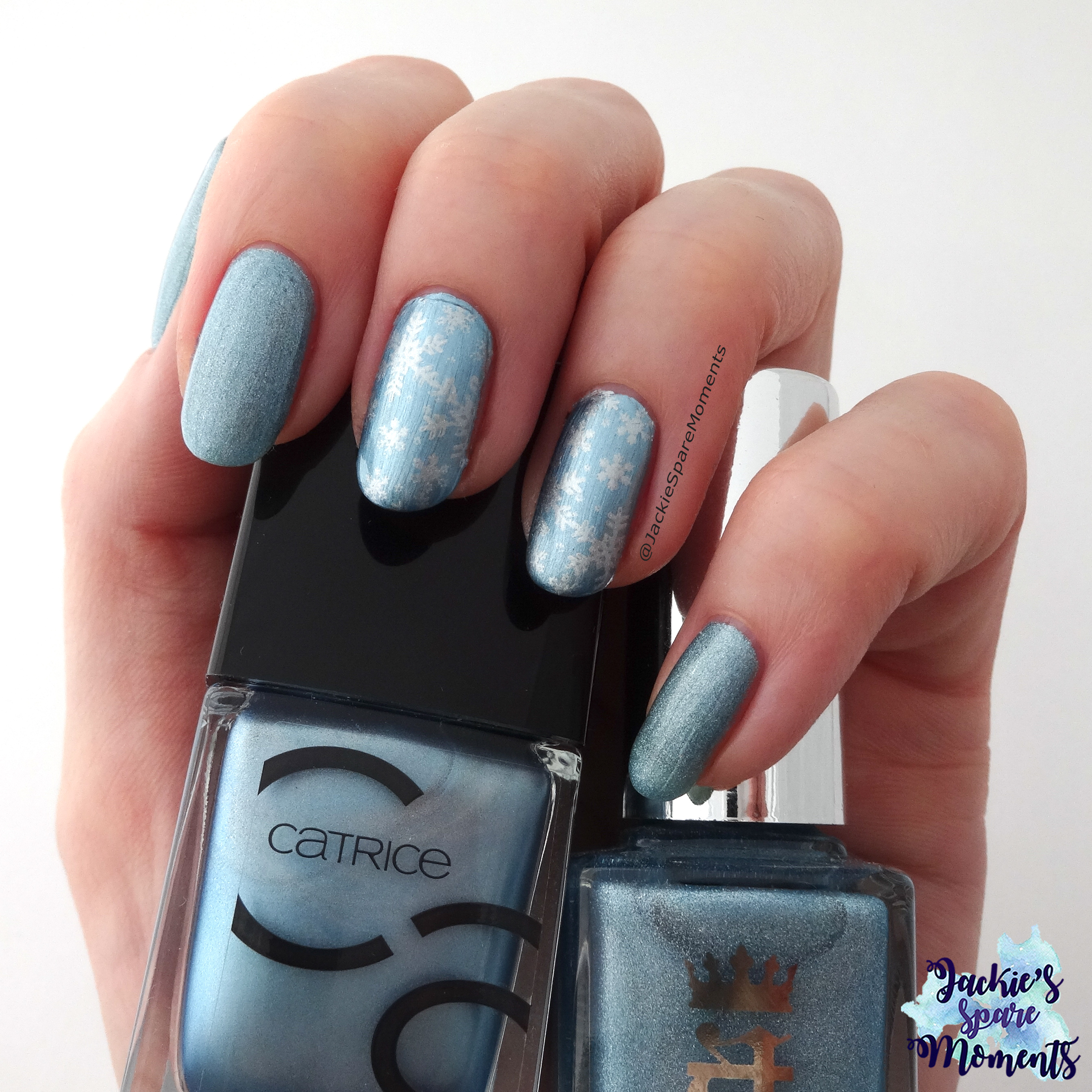
Winter snowflake mani nail art with A England Symphony in Blue and Silver, Catrice 52 Another Day, Another Blue

Ik heb mijn duim, wijsvinger er pink gelakt met A England Symphony in Blue and Silver, mijn middelvinger en ringvinger heb ik gelakt met Catrice ICONails Gel Lacquer 52 Another Day, Another Blue. Ik houd er niet zo van om over holo lak te stempelen (daarvoor vind ik ze te mooi), dus wisselde ik af met deze lichtblauwe metallic lak van Catrice. Ik heb de sneeuwvlokken gestempeld met Il était un vernis, die ook een subtiele holo glitter heeft.

I painted my thumb, pointer and little finger with A England Symphony in Blue and Silver. My middle finger and ring finger were painted with Catrice ICONails Gel Lacquer 52 Another Day, Another Blue. I don’t like stamping over a holo polish (I think they’re too pretty for that), so I used this metallic light blue. I stamped the snowflakes with Il etait un vernis, a silver with also a subtle holo glitter.

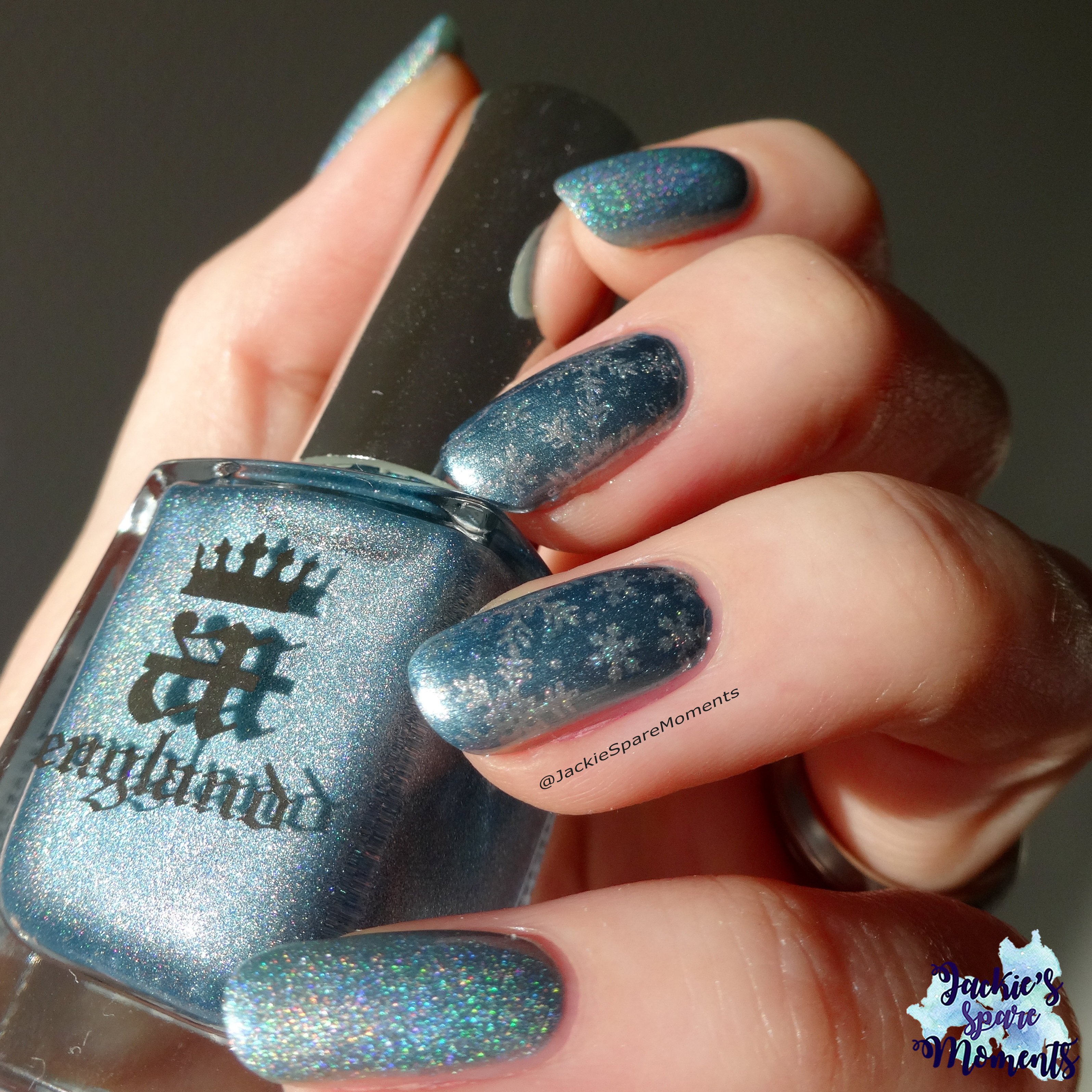
Winter snowflake nail art with A England Symphony in Blue and Silver

Toen de zon vandaag doorkwam kon ik deze foto maken. Hier werd ik zo blij van!

When the sun came out today, I was able to take this picture. It made me so happy!

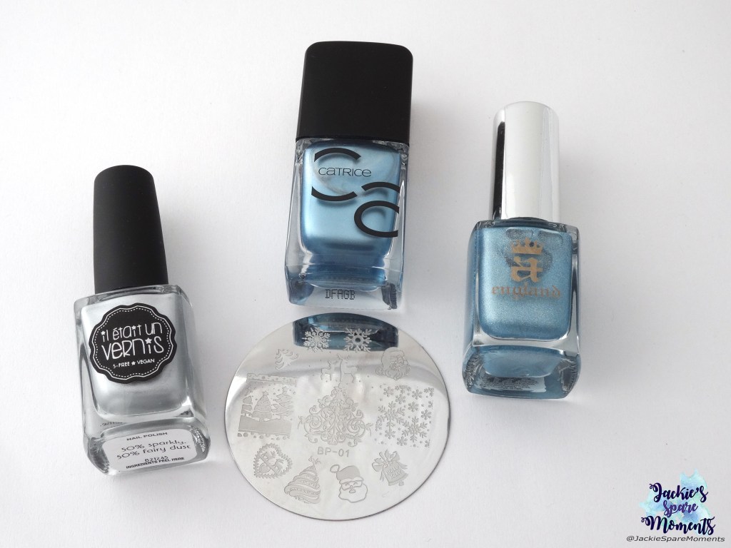
Materials used: Il était un vernis 50% sparkly, 50% fairy dust, Catrice 52 Another Day, Another Blue, A England Symphony in Blue and Silver, BornPretty stamping plate BP-01

Dit heb ik dus allemaal gebruikt: Il était un vernis 50% sparkly, 50% fairy dust, Catrice 52 Another Day, Another Blue, A England Symphony in Blue and Silver en BornPretty stempelplaat BP-01.

Materials used: Il était un vernis 50% sparkly, 50% fairy dust, Catrice 52 Another Day, Another Blue, A England Symphony in Blue and Silver and BornPretty stamping plate BP-01.

Wat vonden jullie van de sneeuw? Yeah of nee?

Did you like last weeks snow? Yes or no?

Tot de volgende keer!

Until next time!

Jackie

Pantone kleur van 2019: Living Coral

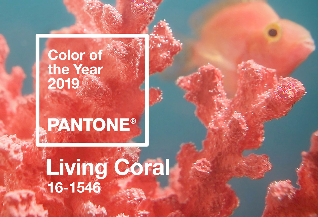
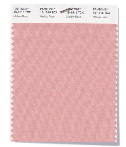
Nu ik de het hele herfst/winter palet van Pantone erop heb zitten, is het wel passend dat ik jullie voorstel aan de kleur van het jaar 2019: Living Coral. Deze levendige koraaltint met een gouden ondertoon is door Pantone verkozen tot kleur van het jaar, omdat we met alle digitale technologie en sociale media behoefte hebben authenticiteit en connectie.

Now I’ve finished swatching the autumn/winter palette of Pantone, it’s only fitting to introduce you to the colour of the year 2019: Living Coral. This lively coral shade with golden undertones is chosen by Pantone, because with all the digital technologies and social media we feel a need for authenticity and connection.

Pantone Living Coral Color of the Year 2019 (image by Pantone)
Image by Pantone

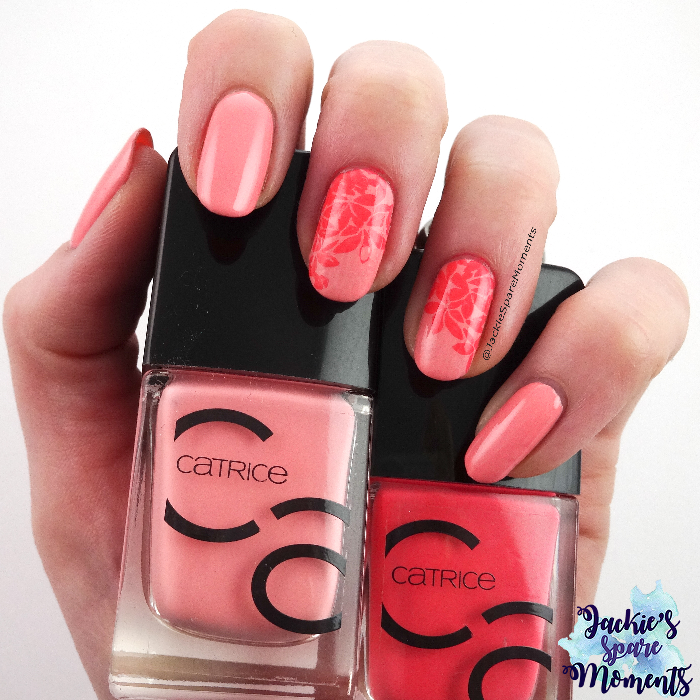
Ik ben mijn nagellak collectie doorgegaan en heb gekozen voor een duo van Catrice ICONails om een nail art te maken. Dit duo heb ik gekocht, toen de nieuwe nagellak lijn van Catrice werd geïntroduceerd. Ik durf dus niet te zeggen of deze lakken nog te koop zijn.

I went through my collection for coral polishes and I chose a duo from Catrice ICONails for a nail art. I bought this duo when the new nail polish line of Catrice was introduced, so I don’t know if you can still buy them.

Nail art Colour of the Year 2019 Living Coral (using Catrice 07 Meet Me At Coral Island and Catrice 08 Catch of the Day)

Zoals je ziet missen deze lakken de gouden ondertoon. Maar ik vind het nog steeds twee mooie koraal tinten.

As you can see, is the golden undertone lacking in these polishes. But I still think these are very beautiful shades of coral.

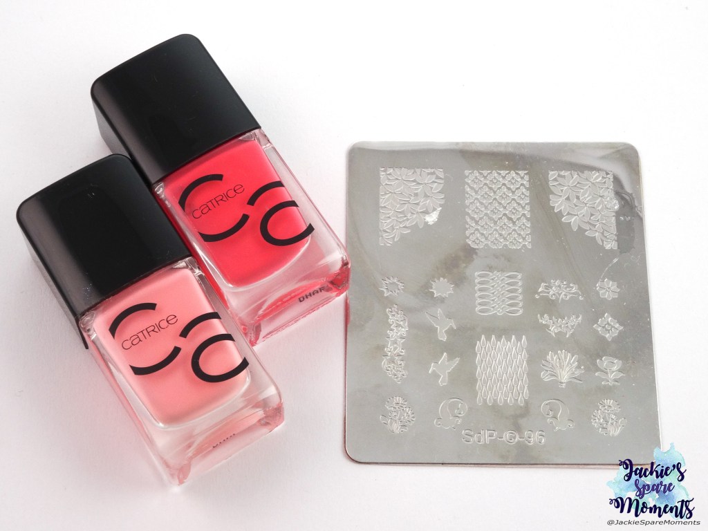
Catrice ICONails Gel Lacquer 07 Meet Me At Coral Island, Catrice ICONails Gel Lacquer 08 Catch of the Day, Dashica stamping plate SdP-96

Dit heb ik gebruikt: Catrice ICONails Gel Lacquer 07 Meet Me At Coral Island (donkere koraaltint), Catrice ICONails Gel Lacquer 08 Catch of the Day (lichte koraaltint) en Dashica stempelplaat SdP-96

Materials used: Catrice ICONails Gel Lacquer 07 Meet Me At Coral Island (dark coral), Catrice ICONails Gel Lacquer 08 Catch of the Day (light coral) and Dashica stamping plate SdP-96

Wat vinden jullie van Living Coral? Kan je je iets bij deze kleur voorstellen?

What do you think of Living Coral? Can you imagine yourself wearing this shade?

Tot de volgende keer!

Until next time!

Jackie

Pantone challenge A/W 2019 slot

Als eerste wil ik jullie vertellen dat mijn blog Jackie’s Spare Moments morgen 1 jaar bestaat! Ik kan het niet geloven dat het zo snel is gegaan. Ik heb iets meer dan 100 blog posts geschreven en ik hoop dat het komende jaar weer te doen!

First I want to tell you that tomorrow my blog will turn 1! Happy blogiversary to me 😄 I can’t believe how time has flown by. I wrote a little over 100 blog posts and I hope to do the same next year!

Zoals jullie misschien hebben gemerkt is het al een tijd geleden dat ik over de Pantone challenge heb geschreven. Dit komt omdat deze challenge helaas is gestopt op instagram. Ik heb besloten om voor mijn eerste blogverjaardag deze challenge dus af te ronden! Bereid je voor op een mega post met negen swatches met de andere kleuren van het seizoenspalet. De eerste post vind je hier en de tweede hier. Helaas ontbreken dus de mooie collages van Maria van TheNailPolishHoarder.

Maybe you have noticed that it’s been a while since I wrote about the Pantone challenge. The challenge was sadly ended on instagram. I have decided to finish the challenge for my first blogiversary! Be prepared for an epic post with nine swatches of the final colours of the seasonal palette. The first post is here and the second here. Sadly I end it without the beautiful collages by Maria of TheNailPolishHoarder.

Mellow Rose

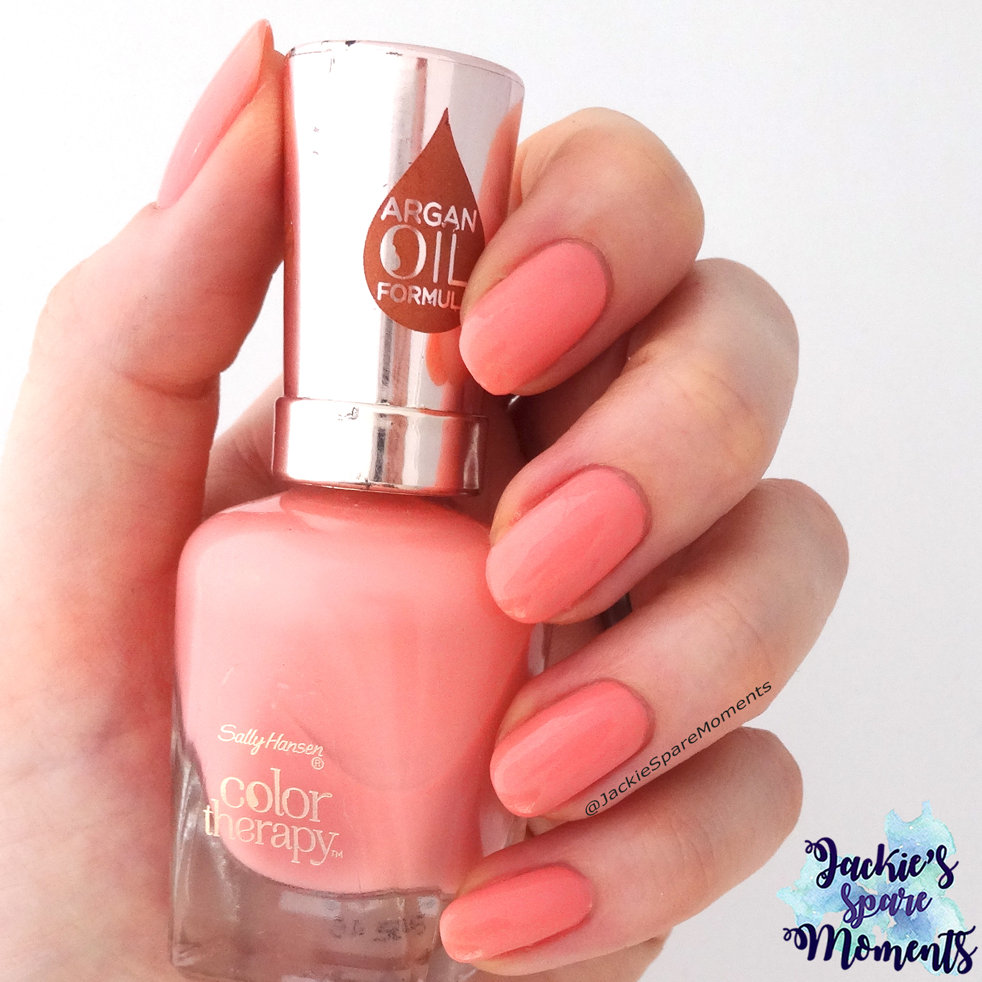
Als eerste komt Mellow Rose. Deze kleur wordt door Pantone beschreven als een traditionele Engelse tint. Ik heb hiervoor Sally Hansen color therapy 240 Primrose and Proper gekozen. Op de foto draag ik twee laagjes. De kleur is op de nagels iets donkerder dan in het flesje.

First up is Mellow Rose. This colour is described by Pantone as a traditional English shade. I chose Sally Hansen color therapy 240 Primrose and Proper. I’m wearing two coats. The colour dries down a bit darker than in the bottle.

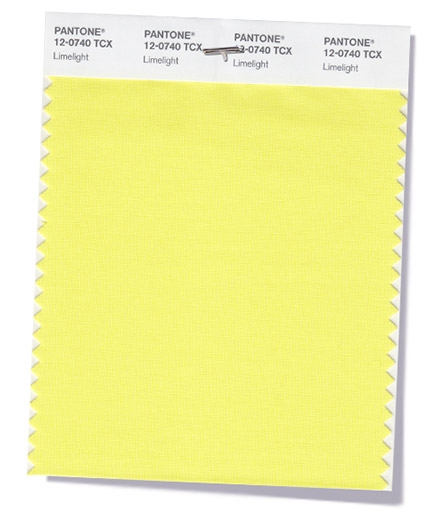
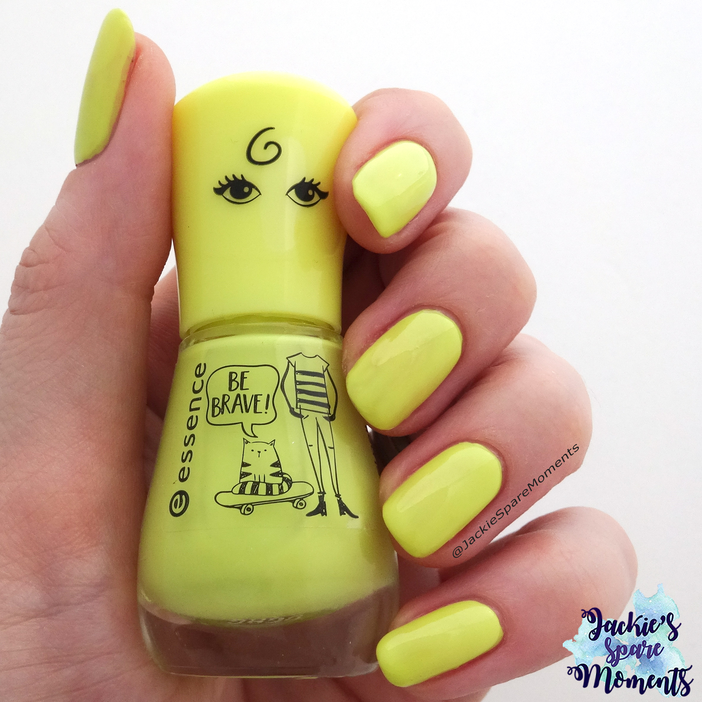
Limelight

Voor Limelight heb ik een kleur van essence gebruikt. Dit is 114 my highlighter. Niet zichtbaar op de foto is dat deze nagellak ook een klein beetje shimmer heeft, waardoor deze nagellak echt opgloeit in het het licht. Op de foto draag ik twee laagjes. Ik heb geen witte base coat gebruikt.

For Limelight I chose a nail polish by essence. This is 114 my highlighter. It’s not visible on the picture, but this polish has a little shimmer. If it’s hit by direct sunlight is truly glows. I’m wearing two coats. No white undies needed.

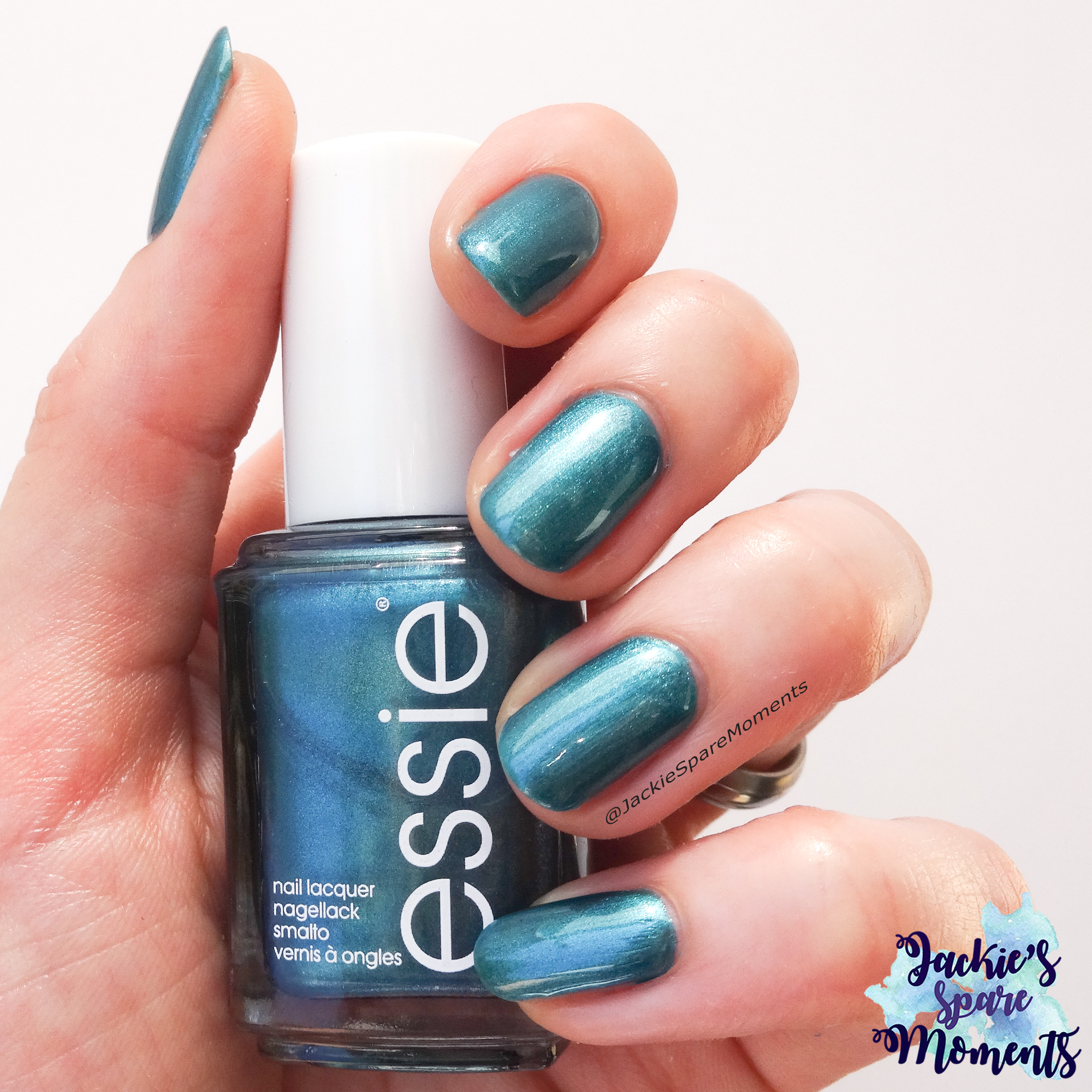
Quetzal Green

Ik vond Quetzal Green een lastige kleur om er een bijpassende nagellak bij te vinden. Het is een vrij diepe blauw-groene tint. Uiteindelijk heb ik gekozen voor Essie Trophy wife. Door de metallic finish toont hij wat lichter op de nagels, maar in het potje ziet het er goed uit. Ik draag twee laagjes.

Quetzal Green was a difficult colour to match. It’s a deep blue-green shade. In the end I went with Essie Trophy wife. It’s a polish with a metallic finish, so it shows a bit lighter on the nails. I’m wearing two coats.

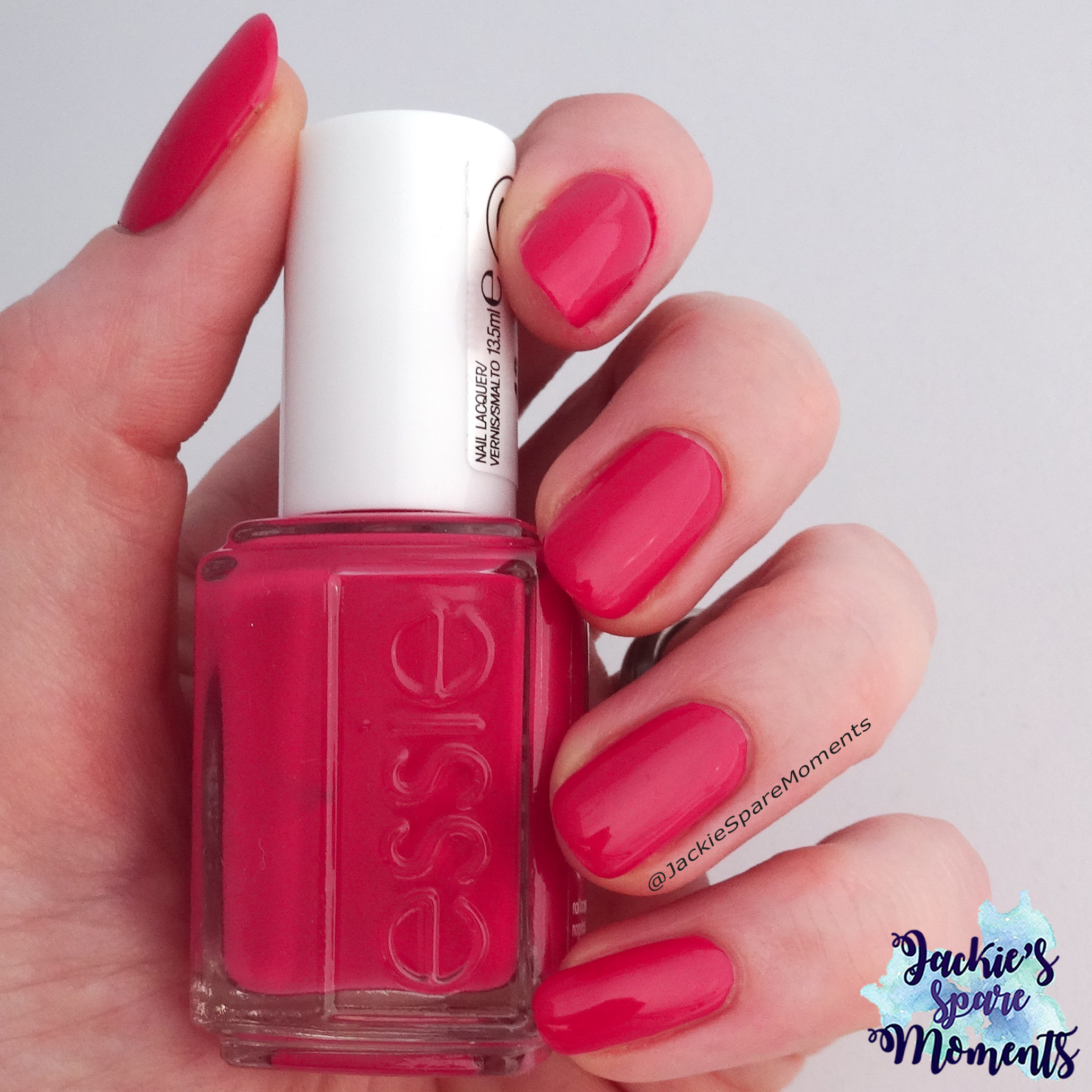
Pink Peacock

Deze felle dieprozerode kleur was geen vriendje van mijn camera. Uiteindelijk wilde Essie B’aha Moment wel kleurecht op de foto. Ik draag op de foto één, wat dikker aangebracht, laagje. Deze Essie lak is heel gepigmenteerd.

This deep pink shade was no friends with my camera. In the end Essie B’aha Moment wanted to show her real colour on the picture. I’m wearing one thick coat of this polish. It’s very pigmented.

Sargasso Sea

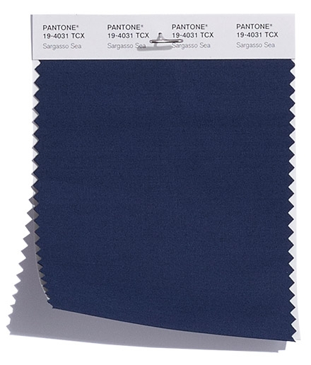
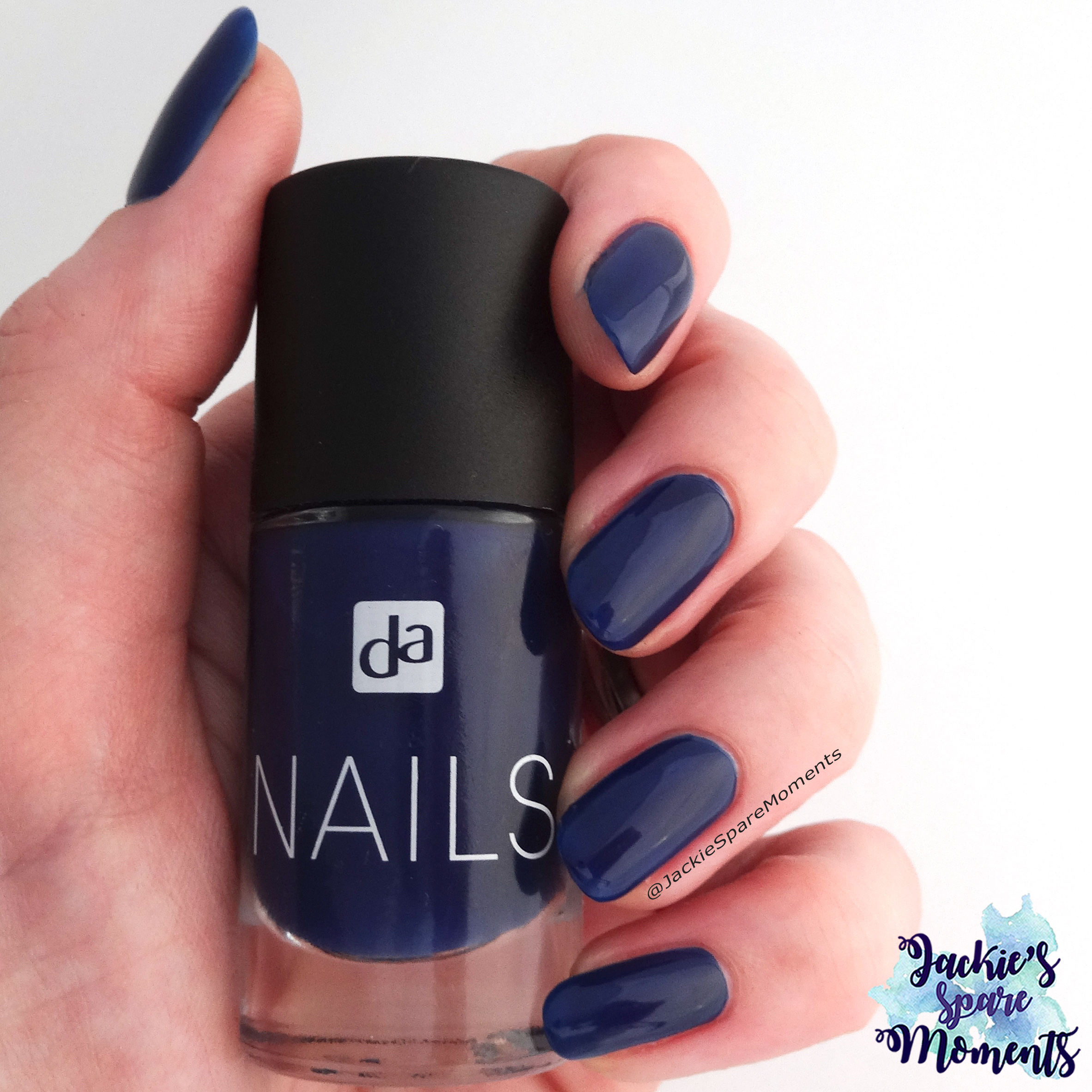
Sargasso Sea is een hele mooie donkerblauw. Het is een van de kleuren van het Klassieke palet van Pantone. Ik vond een match in DA Nails 032 Navi Blue. Ik draag twee laagjes op de foto.

Sargasso Sea is a very beautiful deep blue. It’s part of the Classic Colour Palette. I matched it with DA Nails 032 Navi Blue (DA nail polish is a local Dutch brand). I’m wearing two coats.

Tofu

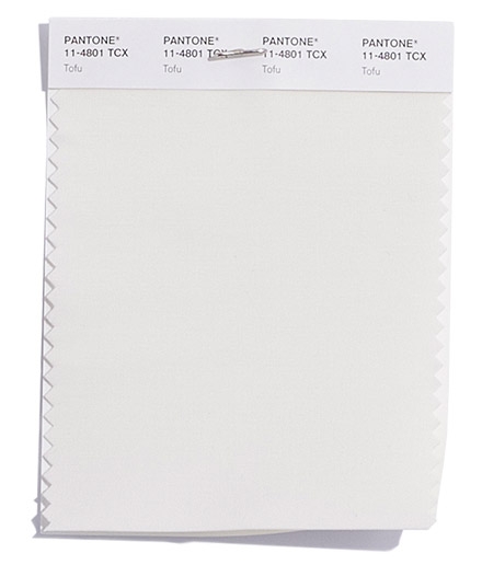
Tofu is een creme wit. Ik koos voor Catrice ICONails 24 Good Lack! omdat dit een hele fijne off-white is. Deze lak heeft een witte shimmer waardoor hij opgloeit in het licht. Ik heb twee laagjes aangebracht.

Tofu is a creamy white. I chose to match it with Catrice ICONails 24 Good Lack!, because that’s a very nice off-white polish. This polish has a white shimmer and it glows when hit with the light. I’m wearing two coats.

Almond Buff

Pantone beschrijft Almond Buff als een camel tint. Ik vond het een lichte goudkleur. Ik heb gekozen voor Herome Nail Colour in nummer 13. En als je wat zonlicht op deze nagellak laat vallen dan wacht je een holo verrassing. Ik heb twee laagjes aangebracht voor de foto.

Pantone describes Almond Buff as a camel hue. I thought it’s more a golden shade. I chose Herome Nail Colour in number 13 as a match. And if you hold it up in direct sunlight, you’re up for a holo surprise. I’m wearing two coats on this picture.

Quiet Gray

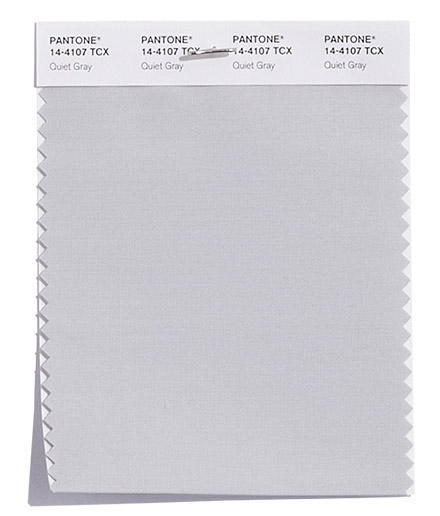
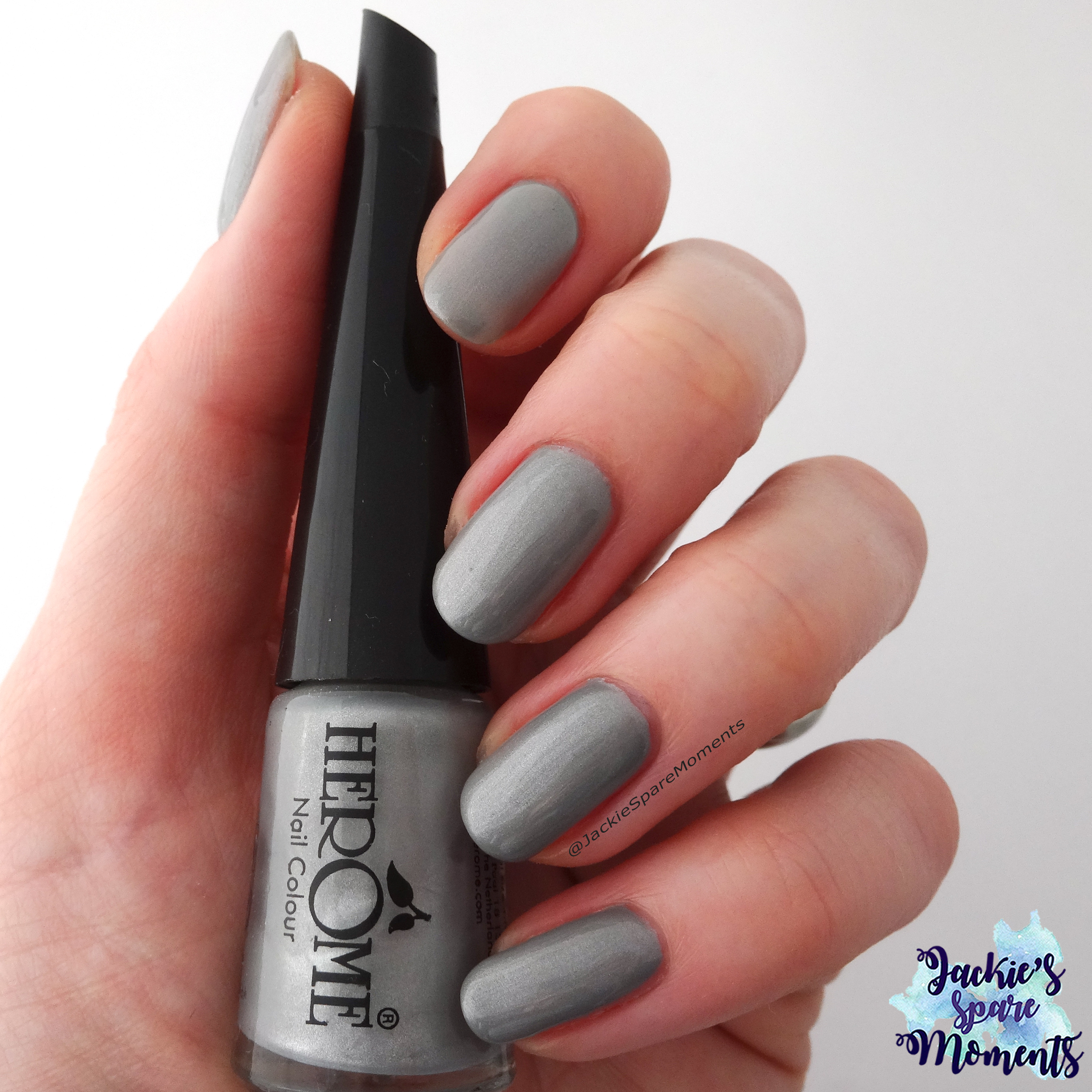
Voor Quiet Gray koos ik Herome Nail Colour nummer 65. Het heeft een zachte metallic finish en je ziet wat lichte kwastsporen. Ik draag 2 laagjes.

For Quiet Gray I chose Herome Nail Colour number 65. It has a soft metallic finish and you can see some slight brush strokes. I’m wearing two coats.

Meerkat

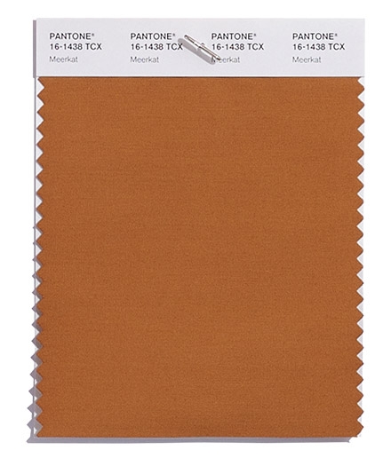
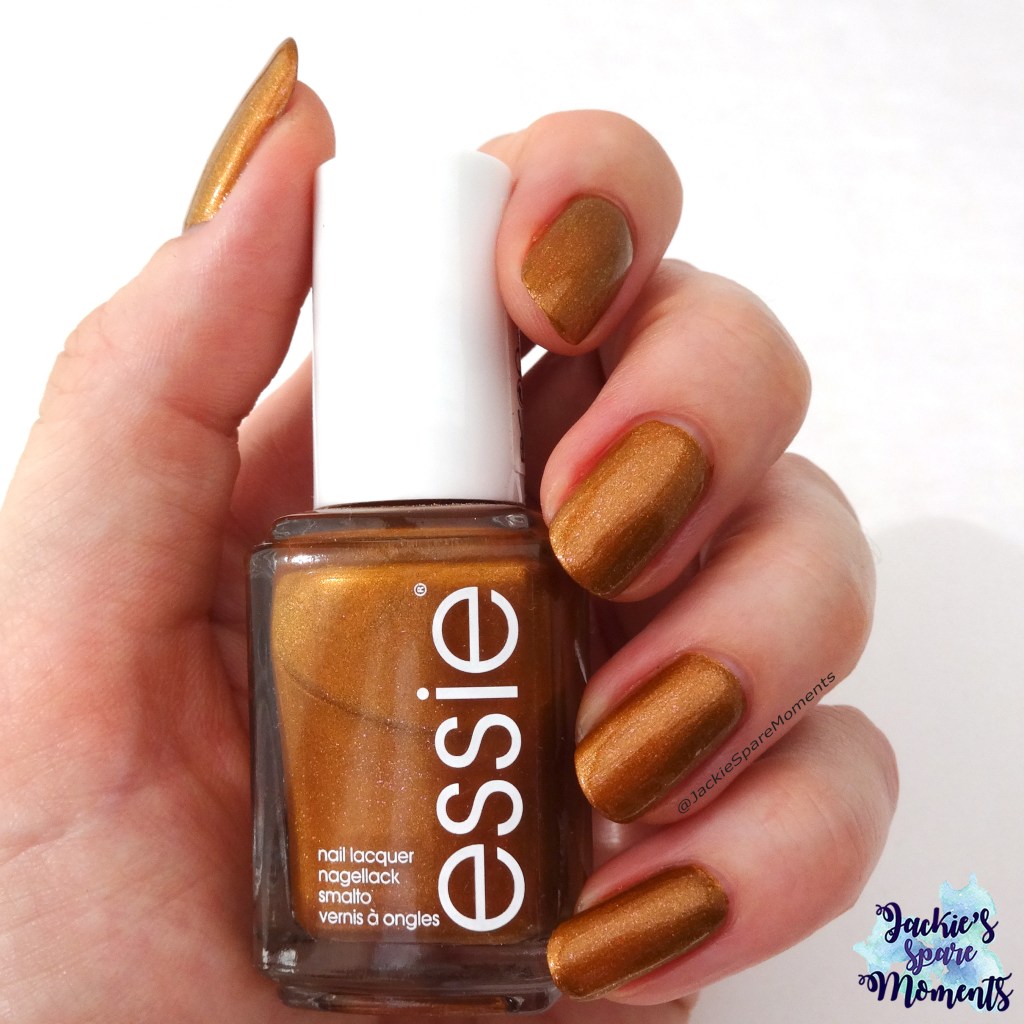
Als laatste kleur is Meerkat. Ik heb hiervoor Essie Leggy Legend gekozen. Een van mijn favoriete kleuren voor de herfst.

The last colour of this seasonal palette is Meerkat. I chose Essie Leggy Legend. One of my favourite colours for autumn.

Wat vinden jullie van deze Pantone kleuren voor deze herfst en winter? Zit er nog een favoriet van je bij?

How do you like these colours of the Pantone palette for autumn and winter? Is there a favourite of yours included?

Tot de volgende keer!

Until next time!

Jackie
Blauw, Paars en Roze

Het is alweer tijd voor When colours collide. Deze keer was het met de kleuren Blauw, Paars en Roze. Ik droom al van het voorjaar en kwam op deze nail art. Toen deze nail art ingeleverd moest worden, hadden we de hele tijd grijs en koud winterweer.

It’s time for a new When colours collide. This time it’s with the colours Blue, Purple and Pink. I’m already dreaming about spring, so I came up with this nail art. When I had to submit this nail art, it was grey and cold winter weather.

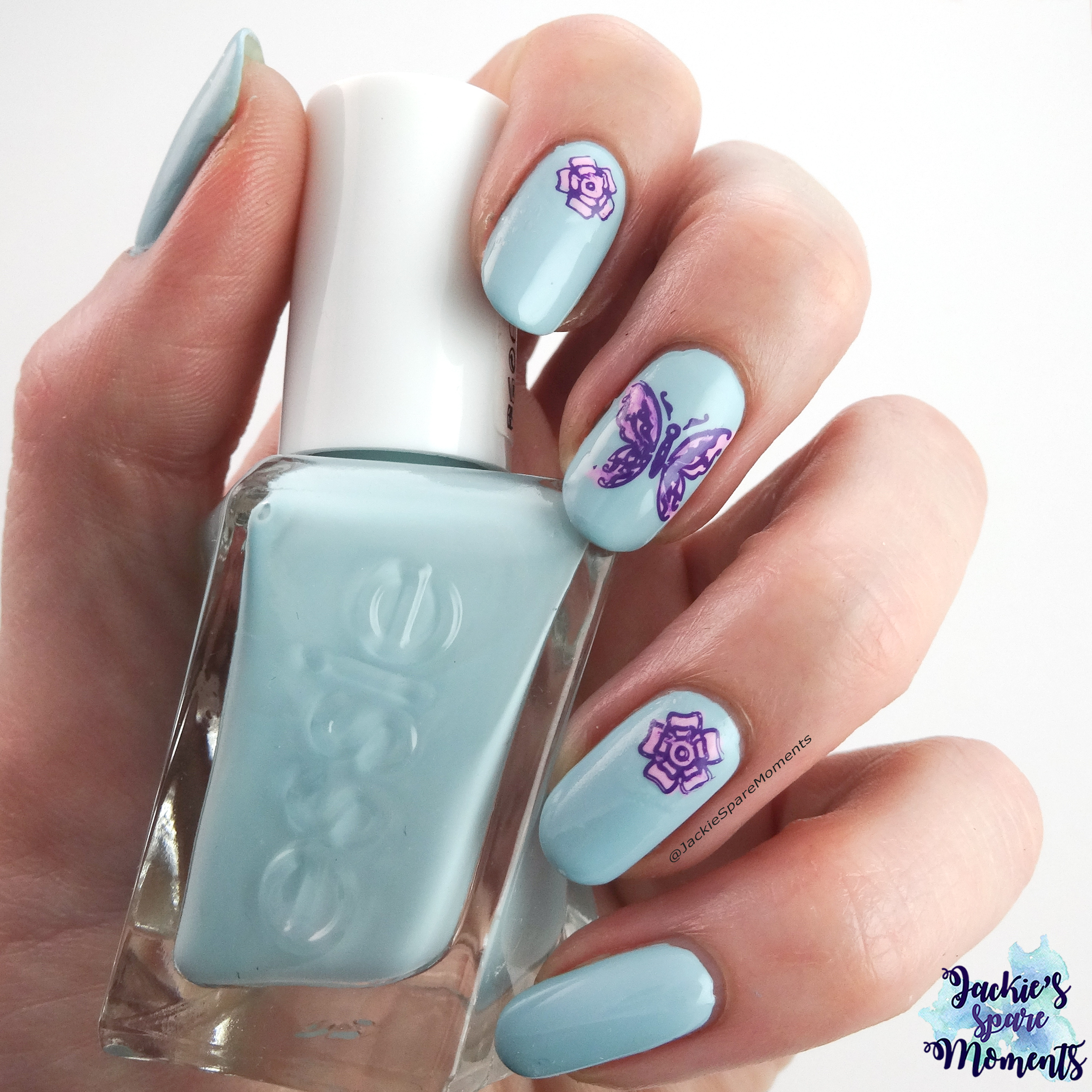
Spring nail art with butterfly using Essie Getting Intricate

Ik heb mijn nagels lichtblauw gelakt met Essie Getting Intricate en daarna met de reverse stamping techniek twee bloemetjes en een vlinder erop gezet.

I painted my nail in a light blue shade with Essie Getting Intricate and did some reverse stamping. I placed two flowers and a butterfly on my nails.

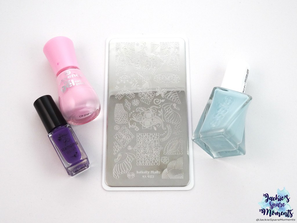
Essie Gel Couture Getting intricate, essence the gel polish 55 be awesome tonight!, Clear Jelly Stamper CJS 016, Dashica beauty shop Infinity Nails stamping plate 183

Dit heb ik gebruikt: Essie Gel Couture Getting intricate, essence the gel polish 55 be awesome tonight!, Clear Jelly Stamper CJS 016 en Dashica beauty shop stempelplaat Infinity Nails 183.

Materials used: Essie Gel Couture Getting intricate, essence the gel polish 55 be awesome tonight!, Clear Jelly Stamper CJS 016 and Dashica beauty shop stamping plate Infinity Nails 183.

Bekijk de hashtag #whencolourscollide om te zien wat de andere deelnemers hebben gemaakt!

Search the hashtag #whencolourscollide to see what the other participants made!

Tot de volgende keer!

Until next time!

Jackie


Vier swatches Essie Gel Couture

Ongeveer twee weken geleden gingen Man en ik winkelen in de outlet van Roermond. Ik hoopte nog wat kleding te vinden (man slaagde, ik niet), maar ik kwam er een outlet winkel tegen van L’Oreal. Ze hadden er make-up en nagellak van diverse L’Oreal merken, zoals L’Oreal, Maybelline en Essie. Ik heb toen in totaal zes Essie Gel Couture lakken gekocht. De vier meer neutrale kleuren laat ik in deze post zien.

About two weeks ago Husband and I went outlet shopping in Roermond. I hoped to buy some clothes (Husband did, I didn’t), but I found an outlet store of L’Oreal. They sold make-up and nail polish by different L’Oreal brands, like L’Oreal, Maybelline and Essie. I bought in total six Essie Gel Couture polishes. I chose four more neutral shades and I will show them in this post.

Essie Gel Couture Inside Scoop

Essie Gel Couture 468 Inside Scoop

Als eerste wil ik Inside Scoop laten zien. Dit is een meer transparante lak in een zachte roze tint. Het is van de limited edition Gala Bolds collectie van zomer 2017 (dat heeft Google mij geleerd 😉). Ik draag hier twee laagjes. Deze lak zou in drie lagen nog iets meer dekken en meer roze tonen, maar ik vond dit al heel mooi.

First up is Inside Scoop. It’s a more transparent jelly polish in a soft bubble gum pink. It’s from the limited edition Gala Bolds collection of summer 2017 (I learned that from Google 😉). I’m wearing two coats. With three coats I think you will get a little more coverage and it will show up more pink, but I really liked the results of two.

Essie Gel Couture Satin Slipper

Essie Gel Couture 430 Satin Slipper

Satin Slipper is een vanille witte nagellak. Er zit een klein beetje shimmer in, maar dat wilde niet op de foto. Ook deze lak komt van een limited edition, namelijk de Ballet Nudes collectie van winter 2017. Na twee laagjes was het resultaat nog erg streperig, dus hier zie je drie laagjes met topcoat. Ik vind het een hele mooie neutrale kleur en een leuke afwisseling met de vele rozige lakken die ik draag op het werk.

Satin Slippers is a more vanilla white nail polish. It has a little bit of shimmer, but that did not want to show on the picture. This polish is also from a limited edition: the Ballet Nudes collection of winter 2017. After two coats it was still streaky, so shown are three coats with top coat. I like this neutral. It’s a nice change from al the pinky nudes I wear for work.

Essie Gel Couture Matter of Fiction

Essie Gel Couture 484 Matter of Fiction

Deze hele lichte roze nagellak is Matter of Fiction. Deze lak is van de limited edition Enchanted collection van winter 2018. Na twee laagjes was het resultaat nog wat streperig, dus op de foto zie je drie laagjes en top coat.

This pale pink polish is Matter of Fiction. It’s from the limited edition Enchanted collection of winter 2018. After two coats it was still very streaky, so I’m showing three coats with top coat.

Essie Gel Couture Princess Charming

Essie Gel Couture 485 Princess Charming

Als laatste laat ik Princess Charming zien. Deze komt ook uit de Enchanted collectie. Deze roze lak was een droom om aan te brengen. Hij dekt al bijna in de eerste laag. Op de foto laat ik twee laagjes zien met top coat. De lak droogt iets donkerder op dan in het flesje.

The last polish I’m showing is Princess Charming. This is also from the Enchanted collection. This pink polish was a dream to apply. It’s almost covering in one coat. I’m showing two coats with top coat. This polish dries a little darker than the bottle.

Dat waren ze dan. Ik ben erg blij met deze lakken en zal ze zeker vaak dragen. Welke kleur is jullie favoriet?

And here they are. I’m very happy with these polishes and I’m sure I’ll wear them often. Which colour is your favourite?

Tot de volgende keer!

Until next time!

Jackie
Nail art met OPI Let Me Bayou A Drink

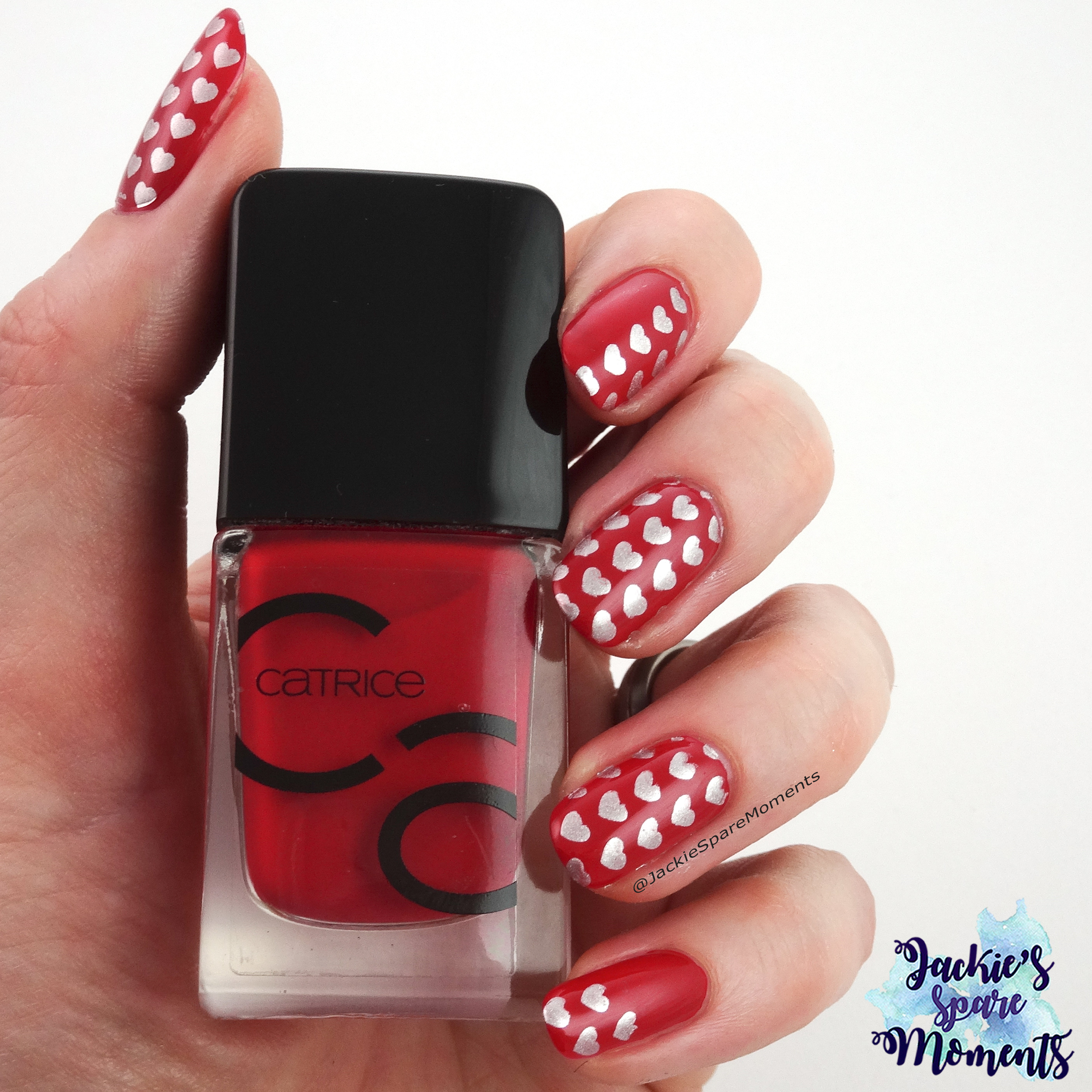
Je zal deze maand nog een paar keer een neutral uit mijn collectie voorbij zien komen! OPI Let Me Bayou A Drink is al een tijdje bij mij, maar verdient eigenlijk meer aandacht dan ze krijgt.

During January I will show you some more neutrals from my collection. First up is OPI Let Me Bayou A Drink. I own this polish already for a some time, but I think she deserves more love.

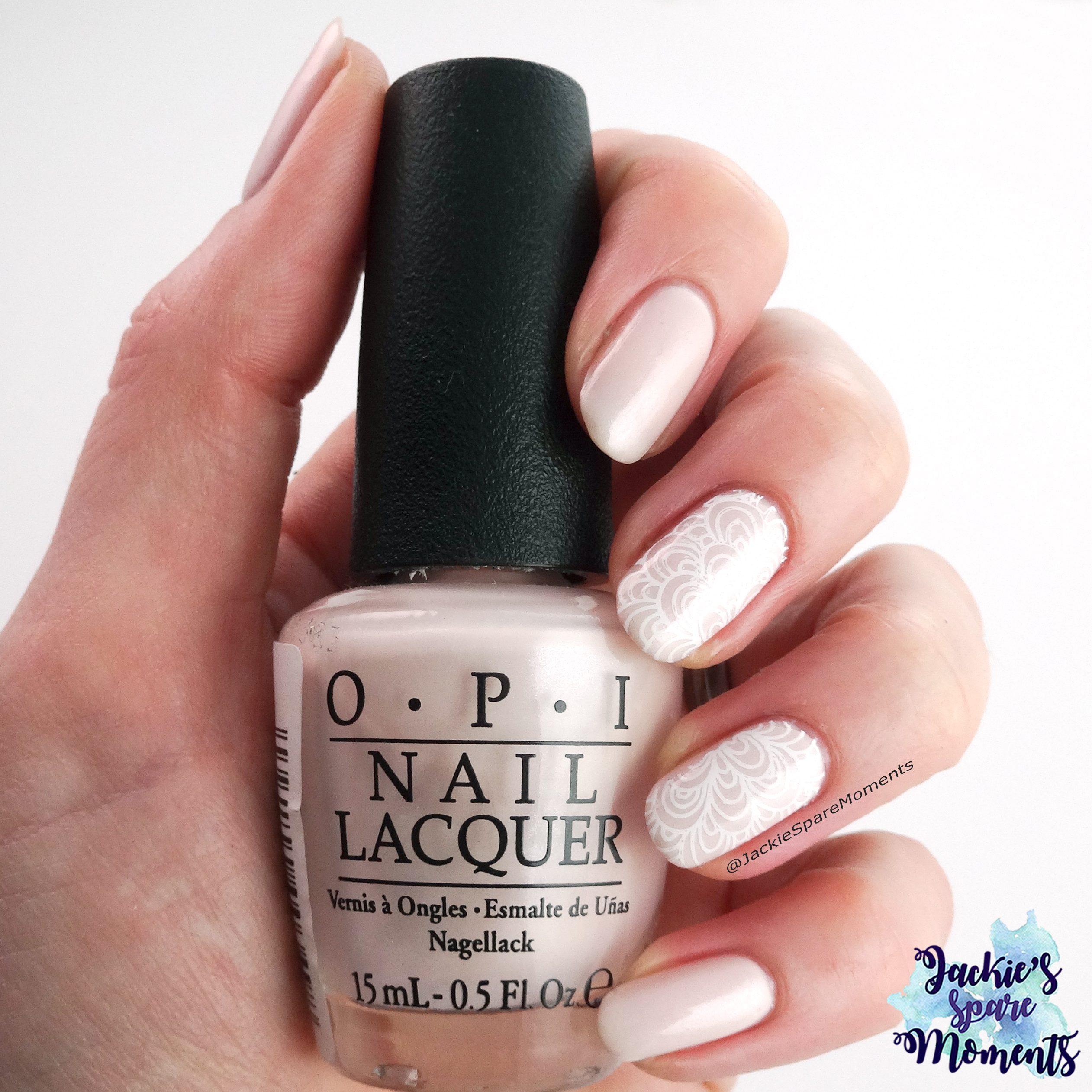
Subtle nail art on a neutral polish, OPI Let Me Bayou A Drink

OPI Let Me Bayou A Drink is een zachtroze nagellak met een klein beetje shimmer. Deze lak is uit de New Orleans collectie van 2016, maar ik denk dat je hem nog wel kan vinden. Ik heb twee laagjes aangebracht en dan zie je nog een klein beetje mijn nagels doorschijnen. In drie laagjes is hij volledig dekkend.

OPI Let Me Bayou A Drink is a soft baby pink nail polish with a little shimmer. This polish was part of the New Orleans collection from 2016, but I think you can still buy it at places. I painted two coats and you can still see some visible nail line. It’s fully covering in three coats.

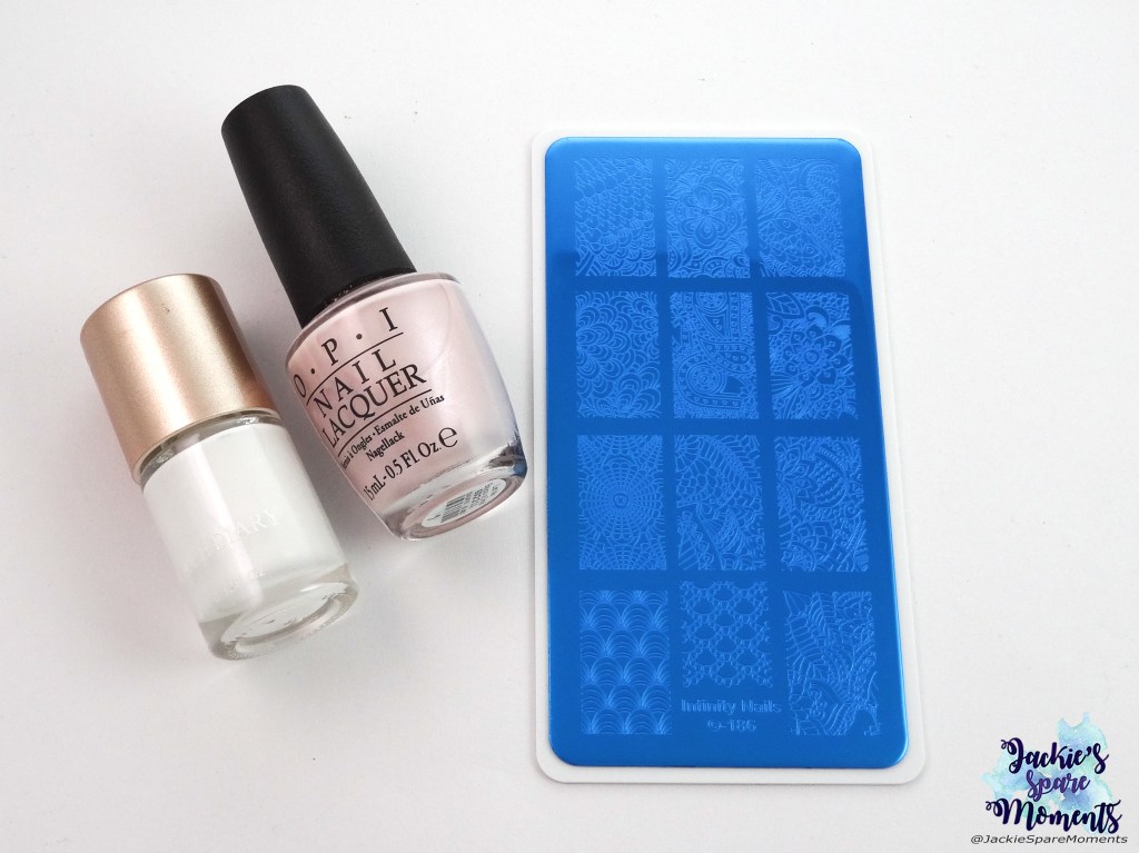
OPI Let Me Bayou A Drink, Infinity Nails 186, white stamping polish

Voor deze subtiele nail art gebruikte ik een van mijn nieuwe Infinity Nails stempelplaten van Dashica (nummer 186) en ook nog witte stempellak.

For this subtle nail art I used one of my new Infinity Nails stamping plates by Dashica (number 186) and white stamping polish.

Tot de volgende keer!

Until next time!

Jackie
Nail art met Masura La Sylphide

Van mijn nieuwe lakken van Masura (zie de swatches hier), sprak La Sylphide mij als eerste het meeste aan. Dat komt omdat ik voor mijn werk neutrals draag, maar ook omdat januari zo’n tussenmaand is. Net na december met al zijn groen, rood en goud en net voor februari met al zijn Valentijnsrood en -roze.

Out of my new Masura polishes (look for the swatches here), La Sylphide was the one I liked most. Partly because I wear neutrals for work, partly because January is a month in between holidays. December has all the greens, reds and golds and February has Valentine with reds and pinks.

Nail art with Masura La Sylphide over a white base

Ik heb twee laagjes van Masura La Sylphide aangebracht over een witte basis. Ik heb met één van mijn nieuwe Dashica Infinity stempelplaten gestempeld met essence tip top taupe.

I applied two coats of Masura La Sylphide over a white base. I chose one of my new Dashica Infinity nail plates and stamped with essence tip top taupe.

Masura 1217 La Sylphide, Dashica Infinity Nails 174, essence 99 tip top taupe

Wat ik heb gebruikt: Masura 1217 La Sylphide, Dashica Infinity Nails 174 en essence 99 tip top taupe.

Materials used: Masura 1217 La Sylphide, Dashica Infinity Nails 174 and essence 99 tip top taupe.

Ik pak dus sneller neutrals in januari. Welke kleur associeren jullie met deze maand?

I like to wear neutrals in January. What are your colour choices for this month?

Tot de volgende keer!

Until next time!

Jackie
Abstract met Groen, Blauw en Oranje

De eerste opdracht voor 2019 bij When Colours Collide is nail art met de kleuren Groen, Blauw en Oranje. Omdat het mij leuk leek om het nieuwe jaar te starten met een nieuwe techniek, is het een abstract ontwerp geworden. Bekijk de hashtag #whencolourscollide om te zien wat de andere deelnemers hebben gemaakt!

The first challenge for 2019 for When Colours Collide is a nail art with the colours Green, Blue and Orange. It’s an abstract design, because I wanted to start the new year by trying a new technique. Search the hashtag #whencolourscollide to see what the other participants made!

Abstract nail art with Catrice ICONails 61 Me, Myself and My Polish.

Ik heb voor deze nail art met nail vinyls en een dotting tool gewerkt. En het is gelukt! Hoe het me nu een keer gelukt is, komt door een filmpje op de instagram van @polishpixie92. Ze gebruikt haar stempel. Eerst maakte ze op de stempel het figuur met de nail vinyl en nagellak en dan plaatst ze het met de stempel op de nagel. Ik vond het geniaal!

For this nail art I used nail vinyls and a dotting tool. I own nail vinyls for a long time, but I never got them to work. The video I saw on the instagram of @polishpixie92 blew my mind. She used her stamper. First she made the figure on her stamper with the nail vinyls (and of course polish) and then she placed it on the nail with the stamper. Genius!

Materials used: nail vinyls, stamper, dotting tool, DA Nails 044 Orange County, Herome nr. 63, Catrice ICONails 61 Me, Myself and My Polish.

Wat ik heb gebruikt: nail vinyls, stempel, dotting tool, DA Nails 044 Orange County, Herome nr. 63 en Catrice ICONails 61 Me, Myself and My Polish.

Materials used: nail vinyls, stamper, dotting tool, DA Nails 044 Orange County, Herome nr. 63 and Catrice ICONails 61 Me, Myself and My Polish.

Hadden jullie al van deze manier van werken met nail vinyls gehoord?

Did you already know about this technique for nail vinyls?

Tot de volgende keer!

Until next time!

Jackie

Vier swatches Masura

Zoals ik afgelopen woensdag schreef, heb ik vier nagellakjes van Masura met Kerst gekregen. In deze post laat ik de swatches zien. Ik had een reepje winterzon, dus excuses voor de achtergrond. Maar ik vond het toch erg leuk om deze nagellakken in verschillende lichtomstandigheden te laten zien.

Like I wrote last Wednesday, I received four Masura polishes for Christmas. In this blog post I want to show you the swatches. I had some winter sun, so I apologise for the background. But I think it’s interesting to show the polishes in different lighting situations.

Four Masura polishes: Masura 1181 Pearly Rain, Masura 1217 La Sylphide, Masura 1235 Keeper, Masura 1178 Cat-titude

Ik ga de lakken in de volgorde van dit rijtje laten zien. Van links naar rechts Masura 1181 Pearly Rain, Masura 1217 La Sylphide, Masura 1235 Keeper en Masura 1178 Cat-titude.

I wil show the polishes in the same order as this picture.Masura 1181 Pearly Rain, Masura 1217 La Sylphide, Masura 1235 Keeper and Masura 1178 Cat-titude.

Masura 1181 Pearly Rain

Pearly Rain is een lichtgrijze, bijna witte nagellak. Ik heb drie laagjes aangebracht met topcoat en zo is hij bijna dekkend. De rozerode flash in de zon vind ik heel mooi. Je ziet ook een klein glittertje erdoorheen. Ik ben heel blij met dit lakje!
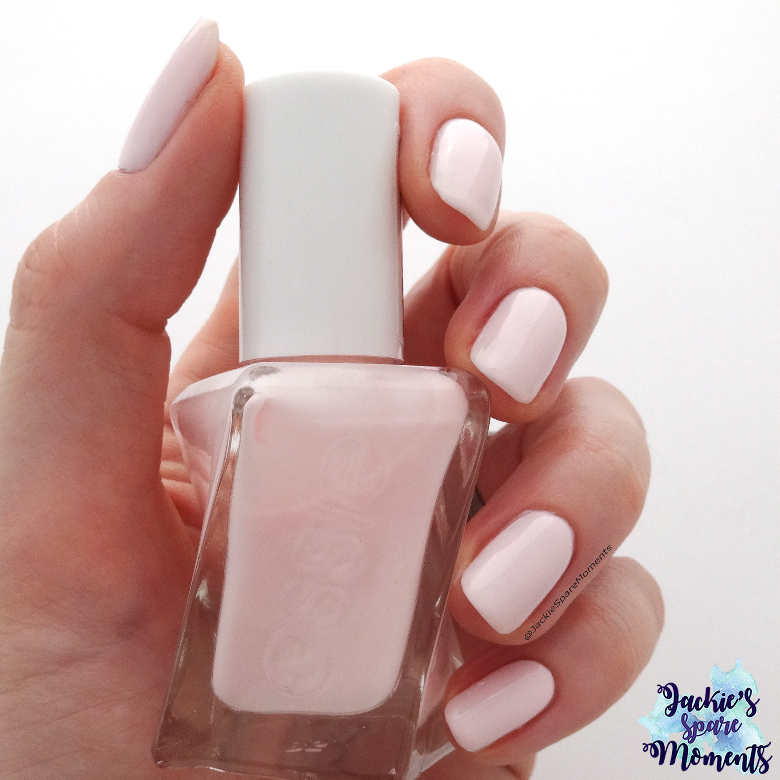
Pearly Rain is a light grey, almost white nail polish. I applied three coats with top coat to make it almost opaque. The orangey red flash in the sun is very beautiful. You can also see a little glitter throughout. I am very happy with this polish!

Masura 1217 La Sylphide

La Sylphide is een dromerige, transparante neutrale nagellak. Hij is ontwikkeld in samenwerking met @la_avenail. Ik houd van dit soort lakjes die werkneutraal zijn, maar toch iets speciaals hebben. Hij doet denken aan First Love. Maar First Love heeft een roze basis met gouden flakies en La Sylphide heeft een taupekleurige basis met kleine holografische glitters. Op de foto draag ik twee laagjes.

La Sylphide is a dreamy sheer neutral polish. It’s a collaboration shade with @la_avenail. I love this kind of shades. It’s a neutral I can wear to work, but it’s still special. I reminded me of First Love. Only First Love has a sheer pink base with golden flakies and La Sylphide has a sheer taupe coloured base with little holographic glitters. I’m showing two coats.

Masura 1235 Keeper

Deze kleur is in samenwerking met @laublm ontwikkeld. Ik draag twee laagjes en top coat en kijk eens naar de holo in de zon!

This colour is a collab with @laublm. I’m wearing two coats with top coat and look at all that holo in the sunshine!

Masura 1178 Cat-titude

Deze donkere wijnrode kleur is ook ontwikkeld in samenwerking met een blogger, maar nu een Nederlandse namelijk @nailtalk! Ik had Cat-titude al bij haar voorbij zien komen en hem meteen op mijn wensenlijstje gezet. Hij is echt prachtig en tjokvol glitter en flakies! Ik laat hier twee laagjes ziet met top coat.

This deeper burgundy shade is also a collab shade, but this time with the Dutch blogger @nailtalk. I had seen Cat-titude in her feed and it went straight to my wish list. It’s gorgeous with lot’s of holographic glitter and iridescent flakies! Shown are two coats with top coat.

Zoals in mijn eerdere Masura swatch posts vermeld, hier nog een kleine reminder: Masura gebruikt nog steeds smalle kwastjes! Ze werken prima met hun lakken, maar je hebt wel meerdere banen per nagel nodig.

As mentioned in my past Masura swatch posts, here a little reminder: Masura still uses skinny brushes! They work wonderfully with their polishes, but you do need multiple strokes for a nail.

Welke kleur vinden jullie het mooist? Vertel het me in de comments!

What’s your favourite colour? Let’s chat in the comments!

Tot de volgende keer!

Until next time!

Jackie