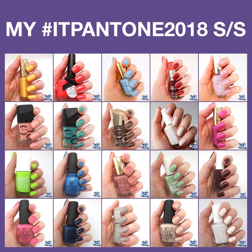
Ik ben heel blij dat ik jullie kan vertellen dat Maria van @TheNailPolishHoarder de herfst/winter kleuren van Pantone opnieuw als challenge houdt. Maar voordat ik jullie de nieuwe kleuren laat zien, zal ik de collage tonen van de lente/zomer editie. Het is speciaal door Maria gemaakt voor de super deelnemers.
I’m very happy to announce that Maria of @TheNailPolishHoarder is hosting the Pantone challenge again. Before I show you the new colours of this season, I will show you the collage of the spring/summer edition. It was made by Maria for the super participants.
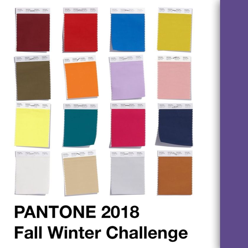
Dit zijn de kleuren van de nieuwe editie. Er zitten een paar lastige tussen, zeg ik zo op het eerste gezicht. Andere kleuren lijken erg op het vorige seizoen. Dus daarin zit de uitdaging niet hetzelfde potje te pakken.
These are the colours of the new edition. It has some difficult ones, or so I think at first look. Some colours also look very similar to the last season, so they have the difficulty of not using the same colour of nail polish.
De challenge is nu vier weken bezig en ik zal je steeds mijn keuzes laten zien samen met de inspiratie collage van Maria.
The challenge is now in it’s fourth week. I will show you my picks together with the inspirational collages by Maria.
Red Pear
De challenge is gestart met de kleur Red Pear. Dit is een donkerrode tint die mij erg deed denken aan Spiced Apple van het vorige seizoen. Ik heb gekozen voor Catrice ICONails 42 Rust In Peace. Ik bracht twee laagjes aan met topcoat.
The challenge started with the colour Red Pear. This is a dark red that reminded me a lot of Spiced Apple of the previous edition. I chose Catrice ICONails 42 Rust In Peace. I painted two easy coats with top coat.


Valiant Poppy
Daarna volgde Valiant Poppy, een oranjerode tint. Ik vond mijn beste match in Ciaté PP017 Boudoir. Deze lak is meer een crelly, dus ik had drie laagjes nodig om het voldoende dekkend te krijgen.
After Red Pear came Valiant Poppy, an orangey red. My best match was Ciaté PP017 Boudoir. This polish is more a crelly, so I needed three coats to get even coverage.


Nebulas Blue
Nebulas Blue wordt een bedachtzame kleur blauw genoemd. Ik vind het een hele mooie tint. Ik heb een vrij oude Catrice gevonden als match. Het is drie laagjes van Catrice 49 Keep Pool.
Nebulas Blue is described as a thoughtful, starry-eyed blue. I like it a lot. I chose a rather old Catrice nail polish as match. This is three coats of Catrice 49 Keep Pool.


Ceylon Yellow
Ceylon Yellow is de kleur van deze week. Morgen komt de nieuwe. Ceylon Yellow wordt beschreven als kruidige geeltint. Ik vind het een kerrie kleur. Ik vond Golden Yellow van de Hema de beste match. Je ziet hier twee laagjes en top coat.
Ceylon Yellow is the colour of this week. Tomorrow a new colour will be published. Ceylon Yellow is described as a spicy yellow. I think it’s the colour of curry powder. My match is Golden Yellow by Hema (Dutch department store). I’m showing two coats with top coat.


Zit jouw favoriete kleur van het seizoen er ook bij? Laat het me weten in de reacties!
Is your favourite colour for this season included in the challenge? Let me know in the comments!
Tot de volgende keer!
Until next time!
Jackie

Pingback: Pantone challenge A/W 2019 slot | Jackie's Spare Moments