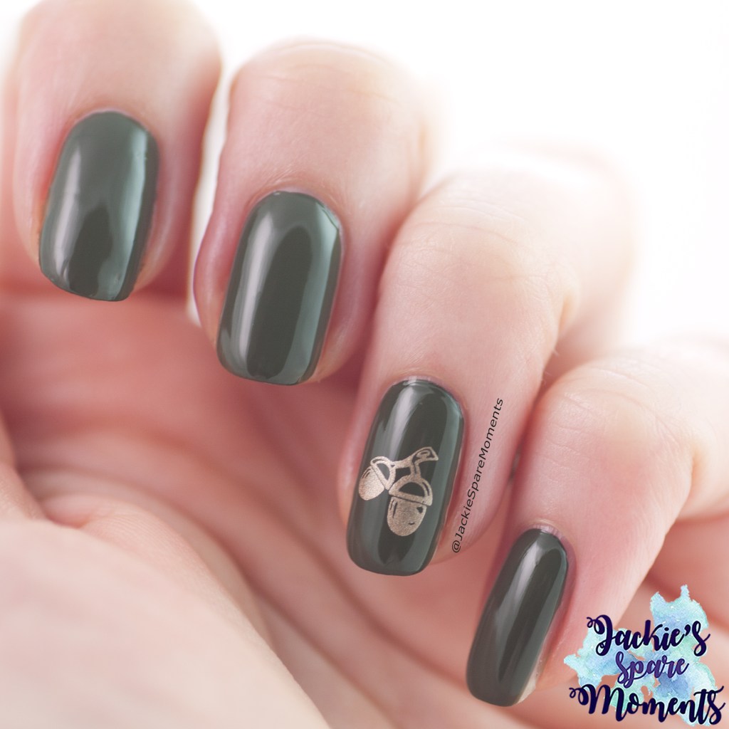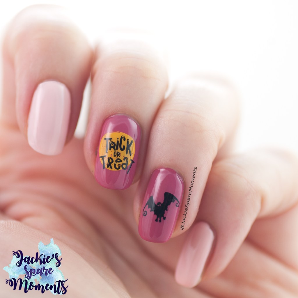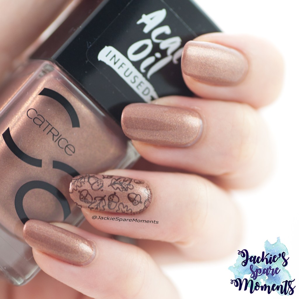
Het is herfstvakantie en dus tijd voor mijn eerste echte herfst nail art.
It’s fall break here and I thought that’s a perfect time to create my first fall mani.
Ik heb het simpel gehouden, want dit is al een prachtige kleur op zichzelf. Dus het zijn 10 nagels met Catrice ICONails 85 Every Sparkle Happens For A Reason. En op mijn ringvinger heb ik een herfstafbeelding gestempeld van blaadjes en eikeltjes.
I kept it simple, because this nail polish is already gorgeous. So I painted 10 nails with Catrice ICONails 85 Every Sparkle Happens For A Reason. And on my ring finger nail I stamped an autumnal image with leaves and little acorns.
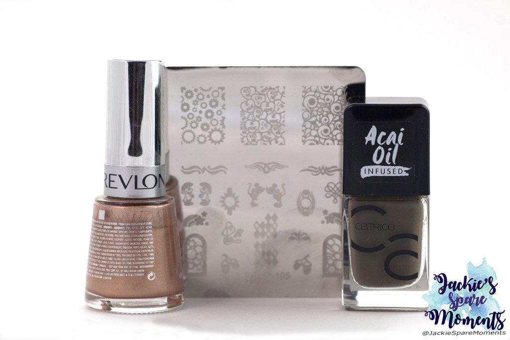
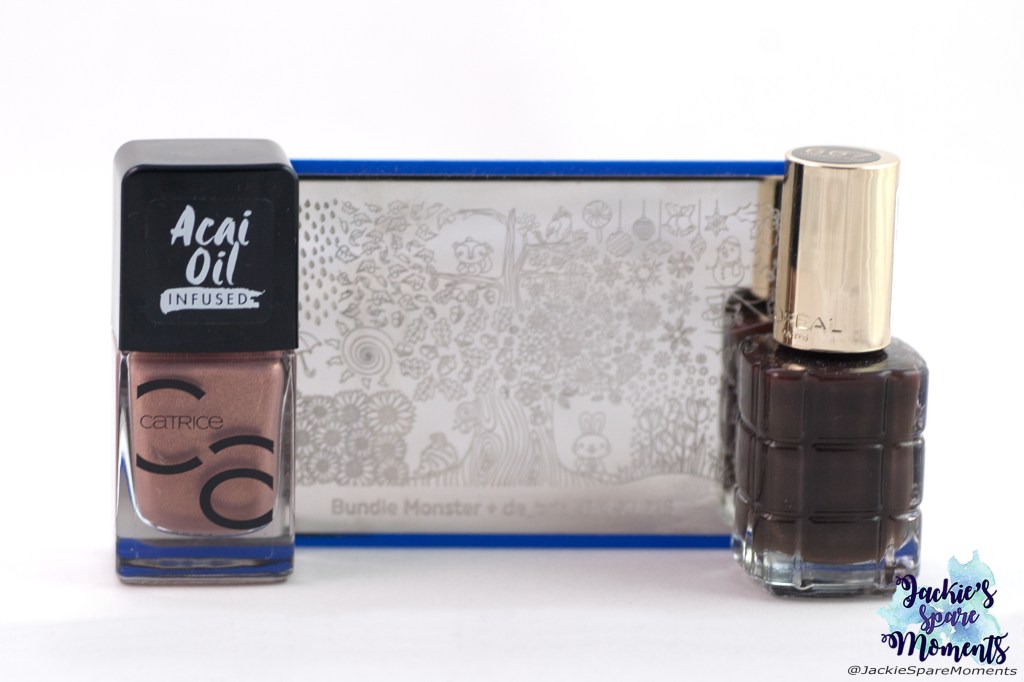
Dit heb ik gebruikt: Catrice ICONails 85 Every Sparkle Happens For A Reason, L’ Oreal 667 L’Atelier Choco (om mee te stempelen), Maniology stempelplaat BM-XL215.
Materials used: Catrice ICONails 85 Every Sparkle Happens For A Reason, L’ Oreal 667 L’Atelier Choco (for stamping), Maniology stamping plate BM-XL215.
Ik ben heel blij dat het vandaag een droge dag was met wat zon! We hebben genoten van de buitenlucht. Gaan jullie ook graag wandelen in de herfst?
I’m happy the weather has improved and that it was not raining and even a little sun shine! We loved going outdoors today. Do you also love going on walks in autumn?
Deze keer waren het best felle kleuren bij When Colours Collide met Rood, Oranje en Paars. Daarom heb ik er ook een nail art mee gemaakt die wat afwijkt van alle herfst mani’s die je nu overal langs ziet komen.
This time with When Colours Collide the colours were bright with Red, Orange and Purple. That’s why I created an off-season nail art that is not autumnal at all.
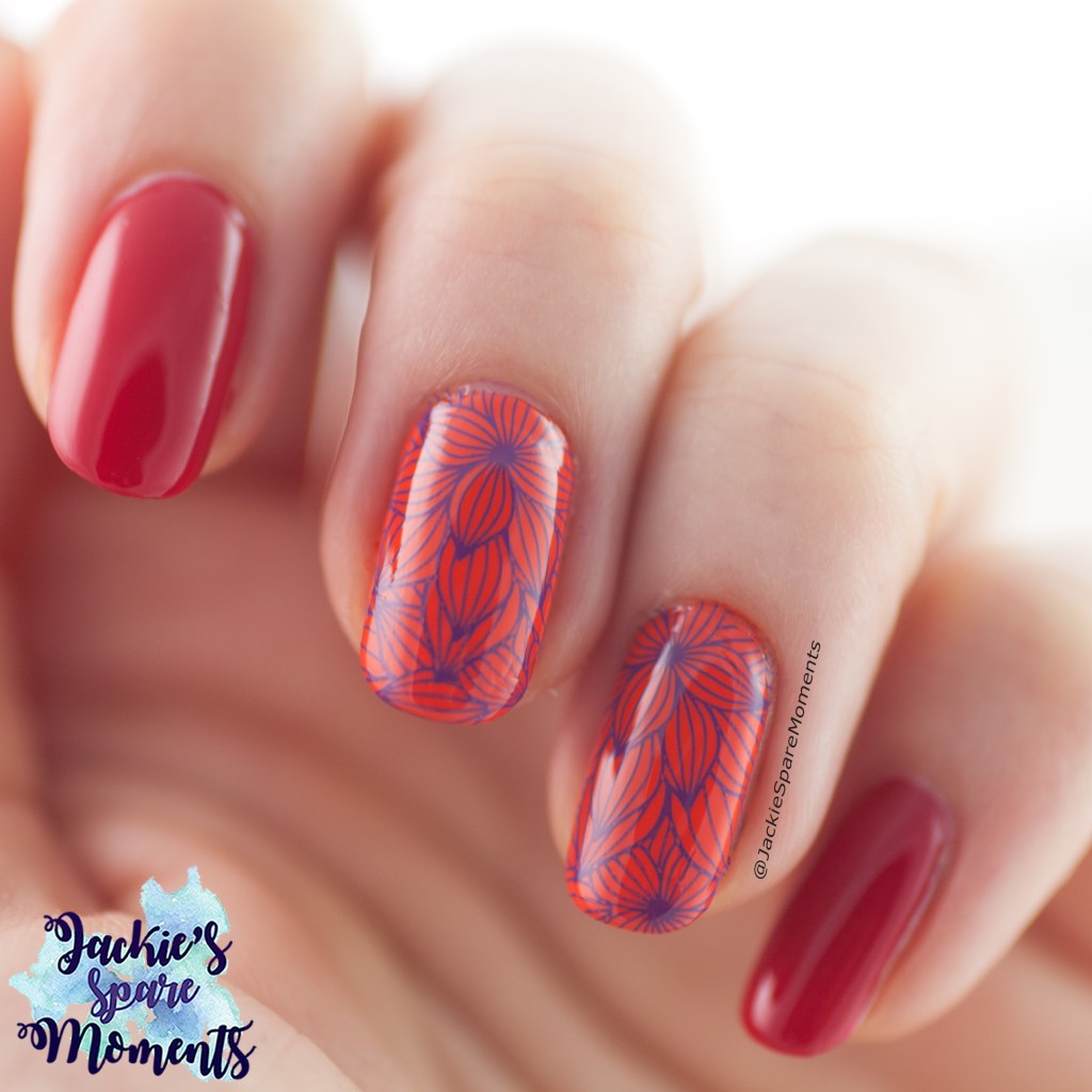
Ik lakte mijn duim, wijsvinger en pink rood. Mijn middelvinger en ringvinger werden oranje. Over de oranje nagels stempelde ik in paars een bloemmotief van Moyra stempelplaat 114.
I painted the nails on my thumb, pointer and little finger red. My middle finger and ring finger were painted orange. On the orange nails I stamped an image in purple from Moyra stamping plate 114.
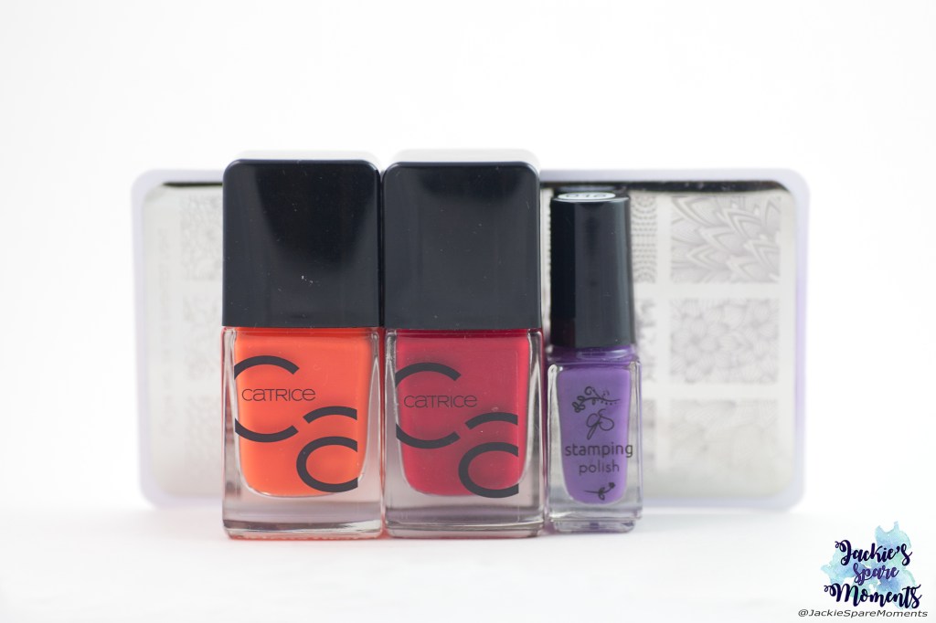
Dit heb ik gebruikt: Catrice ICONails Gel Lacquer 46 Work Hard, Play Orange en 02 Bloody Mary To Go, Clear Jelly Stamper stempellak 016, Moyra stempelplaat 114.
Materials used: Catrice ICONails Gel Lacquer 46 Work Hard, Play Orange, 02 Bloody Mary To Go, Clear Jelly Stamper stamping polish 016, Moyra stamping plate 114.
Bekijk de hashtag #whencolourscollide om te zien wat de andere deelnemers hebben gemaakt!
Search the hashtag #whencolourscollide to see what the other participants made!
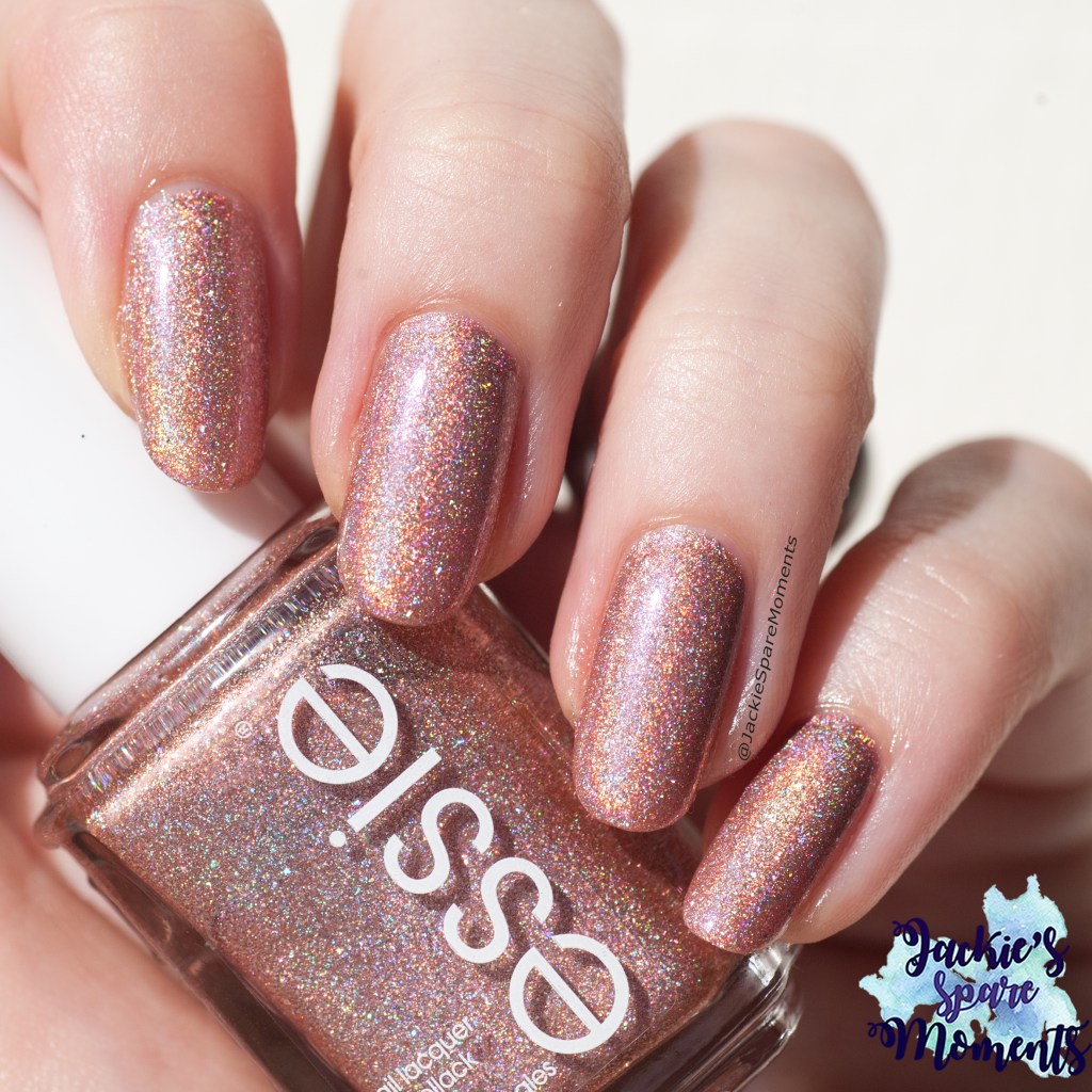
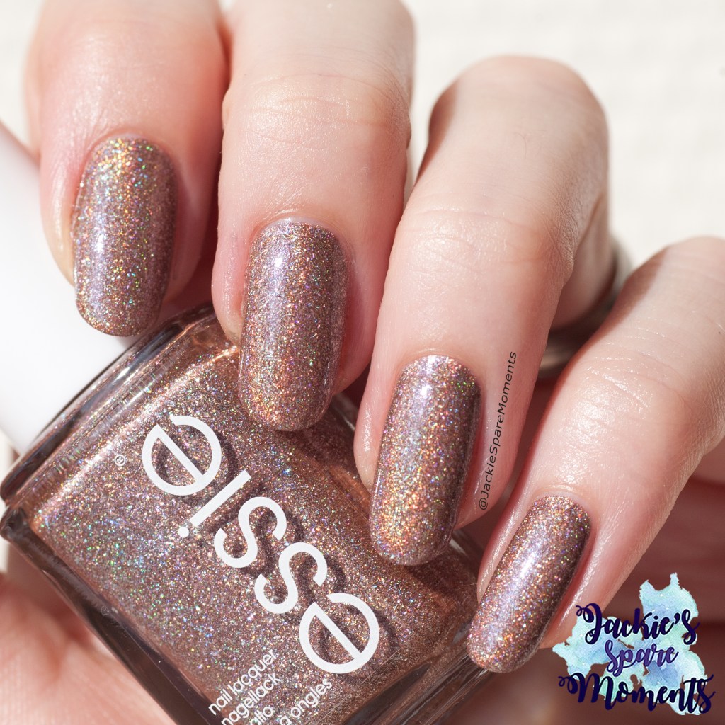
Deze collectie heb ik sinds de zomer. Ik kocht dit gelijk toen ik het kon! Sorry dus voor de mensen die hier ook zo hebberig van worden, ik weet dus niet of deze collectie nog te vinden is!
I bought this collection early summer. I bought it immediately when I found it! I’m sorry if you also want to get it, because I don’t know if it’s still available!
Rock your world
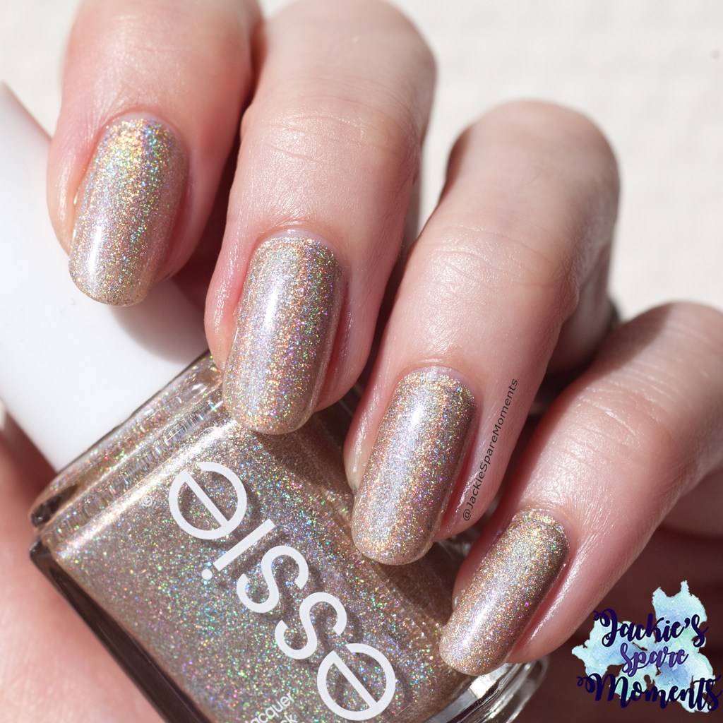
Rock your world is een zilveren holografische nagellak. Volgens Essie heeft het beige in de basis, waardoor het wat warmer toont. Ik had het dekkend in drie laagjes. Ik laat alle lakken zien met top coat, omdat ze dan nog mooier schitteren in de zon.
Rock your world is a silver holographic nail polish. According to Essie it has some beige in the base colour, that’s why it shows a bit of warmth. I had full coverage in three coats. And I’m showing all polishes with top coat, because then they sparkle even more beautiful in the sun.
Semi precious tones
Deze nagellak is een zachte goudtint met prachtige holo. Ik had deze dekkend in twee laagjes.
This nail polish is a soft gold with beautiful holo. I had full coverage in just two coats.
Of quartz
Of quartz is meer bronsachtig. Volledig dekkend in twee laagjes.
Of quartz is more of a bronzy shade. Full coverage in two coats.
Gorge-ous geodes
De naamgever aan deze nagellak collectie. Dit is meer een roze tint. Dekkend in drie laagjes.
The name sake of this collection. It’s more of a pink shade. Full coverage in three coats.
You’re a gem
You’re a gem is een bruine holo. Dekkend in twee laagjes.
You’re a gem is a brown holo nail polish. Full coverage in two coats.
Stop look and glisten
Deze nagellak is grijs. Maar ik vind het meer een donkere taupe. Ik vind deze zo mooi, ik heb hem al het meest gedragen. Het is gewoon een prachtige kleur voor de herfst.
This is a grey polish. But I look at it and think deep taupe. I love this one the most and have worn it a lot already. It’s just a beautiful fall shade.
Zoals je merkt had ik niet zoveel te vertellen over deze nagellakken. Ik vind ze prachtig. Het zijn mooie kleuren in indirect licht die heel neutraal en makkelijk te dragen zijn. Met als bonus fantastische holo in de zon!
As you notice, I haven’t got that many words for these polishes. I just think they’re gorgeous. They’re beautiful neutral shades in indirect light, which makes them very wearable. And as a bonus they have beautiful holo in the sunlight!
Deze ronde van When Colours Collide was met de kleuren Grijs en Mint. Ik koos voor een nail art met verenstempels.
This time with When Colours Collide it’s the colours Grey and Mint. I chose to make a nail art with stamped feather images.
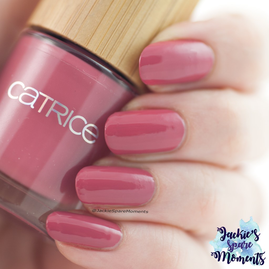
Ik lakte mijn nagels met twee laagjes van Catrice ICONails 14 Mint Map mintgroen, behalve mijn ringvinger. Die kreeg twee laagjes Etos Nail Polish 40 Mouse. Daarna stempelde ik op mijn mintgroene nagels veren van de stempelplaat BM-XL201.
I painted my nails mint green with two coats of Catrice ICONails 14 Mint Map, except for my ring finger. That one got two coats of Etos Nail Polish 40 Mouse. Then I stamped feather images from stamping plate BM-XL201 over all my mint green nails.
Dit heb ik gebruikt: Etos Nail Polish 40 Mouse, Maniology stempellak storm cloud, Catrice ICONails 14 Mint Map en Maniology stempelplaat BM-XL201.
Materials used: Etos Nail Polish 40 Mouse, Maniology stamping polish storm cloud, Catrice ICONails 14 Mint Map and Maniology stamping plate BM-XL201.
Bekijk de hashtag #whencolourscollide om te zien wat de andere deelnemers hebben gemaakt!
Search the hashtag #whencolourscollide to see what the other participants made!
Deze keer bij de (bi-)Monthly Music Mani groep, was het thema sound tracks. Ik ben dol op de films van Shrek, dus ik wist dat ik hier iets mee ging doen. Het slot van de eerste Shrek film is het vrolijke “I’m a believer” origineel van The Monkees. Man en ik hebben Shrek 1 gekeken (op DVD of misschien nog op video) toen we nog maar kort verkering hadden. Later hebben we dit liedje op onze trouwdag gebruikt.
This round with the (bi)Monthly Music Mani group had the theme sound tracks. I just love the Shrek movies, so I knew I was going to pick a song from one of these films. The ending of the first Shrek movie is set on the happy tune of “I’m a believer” originally sung by The Monkees. Husband and I watched this movie on a date night (DVD or maybe even still on video tape?) when we were still boyfriend and girlfriend. Later we used this song on our wedding.
Eerst heb ik geprobeerd Shrek-groene nagels te krijgen en daarvoor heb ik OPI Front Lawn gebruikt (een mystery OPI) en twee laagjes Masura Forest Fairy. Daarna ben ik los gegaan met stempelen en heb ik voor iedere nagel een afbeelding van een andere stempelplaat gebruikt!
First I tried to get green nails like Shrek. I used OPI Front Lawn (a mystery OPI) and two coats of Masura Forest Fairy. Then I stamped my heart out with a different stamping plate for each nail!
Dit heb ik gebruikt: OPI Front Lawn, Masura Forest Fairy, Twinkled T stamping polish Swerve, L’Oreal 667 L’Atelier Choco (om mee te stempelen), zwarte en witte stempellak, CJS stamping polish 019, Dashica stempelplaten SdP-33, SdP-66, SdP-111 en BornPretty stempelplaat BP-180.
Materials used: OPI Front Lawn, Masura Forest Fairy, Twinkled T stamping polish Swerve, L’Oreal 667 L’Atelier Choco (used for stamping), black and white stamping polish, CJS stamping polish 019, Dashica stamping plates SdP-33, SdP-66, SdP-111 and BornPretty stamping plate BP-180.
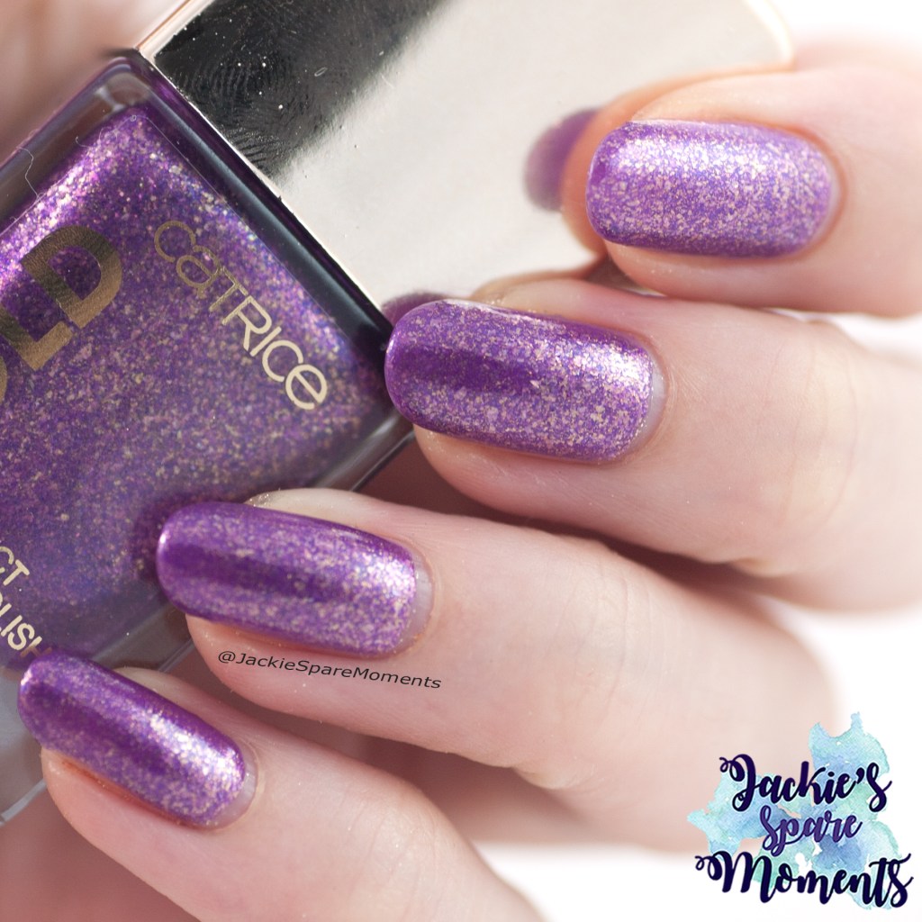
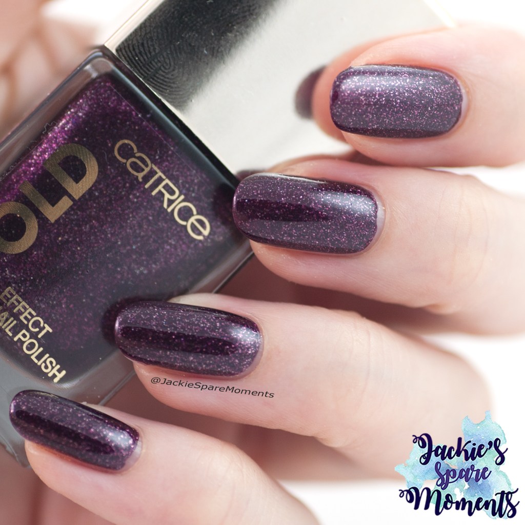
Toen ik de nieuwe Catrice Gold Effect nagellakken tegenkwam in de winkel, heb ik meteen zes van de acht kleurtjes gekocht. Maar toen gebeurde er een heleboel en duurde het een tijdje voor het op de blog kwam. Maar bij deze, hier zijn mijn swatches!
When I found the Catrice Gold Effect nail polishes in a nearby drugstore, I immediately bought six polishes from this eight polish collection. And then life happend and it took some time to get it all ready for the blog. However, I made it. Here are my swatches!
Deze kleuren heb ik gekocht: 01 Attracting Pomp, 02 Fascinating Grace, 05 Magnificent Feast, 06 Splendid Atmosphere, 07 Lustrous Seduction en 08 Noble Poshness.
I bought the following colours: 01 Attracting Pomp, 02 Fascinating Grace, 05 Magnificent Feast, 06 Splendid Atmosphere, 07 Lustrous Seduction and 08 Noble Poshness.
Catrice Gold Effect Nail Polish 01 Attracting Pomp
Attracting Pomp is een diep roze-rode kleur met gouden glitters en gouden flakes. Deze kleur dekte in twee laagjes. Ik heb geen top coat gebruikt bij deze swatches zodat je kon zien hoe glad ze zijn ondanks alle glitter die erin is gebruikt.
Attracting Pomp is a deep red shade with pink undertones and with golden glitters and golden flakes. The colour was fully covering in two coats. I didn’t use top coat in these swatches so you could better see if there was any texture going on. But actually there was more a lack of texture despite all the glitters. They all dried down rather smooth!
Catrice Gold Effect Nail Polish 02 Fascinating Grace
Fascinating Grace had een iets dunnere formule. Deze keer had ik drie laagjes nodig. Deze kleur heeft ook duidelijk zilveren flakes. Het heeft een meer metallic finish. Maar de kleur is een neutrale roze, dus ik denk dat je hem vaak en overal bij kan dragen.
Fascinating Grace had a thinner formula. It took me three coats to get full coverage. This shade has also silver flakes and comes with a more metallic finish. It’s a more neutral pink, so I think you can wear this often and with anything.
Catrice Gold Effect Nail Polish 05 Magnificent Feast
De collectie heeft drie goudkleurige nagellakken. De meer bronskleurige en lichtgouden nagellak heb ik laten staan. Alleen deze duidelijk geelgouden nagellak heb ik gekocht, omdat ik dit een mooie herfstkleur vind. Magnificent Feast was dekkend in twee laagjes en heeft gouden glitters en gouden flakes.
This collection has three golden shades. I skipped the more bronze gold and pale gold shades and went with this bright yellow gold. I love such a shade for autumn/fall. Magnificent Feast took two coats to full coverage and it has golden glitters and golden flakes.
Catrice Gold Effect Nail Polish 06 Splendid Atmosphere
Splendid Atmosphere lijkt qua formule erg op Attracting Pomp. Het is een prachtige herfstige paarstint. Dekkend in twee laagjes.
Splendid Atmosphere is very similar to Attracting Pomp with the formula. It’s a beautiful autumnal shade of purple. Full coverage in two coats.
Catrice Gold Effect Nail Polish 07 Lustrous Seduction
Lustrous Seduction is een donkere vampy kleur. Hier zitten weer wat zilveren flakes doorheen. Hij dekte in twee laagjes. Maar pas met dit soort donkere kleuren altijd op, ze kunnen sneller verkleuringen in je nagels geven.
Lustrous Seduction is a dark berry shade and really vampy. This shade also has silver flakes. It’s fully covering in two coats. But be careful with these dark shades, they are potential stainers.
Catrice Gold Effect Nail Polish 08 Noble Poshness
Ik vind de naam Noble Poshness erg grappig voor een kleur die mij doet denken aan de tinnen beeldjes bij mijn grootouders. Noble Poshness is wat dunner qua formule en lijkt daarmee op Fascinating Grace. Ik had het dekkend in drie laagjes. Deze kleur heeft vooral zilveren flakes.
I think the name Noble Poshness is very funny for a shade that reminds me of pewter. The formula is a bit thinner, just like Fascinating Grace. I had full coverage in three coats. This colour has mainly silver flakes.
En dat was het. Welke kleur uit deze collectie spreekt je het meeste aan?
And this is the end. Which colour from this collection really speaks to you?
Deze ronde van When Colours Collide is met de kleuren Zwart, Paars en Pastel Blauw. De inspiratiefoto was met rozen. Ik heb daar deze keer gebruik van gemaakt.
This time with When Colours Collide it’s the colours Black, Purple and Pastel Blue. The inspiration picture was with roses. This time I used the inspiration picture for my nail art.
Ik startte met twee paarse nagels en drie lichtblauwe. Op mijn lichtblauwe nagels sponsde ik wat paars en stempelde ik in zwart een afbeelding van wilde rozen. Helaas vlekte mijn topcoat de zwarte stempellak wat uit.
I started with two purple nails and three in pastel blue. I sponged some purple on my pastel blue nails and stamped with black an image with wild roses. Sadly my top coat smudged the black stamping polish.
Dit heb ik gebruikt: Catrice ICONails 69 If Not Purple… Then What?, Essie Getting Intricate, zwarte stempellak en Maniology stempelplaat BM-XL218.
Materials used: Catrice ICONails 69 If Not Purple… Then What?, Essie Getting Intricate, black stamping polish and Maniology stamping plate BM-XL218.
Bekijk de hashtag #whencolourscollide om te zien wat de andere deelnemers hebben gemaakt!
Search the hashtag #whencolourscollide to see what the other participants made!
De kinderen gaan weer naar school en ook de andere activiteiten gaan weer opstarten. Dit seizoen gaat Dochter dansen in de volgende groep bij ballet. Dat is best spannend, omdat er ook een aantal oudere meisjes bij zitten. Om de spanning op een leuke manier af te leiden, mocht Dochter mijn nail art voor deze week uitzoeken en je raadt het al: het werd een ballet nail art! Hier vind je mijn vorige ballerina nail art.
The kids are back to school and the after school activities are also starting again. This season Daughter will start her ballet lessons in the next group. That is kind of exciting, because there are also some older girls dancing at this time slot. To give her some distraction, Daughter could choose my nail art for this week. And guess what: it is a ballet nail art! Here you can find my last ballerina nail art.
Ik had wat ruzie met de roze nagellak van Sally Hansen Complete Salon Manicure. Die heet Aflorable en ook al is de kleur heel schattig, na drie laagjes was de dekking nog steeds heel onregelmatig. Ik loste dit maar op met een laagje Catrice Galactic Glow en een dikke laag top coat. De Catrice viel heel goed bij Dochter in de smaak, want ze houdt wel van glimmers. Aan de andere kant ging de donkerroze lak er gemakkelijk op in twee laagjes.
It was a bit of a fight to paint the light pink nails. I used Sally Hansen Complete Salon Manicure called Aflorable. Even though the colour is really adorable, after three coats is was still a streaky mess. I solved it with a layer Catrice Galactic Glow and a thick layer of top coat. This solution was very much liked by Daughter, because she likes shimmery things. On the other hand the dark pink polish was an easy two coats.
Dit heb ik gebruikt: Sally Hansen Complete Salon Manicure 542 Cherry Up en 523 Aflorable, Catrice Galactic Glow 02 Enchanted by prismatic spell, Hit the bottle stempellak Bubblegum Bliss en KADS stempelplaat FASHION 042. De Sally Hansen nagellakken heb ik al wat jaren, dus dus ik weet niet zeker of dat van invloed is op de kwaliteit van Aflorable.
Materials used: Sally Hansen Complete Salon Manicure 542 Cherry Up and 523 Aflorable, Catrice Galactic Glow 02 Enchanted by prismatic spell, Hit the bottle stamping polish Bubblegum Bliss and KADS stamping plate FASHION 042. I own the Sally Hansen polishes already for some years, I don’t know if that has an impact on the streakiness I experienced with Aflorable.
Wat doe je met de kleuren geel, grijs en bruin dacht ik toen ik de nieuwe opdracht van When Colours Collide las. Zonnebloemen? Ik ging mijn stempelplaten door en kwam een grafische bloemenpatroon tegen. Dit heb ik er van gemaakt.
What to do with Yellow, Grey and Brown were my thoughts when I read the new challenge of When Colours Collide. Sun flowers maybe? I searched my stamping plates and found a graphic art inspired floral pattern. This is what I made.
Ik heb mijn duim en pink bruin gelakt en de overige vingers geel. Op de gele nagels heb ik met grijze stempellak een grafisch bloemenpatroon gestempeld. In het centrum van de bloemen heb ik met een dotting tool bruine stippen gezet.
I painted my thumb and little finger with brown polish and the other fingers with a yellow polish. I stamped over the yellow polish with a grey stamping polish a graphic art inspired floral pattern. In the middle of the flowers I added a brown dot with a dotting tool.
Dit heb ik gebruikt: Dashica Infinity Nails stempelplaat 157, Maniology stempellak in de kleur storm cloud (grijs), Catrice ICONails 68 Turn the lights on (geel) en Catrice Brown Collection 01 Fashion Addicted (bruin).
Materials used: Dashica Infinity Nails stamping plate 157, Maniology stamping polish storm cloud (grey), Catrice ICONails 68 Turn the lights on (yellow) and Catrice Brown Collection 01 Fashion Addicted (brown).
Bekijk de hashtag #whencolourscollide om te zien wat de andere deelnemers hebben gemaakt!
Search the hashtag #whencolourscollide to see what the other participants made!
Ik heb weer een aantal stempelplaten bij KADS besteld. Nadat mijn eerste ervaring zo-zo was, heb ik nu een aantal hele leuke platen bij KADS besteld. Daarbij heb ik ook een paar stempellakken besteld en nu alles binnen is wil ik met jullie naar deze twee stempelplaten en een groene stempellak kijken.
I placed a new order with KADS for stamping plates and stamping polishes. After my first so-so experience, I think I have recieved some really nice plates. Now I have received everything I want to look at two stamping plates and a green stamping polish.
De stempelplaten FLOWER 043 en 044 zijn samen te gebruiken om middels double stamping diverse bloemen- en bladerafbeeldingen te creëren. Ik heb een takje van de plaat FLOWER 044 gecombineerd met een bloem van de FLOWER 043.
The stamping plates FLOWER 043 and 044 can be used together to create several flower and leaves images. They are meant to be used as double stamping templates. I used a leave image from FLOWER 044 with a flower from FLOWER 043.
Ik ben nog niet helemaal fan van de stempellakken, omdat deze groene stempellak in ieder geval vlekt met de top coat die normaal wel goed gaat met mijn andere stempellakken.
I’m not really a fan yet of their stamping polishes, because this green stamping polish smudged with my usual top coat. And I normally have no problems with the other stamping polishes.
Dit heb ik allemaal gebruikt: essence the gel polish 95 vibrant purple, essence the gel polish 55 be awesome tonight, KADS stempellak “donkergroen”, CJS stempellak 016, Maniology stempellak eldorado, Hit the bottle stempellak cactus juice, KADS stempelplaten FLOWER 043 en 044.
Materials used: essence the gel polish 95 vibrant purple, essence the gel polish 55 be awesome tonight, KADS stamping polish “dark green”, CJS stamping polish 016, Maniology stamping polish eldorado, Hit the bottle stamping polish cactus juice, KADS stamping plates FLOWER 043 and 044.