September startte zomers, maar eindigde herfstachtig. Ook begonnen de bomen eind september al in hun herfstkleuren te verkleuren. Dat is een aantal weken eerder dan vorig jaar. Toen kwamen de herfstkleuren pas midden oktober als ik het goed heb. Prive was het bij ons een drukke maand, hierdoor heb ik iets minder vaak mijn nagels gelakt als anders. Ik draag mijn manicures met base coat en top coat, tenzij anders vermeld.
This September started with summer weather and ended with calm and cool fall weather. Also the trees started to change into their fall colours by the end of the month. That’s weeks earlier than last year. Then it happened mid October if I remember correctly. Privately it was a very busy month, so I had less time painting my nails. I wore all my manicures with base coat and top coat, unless otherwise stated.
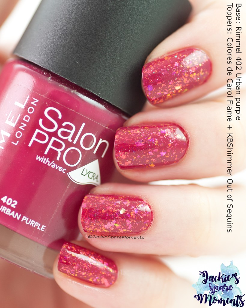
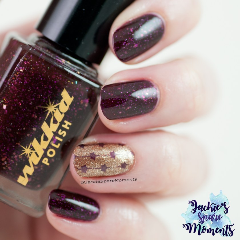
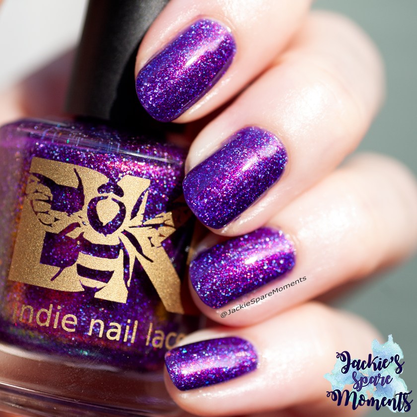
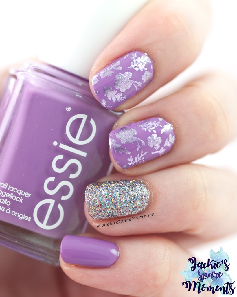
Rimmel Urban Purple with toppers
Rimmel Urban Purple topped with Colores de Carol Flame and KBShimmer Out of Sequin
Ik startte de maand met een oude nagellak. Deze lijn van Rimmel vond ik erg fijn toen hij nog te koop was. Ik draag Urban purple in twee laagjes. Ik had zin om wat te experimenteren met toppers. Dus ik bracht eerst een laagje Colores de Carol Flame aan en daarover een dun laagje KBShimmer Out of Sequins. Ik heb in een klein 5 ml nagellak potje wat heldere nagellak gemixt met KBShimmer Out of Sequins om de reflective glitter wat te verdunnen. Was erg tevreden met het resultaat.
I started the month with an old nail polish. I used to love this line from Rimmel, when it was still available in the drugstore. I wore Urban purple in two coats. I was inspired to experiment with some toppers. So I first applied a layer of Colores de Carol Flame. On top of that I applied a thin layer of KBShimmer Out of Sequins. In a small 5 ml nail polish bottle I mixed some of the KBShimmer Out of Sequins with some clear base to dilute the reflective glitter. I was very happy with the end result.
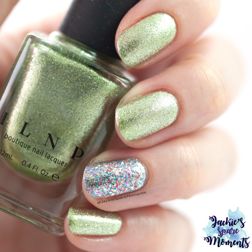
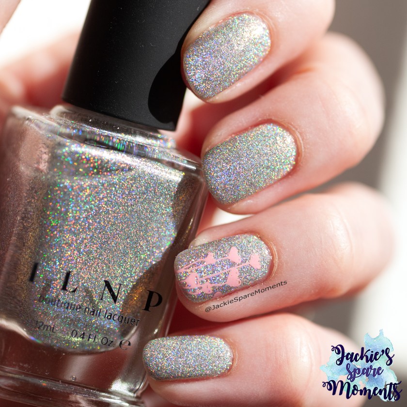
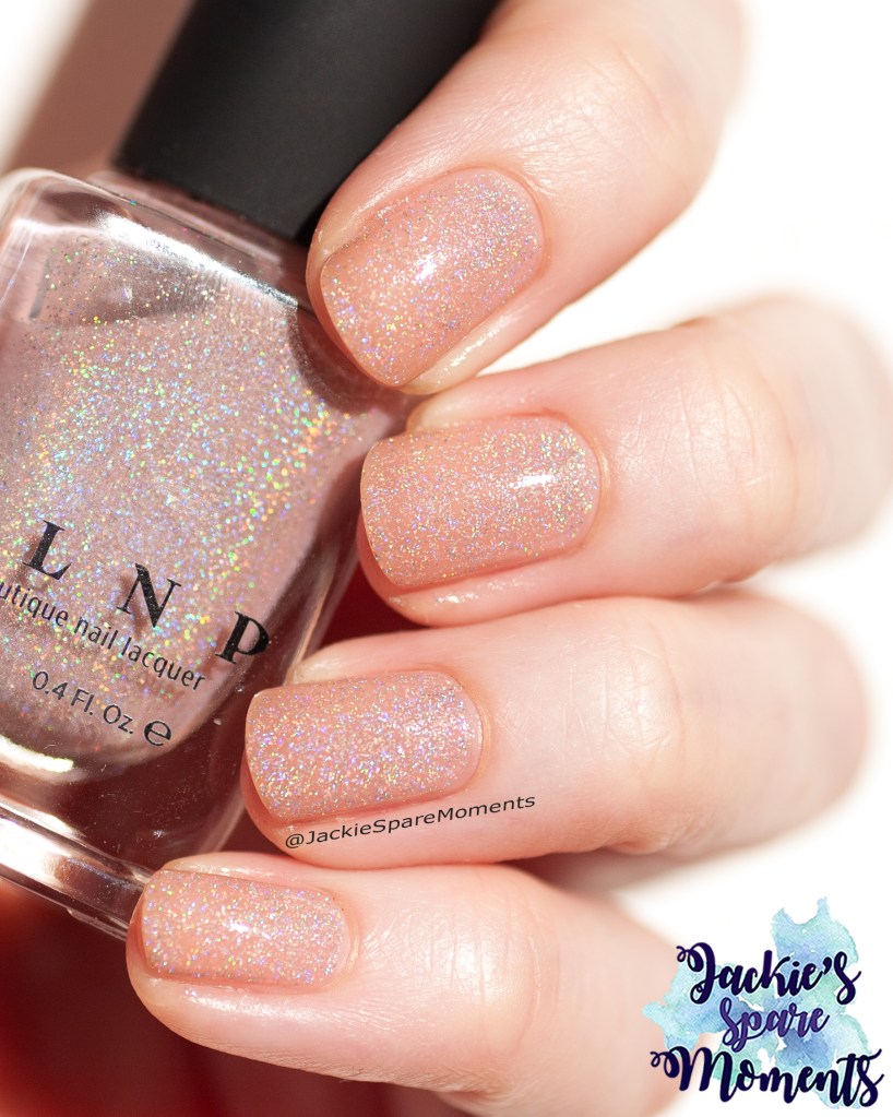
ILNP Riley
ILNP Riley
Daarna droeg ik ILNP Riley, een koraalkleurige nagellak met gouden shimmer en holografische flakes. Ik droeg het in drie laagjes, maar het is al bijna dekkend in twee laagjes. Het is de tweede keer dat ik deze nagellak van ILNP draag en ik vind het nog steeds een hele mooie kleur voor de nazomer.
Next I wore ILNP Riley, a coral polish with golden shimmer and holographic flakes. I wore it in three coats, but it’s almost at full coverage in two coats. It’s the second time that I wore this polish from ILNP and I still think it’s a beautiful colour for late summer.
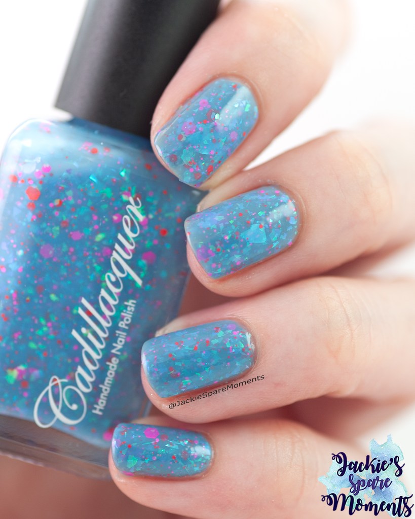
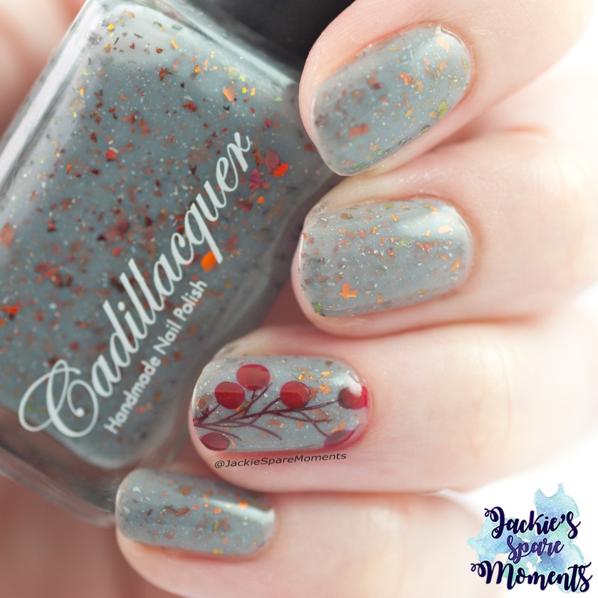
Cadillacquer Positive Thinking
Cadillacquer Positive Thinking
Cadillacquer Positive Thinking is een nieuwe nagellak in mijn collectie. Vanwege de naam en de leuke glitter en flake mix in de blauwe basis, wilde ik het meteen dragen. Ik draag hier drie laagjes met glitter smoothing top coat en reguliere top coat.
Cadillacquer Positive Thinking is a new nail polish in my collection. Because of the name and the fun glitter and flake mix in this blue base colour, I wanted to wear right away. I wear it in three coats with glitter smoothing top coat and a regular top coat.
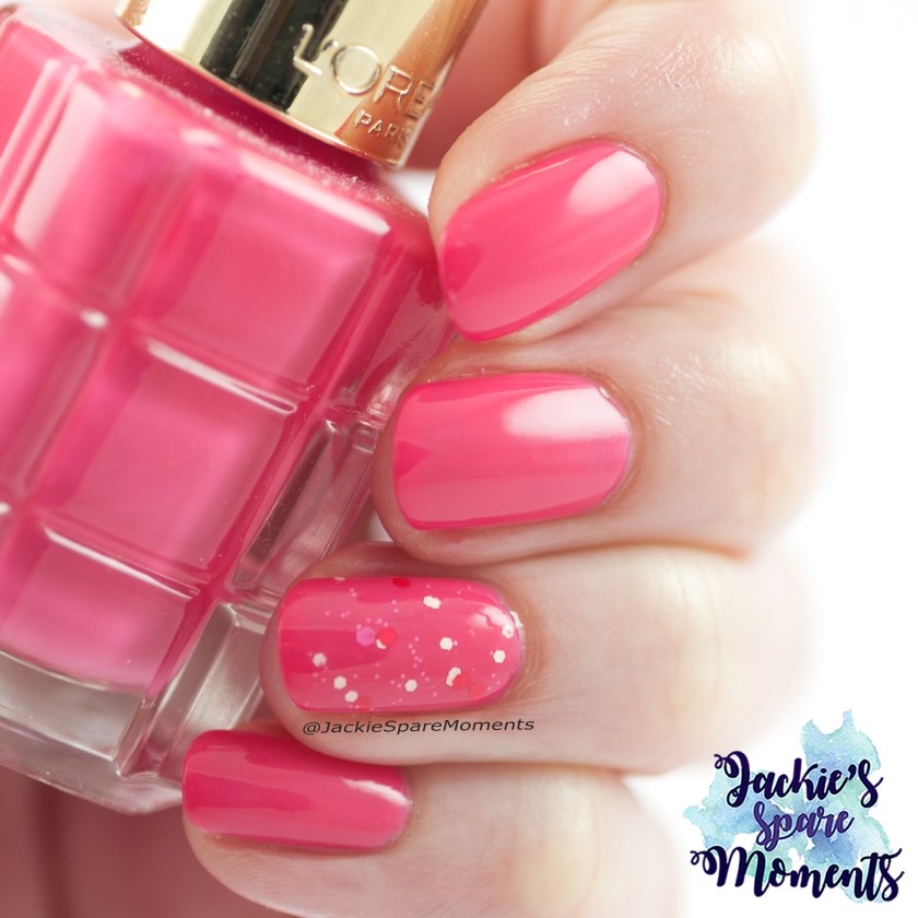
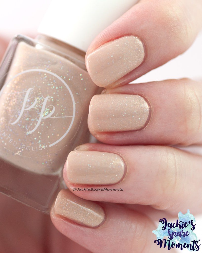
HEMA nail polish 908 Pink Sunrise
HEMA Pink Sunrise
Vervolgens droeg ik HEMA nagellak Pink Sunrise in drie laagjes. Een mooie roze nagellak met gouden shimmer.
Next I wore HEMA nail polish Pink Sunrise in three coats. A beautiful pink nail polish with golden shimmer.
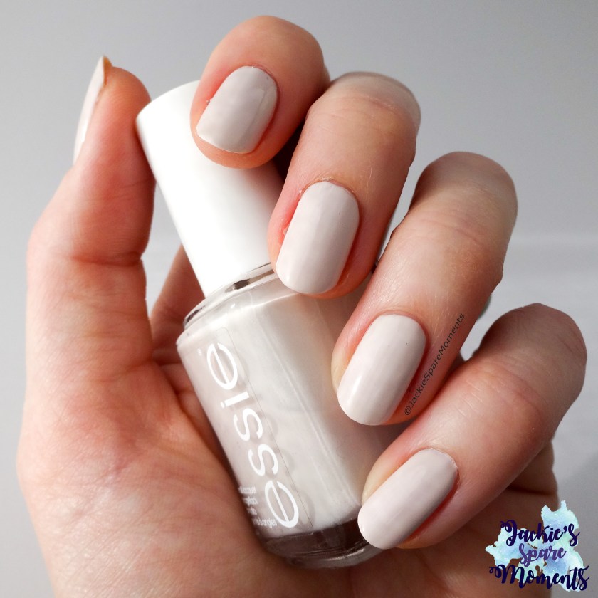
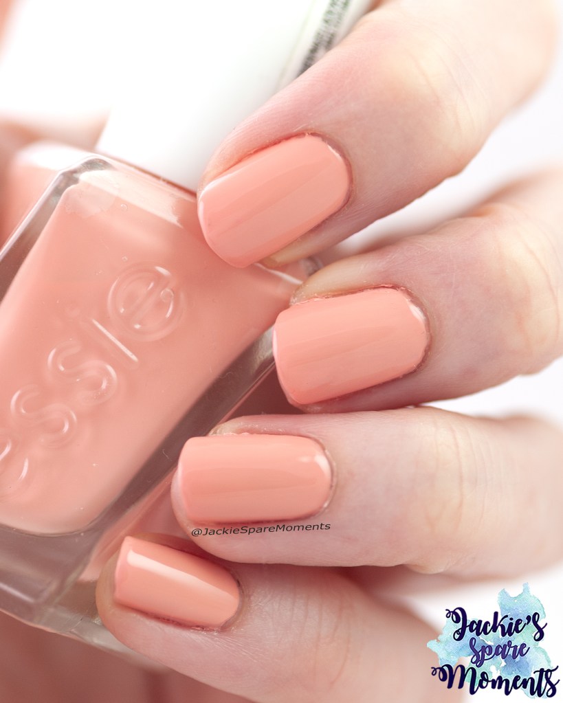
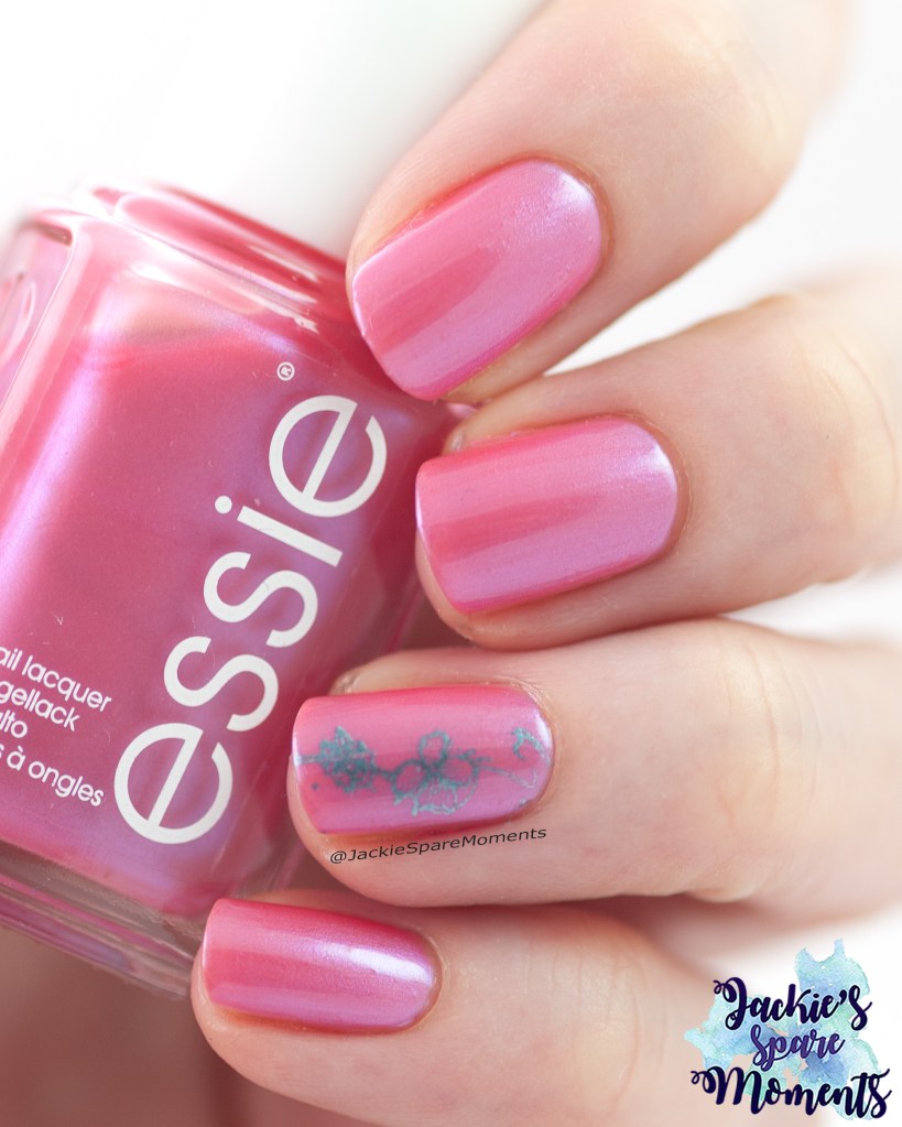
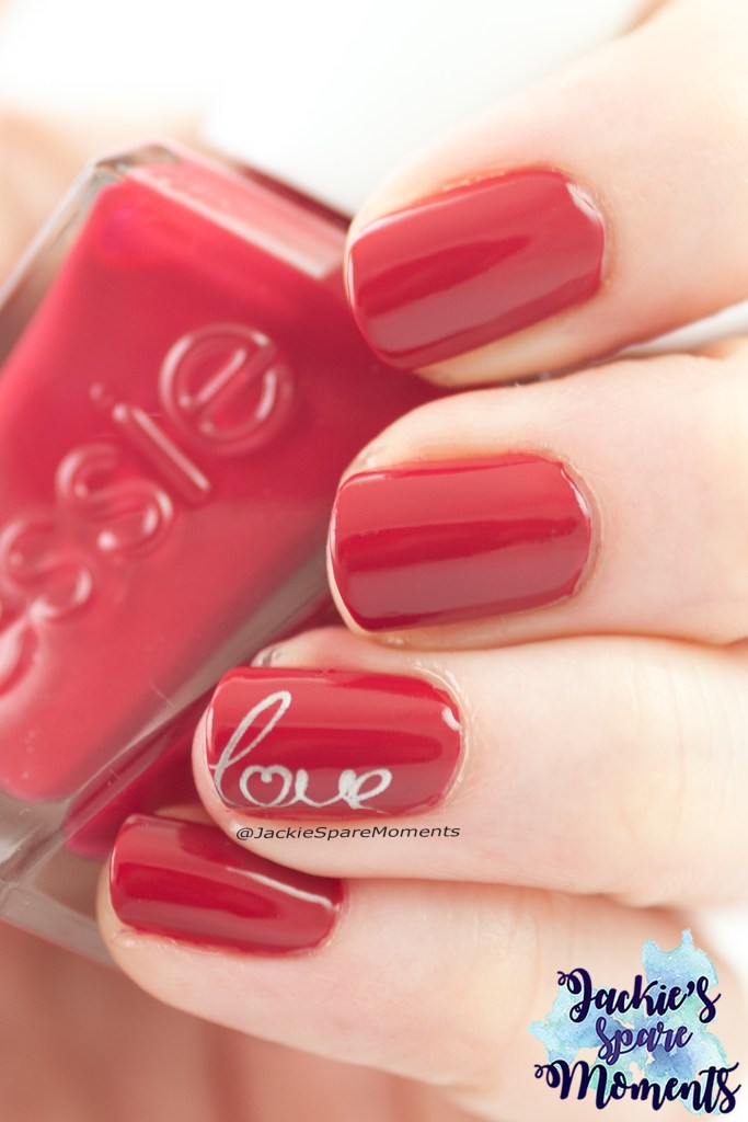
Skittle mani with nail art
Essie Chubby Cheeks and Essie pass-port to sail with water decal nail art
Het weer begon al af te koelen, maar ik wilde het gevoel van zomer nog even vasthouden middels deze manicure. Ik draag hier twee laagjes van Essie Chubby Cheeks in twee laagjes met een laagjes China Glaze Fairy Dust. Dit is een kleur tussen oranje en koraal in. Op de andere nagels draag ik drie laagjes pass-port to sail, een zandkleurige beige met een beetje shimmer. Over deze nagels heb ik water decals aangebracht van Ali Express. Ik was heel blij ermee.
The weather started to cool down, but I wanted to prolong the feeling of summer with this manicure. Here I’m wearing two coats of Essie Chubby Cheeks with a layer of China Glaze Fairy Dust. This is a colour between orange and coral, a coral orange. On the other nails I wore three layers of Essie Pass-port to sail, a sandy beige with a little shimmer. On these nails I added water decals from Ali Express. I was very happy with it.
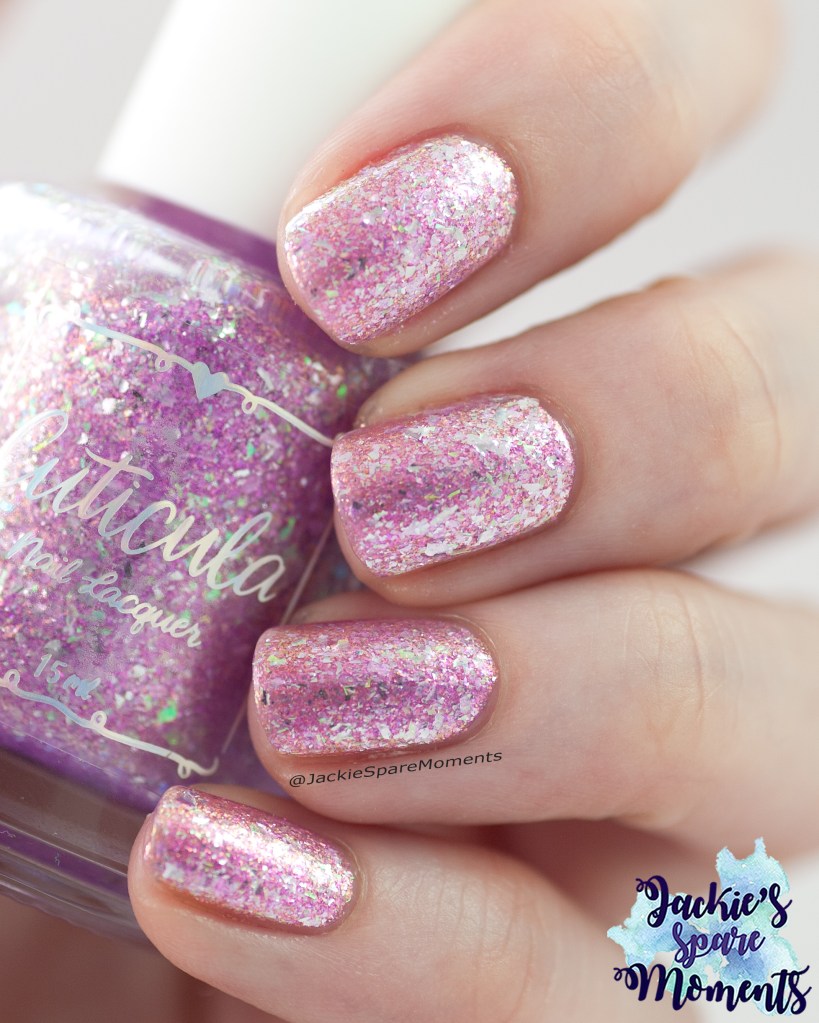
Cuticula Blossom by blossom
Cuticula Blossom by blossom
Dit is weer een nagellak die ik opnieuw draag. Vorig jaar in september droeg ik voor het eerst Cuticula Blossom by blossom. Dit jaar droeg ik het opnieuw in drie laagjes. Blijft een mooie nagellak.
This is another rewear this month. Last year in September I wore Cuticula Blossom by blossom for the first time. This year I wore it again in three coats. It’s still a beautiful polish.
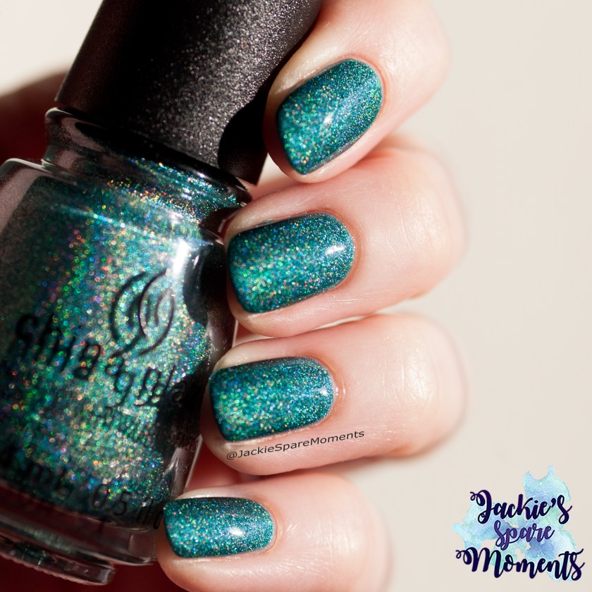
Essie Gorge-ous Geodes
Essie Gorge-ous Geodes
En ook deze nagellak heb ik eerder gedragen. En ik vind het nog steeds een hele mooie kleur. Dit zijn twee laagjes van Essie Gorge-ous Geodes.
This polish is also a rewear. And I still love it. This is two coats of Essie Gorge-ous Geodes.
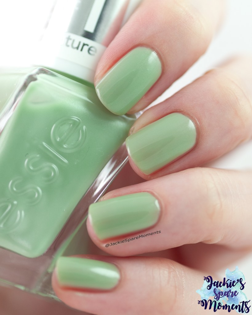
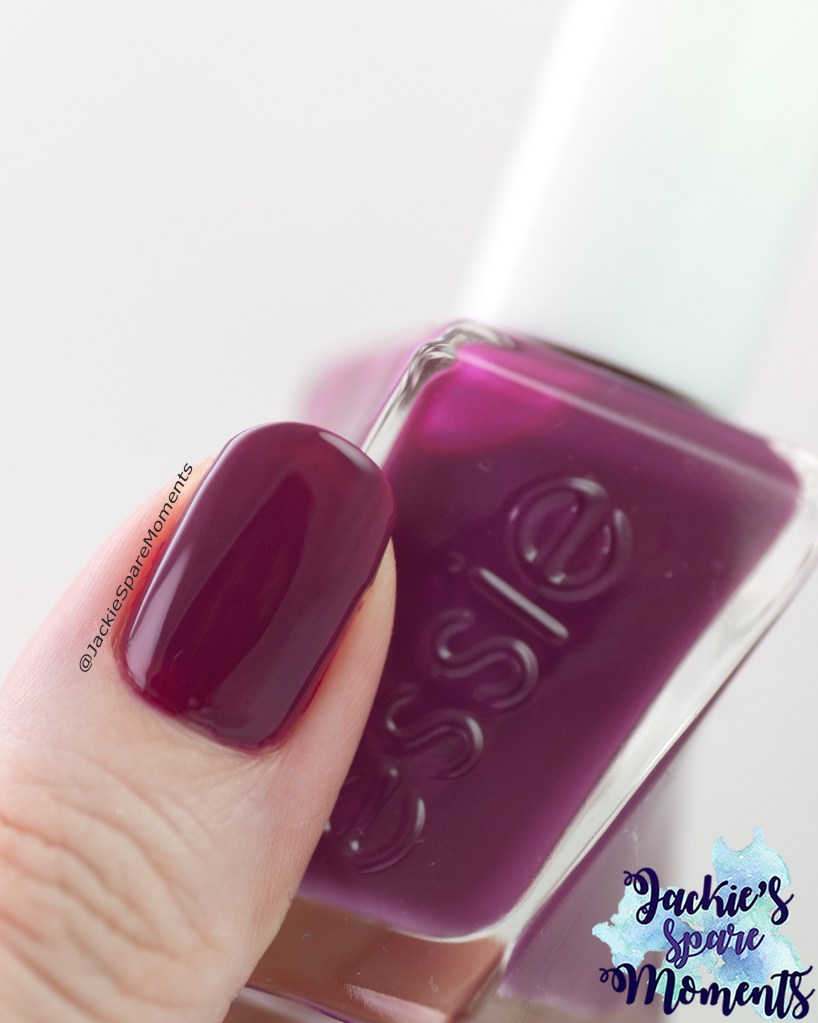
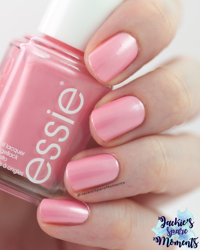
Essie Gel Couture Bling it
Essie Bling it
Daarna droeg ik een Essie Bling it in drie laagjes. Ik droeg het voor de eerste keer. Deze nagellak bleef lang mooi zitten. Hierdoor heb ik het ook langer doorgedragen, want we hadden het privé heel druk die week. Aan het einde van de zomer draag ik een vest en twee blouses met deze kleur in het patroon. Dus daardoor was het makkelijk om deze kleur langer door te dragen.
Next I wore Essie Gel Couture Bling it in three coats. I wore it for the first time. This nail polish wore very good and stayed very beautiful for many days. So I wore it longer than I had planned at first, because it was a very busy week in our private life. At the end of the summer I wear a cardigan and two blouses with this colour in the pattern. So it was a good colour to wear a little longer.
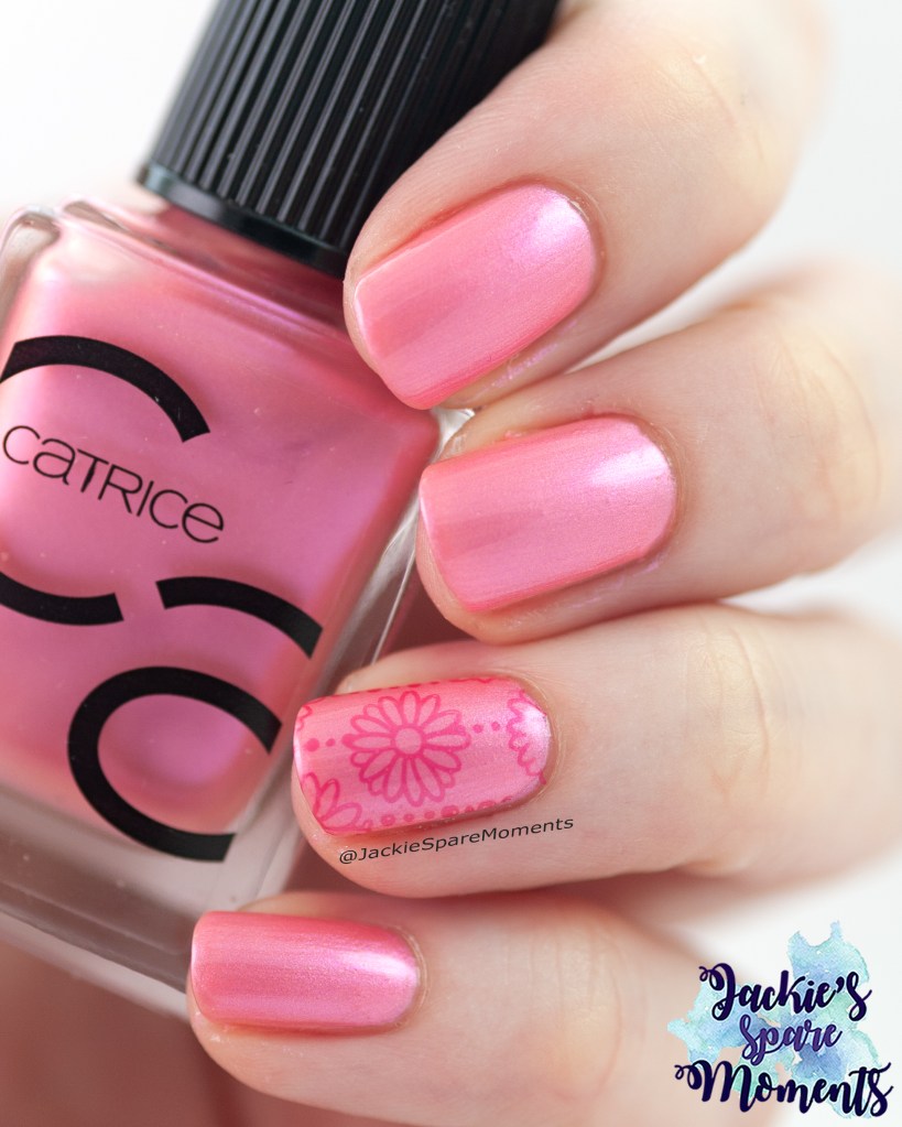
Catrice ICONails 168 You Are Berry Cute with accent nail art
Catrice ICONails 168 You Are Berry Cute and Catrice ICONails 111 Sahara Sand
Mijn laatste manicure deze maand is deze combinatie van Catrice ICONails You are berry cute en Catrice ICONails Sahara sand. Mijn inspiratie is deze water decal van onrijpe bramen. Dit doet mij denken aan de laatste bramen die je aan het einde van het seizoen nog over hebt aan de plant. Ik draag beide nagellakken in twee laagjes. En de water decal komt van Ali Express.
My final manicure this month is a combination of Catrice ICONails You are berry cute and Catrice ICONails Sahara sand. My inspiration was this water decal with unripe blackberries. This reminded me of the last blackberries of the season that are left on the shrub. I wore both polishes in two coats. The water decal is from Ali Express.
Het is alweer september en dus tijd om jullie te vertellen welke pedicures ik deze zomer heb gedragen. Ik heb elke pedicure ongeveer drie weken gedragen.
It’s September and time to tell you about the pedicures I wore this summer. Every pedicure was worn for approximately three weeks.
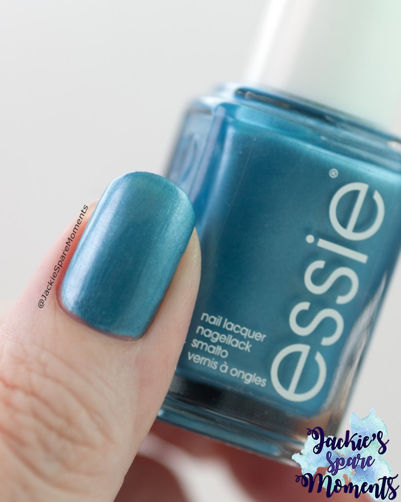
Essie Beach bum blu
Essie Beach bum blue
De eerste pedicure dit seizoen was Essie Beach bum blue, een metallic blauwe nagellak die mij complimenten opleverde. Ik droeg het in twee laagjes.
The first pedicure this season was Essie Beach bum blue, a metallic blue nail polish. This pedicure got me compliments! I wore it in two coats.
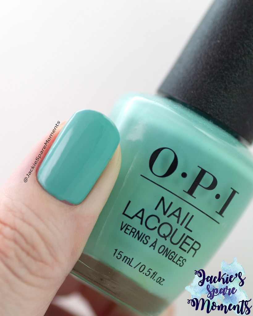
OPI Closer than you might Belém
OPI Closer than you might Belém
Mijn volgende pedicure was OPI Closer than you might Belém. Deze mintgroene nagellak was dekkend in twee laagjes.
My next pedicure was OPI Closer than you might Belém. This mint green nail polish reached full coverage in two coats.
OPI The sky’s my limit
OPI The sky’s my limit
Daarna droeg ik OPI The sky’s my limit. Ook deze nagellak dekte in twee laagjes. Het is een blauwe lak met gouden flakes en groene shimmer. Was een mooie kleur voor op de tenen!
Then I wore OPI The sky’s my limit. This polish also reached full coverage in two coats. This is a blue nail polish with golden flakes and green shimmer. It was a beautiful colour for the toes!
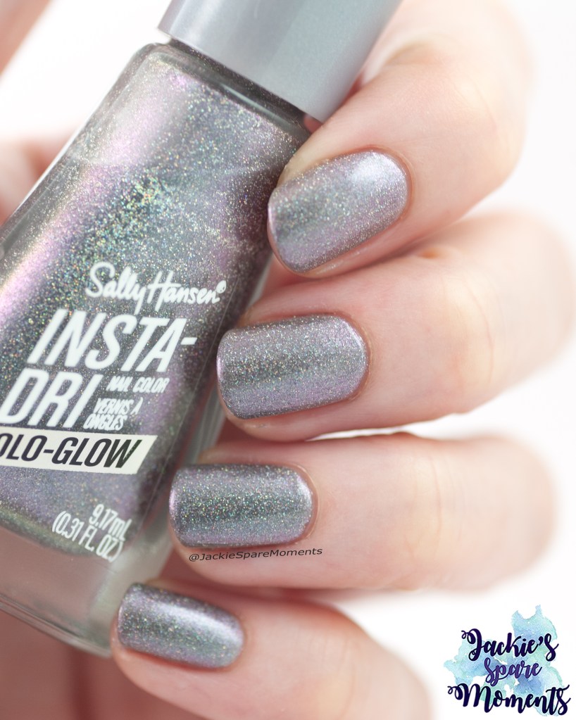
Sally Hansen 893 Beet Me at the Mall
Sally Hansen Beet Me at the Mall
Deze nagellak was me er eentje. Allereerst is het slecht dekkend. Deze duim swatch is vier laagjes en nog steeds zie je de maan van mijn duimnagel doorschemeren. Op mijn tenen droeg ik het in vijf laagjes. Ik had gelukkig die dag de tijd om steeds een laagje aan te brengen en het te laten drogen voor ik het volgende laagje aanbracht. Daarnaast waren mijn teennagels helemaal roze verkleurd toen ik Beet Me at the Mall verwijderde. Dus naast slecht dekkend is het ook nog een stainer.
This polish is a story. First it is was very sheer. This thumb swatch is four coats and you can see the moon of my thumb nail peeking through. On my toes I wore this polish in five coats. That day I had the time to apply a coat and let it dry and slowly build it up. After removing the polish my toe nails were stained into a bright pink. So next to being very sheer it was also a stainer.
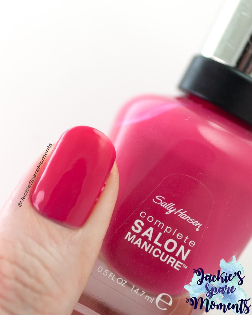
Sally Hansen 542 Cherry Up
Sally Hansen Cherry Up
Daarna droeg ik een andere Sally Hansen nagellak. Dit keer van de Complete Salon manicure lijn. Dit is Cherry Up in twee laagjes. En daarmee was het dekkend. Gewoon een fijne creme nagellak.
Next I wore another Sally Hansen nail polish. This time it’s from the Complete Salon manicure line. This is Cherry Up in two coats. And that was enough for full coverage. Just a nice cream polish.
Essie Gel Couture Graced in garnet
Essie Gel Couture Graced in garnet
De laatste pedicure was Essie Gel Couture Graced in garnet. Ik droeg het in twee laagjes. Omdat het op de tenen was, was het net dekkend genoeg. Als manicure had ik het waarschijnlijk nog een derde laagje gegeven.
The final pedicure was Essie Gel Couture Graced in garnet. I wore it in two coats. It was just enough, because I was wearing it on the toes. For a manicure I would probably added a third coat.
Ik zag dat ik als sinds augustus 2022 met deze serie bezig ben. Het is inmiddels een heel fotoverslag van de gedragen nagellakken geworden. Ik merk ook dat het fijn is om door oude posts te gaan. Augustus is onze vakantiemaand. Deze maand zijn we 2 weken op vakantie geweest. Zoals gebruikelijk had ik wat nagellakken ingepakt om tijdens de vakantie te dragen. Door de start van het schooljaar en alle drukte die daarbij hoort, was ik iets later met het schrijven van deze blog. In ieder geval dit zijn de lakken die ik deze maand gedragen.
I realised that I am writing this series of worn polishes since 2022. It’s become a colourful archive of worn polishes and I am happy when I look back through old posts. August is our holiday month. This time we went on holiday for two weeks. As usual I packed some polishes to wear during this time. Due to the start of the school year, I was a little late with writing this blog. Anyway here is what I wore this month.
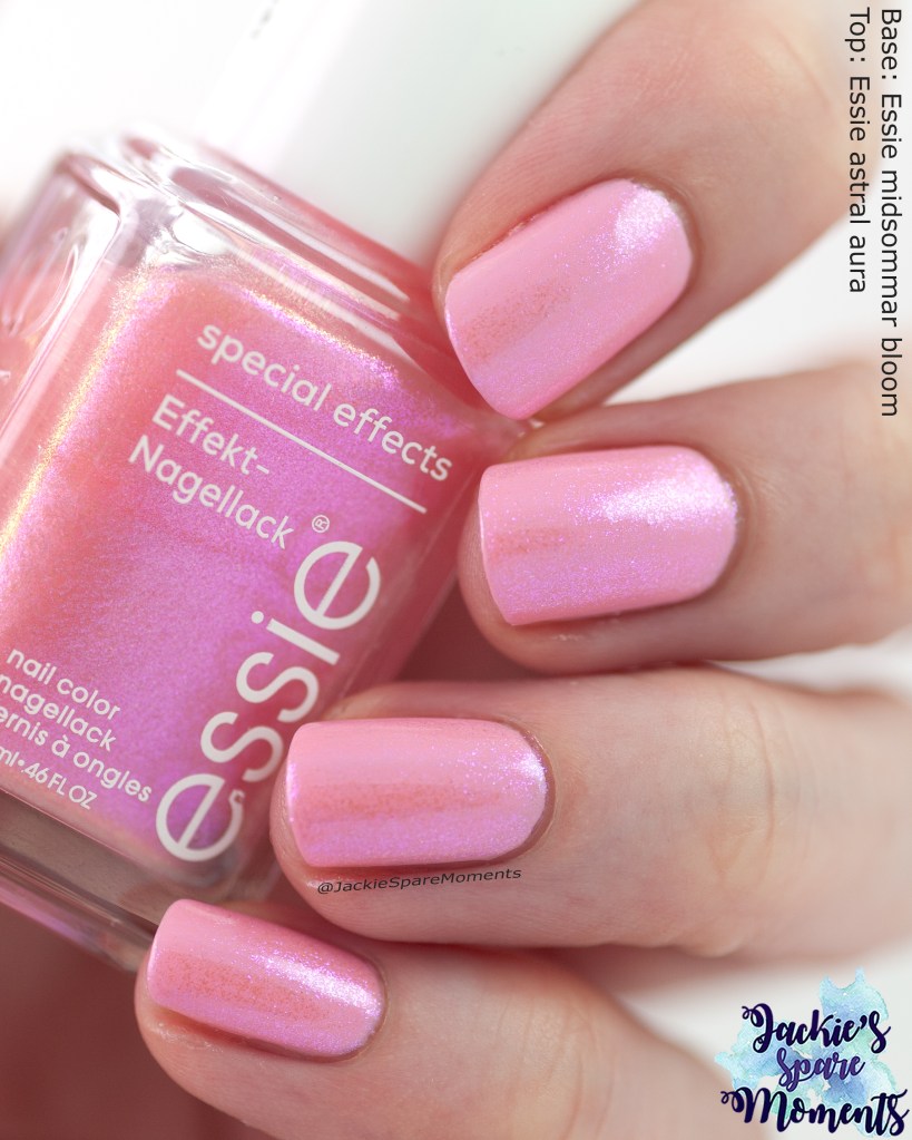
Essie midsommer bloom with topper
Essie midsommer bloom topped with Essie astral aura
De eerste manicure van de maand was Essie midsommar bloom in twee laagjes met een laagje Essie astral aura. Dit was een veilige combinatie met de astral aura topper. In de toekomst wil wat meer gaan experimenteren met deze shimmer over andere kleuren.
The first manicure of the month was Essie midsommar bloom in two coats with one coat of Essie astral aura. It was a safe combination of a pink base with the astral aura topper. In the future I want to experiment with different colours.
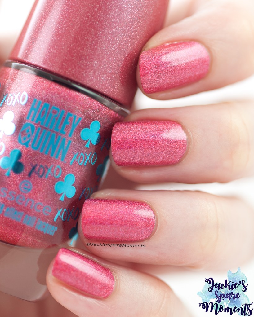
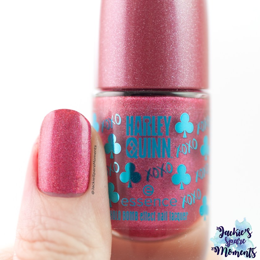
Essence XOXO, Harley
Essence Harley Quinn Holo Bombs 01 XOXO, Harley
Vorig jaar heb ik Essence XOXO, Harley als pedicure gedragen. Dit jaar heb ik het voor het eerst als manicure gedragen in twee laagjes. Hele mooie holografische nagellak. Nu ik het als manicure heb gedragen, vind ik dat het erg veel lijkt op A England Chamuel. Het verschil tussen beide lakken is maar heel klein.
Last year I wore Essence XOXO, Harley as pedicure. This year I wore it for the first time as a manicure in two coats. It’s a beautiful holographic nail polish. Now as I have worn it as a manicure, I think that is looks a lot like A England Chamuel. The difference between the two polishes is only a little.
Essie salt water happy
Essie salt water happy
Daarna droeg ik Essie salt water happy. Ik bracht het in twee laagjes aan. Op mijn ringvinger en duim bracht ik een afbeelding aan van stempelplaat BM-XL218. Ik gebruikte Il etait un vernis 50% sparkly 50% fairy dust als de stempellak. In het licht gaf dat nog extra holo sparkle. Al met al een leuke zomer manicure.
Next I wore Essie salt water happy. I applied it in two coats. On my ring finger and thumb I added an image from stamping plate BM-XL218. I used Il etait un vernis 50% sparkly 50% fairy dust for the stamping. In the sun light it added some extra holo sparkle. In the end a very fun summer manicure.
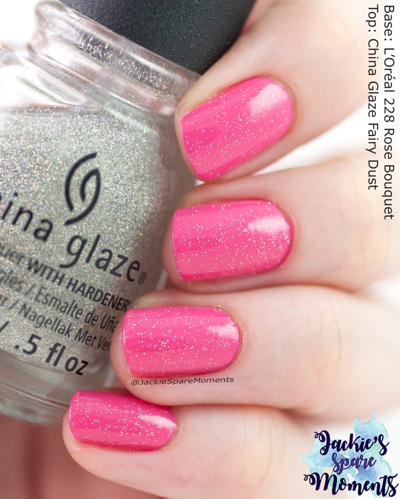
L’Oréal Rose Bouquet with topper
L’Oréal 228 Rose Bouquet with China Glaze Fairy Dust
Vervolgens droeg ik voor de achtste keer dit jaar China Glaze Fairy Dust als topper. Mijn voornemen van dit jaar loopt nog steeds volgens plan. Deze keer droeg ik het over twee laagjes L’Oréal Rose Bouquet. Ik was blij met het resultaat. Eigenlijk kan een een laagje Fairy Dust over elke kleur.
Then I wore China Glaze Fairy Dust for the eighth time this year as topper. My intention to wear it every month this year is still going strong. This time I wore it over two coats of L’Oréal Rose Bouquet. I was happy with the end results. A layer of Fairy Dust is perfect over any colour.
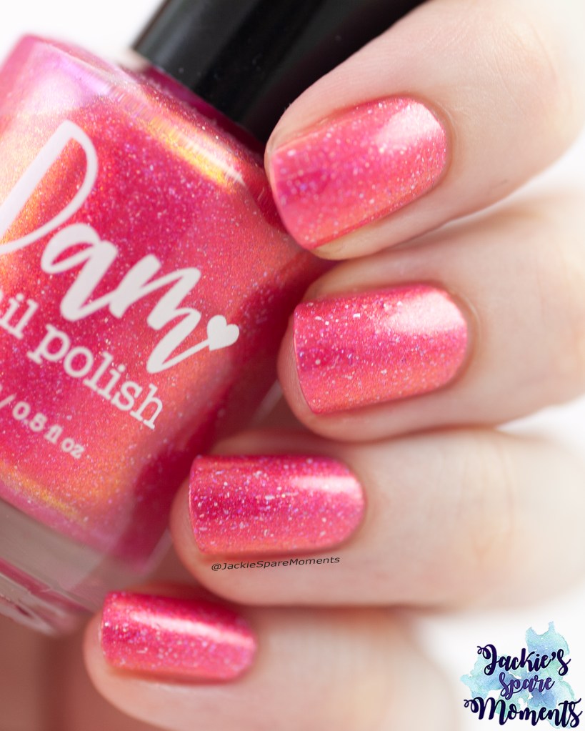
Dam nail polish Shopping at Shibuya
Dam nail polish Shopping at Shibuya
Kort voordat we op vakantie gingen bracht ik Dam nail polish Shopping at Shibuya. Ik bracht het aan in twee laagjes. Dus dit was op mijn nagels bij de start van de vakantie. Mooie nagellak!
Shortly before we went on holiday I wore Dam nail polish Shopping at Shibuya. I applied it in two coats. So this was on my nails at the start of the holiday. Pretty polish!
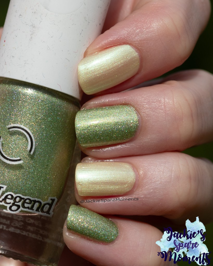
Skittle met DanceLegend Pranks a lot
DanceLegend Pranks a lot and L’Oréal Lemon shiver
Na een paar dagen op vakantie bracht ik deze skittle manicure aan. Dit zijn DanceLegend Pranks a lot en L’Oréal Lemon shiver. Beide draag ik in drie laagjes.
A couple of day into the holiday I painted this skittle manicure. This is DanceLegend Pranks a lot and L’Oréal Lemon shiver. Both polishes are worn in three coats.
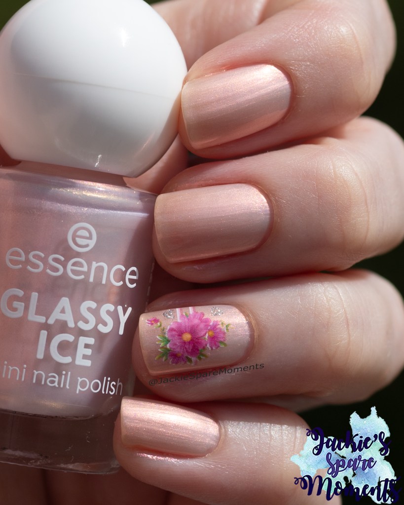
Essence Glassy Ice
Essence 09 Glassy Ice mini nail polish
De tweede vakantie manicure was Essence Glassy Ice mini nail polish. Ik draag het in drie laagjes en als accent bracht ik een water decal aan.
The second holiday manicure was Essence Glassy Ice mini nail polish. I wear it in three coats and as accent I added a water decal.
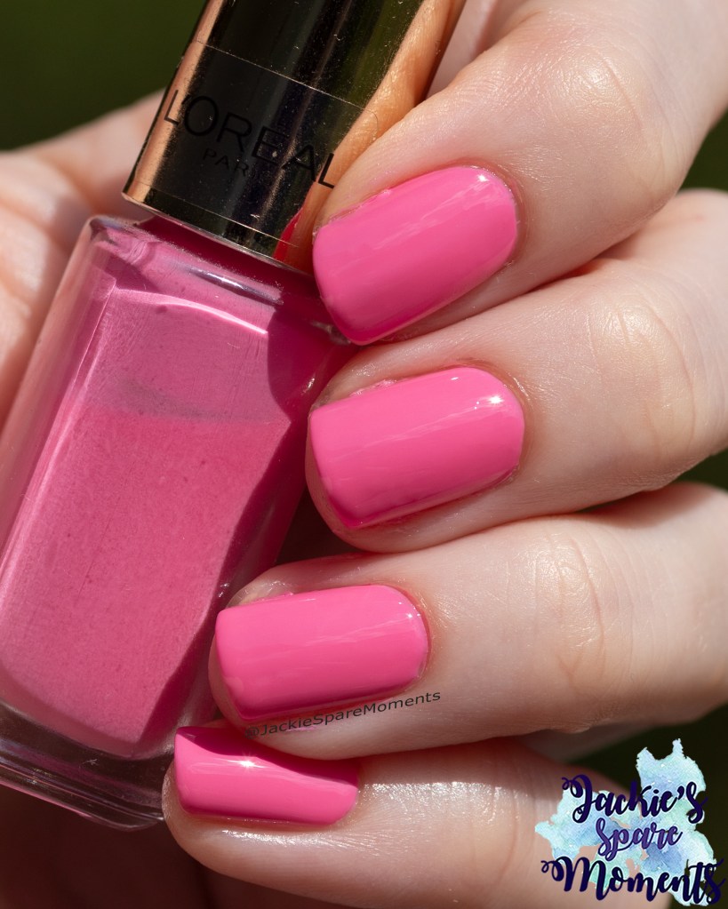
L’Oréal 215 Monaco Roses
L’Oréal Color Riche 215 Monaco Roses
De laatste manicure van de vakantie was L’Oréal Monaco Roses. Ik draag het in drie laagjes. Mooie zomerse roze kleur.
The final manicure of the holiday was L’Oréal Monaco Roses. I wear it in three coats. A nice summer pink.
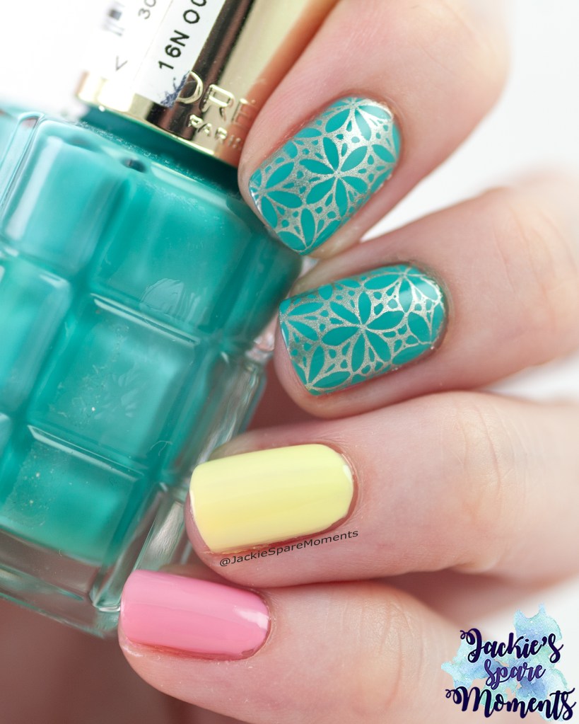
L’Oréal Color Riche A L’Huile skittle manicure
L’Oréal 770 Vert Epoque, B07 Jaune Citron and B08 Rose Bonbon
Meteen na thuiskomst bracht ik deze skittle manicure aan. Op de duim en ringvinger draag ik L’Oréal B07 Jaune Citron. Op wijsvinger en middelvinger draag ik L’Oréal 770 Vert Epoque. Op mijn pink bracht ik L’Oréal B08 Rose Bonbon. Ik draag alle kleuren in twee laagjes. De gele nagellak gaf wel gele staining. Maar een geel in twee laagjes is altijd winst. Als accent bracht ik over de groene nagels een afbeelding aan van Dashica Infinity Nails 188 met een rose gold stempellak.
Immediately after arriving home I painted this skittle manicure. On the nails of the thumb and ring finger I wore L’Oréal B07 Jaune Citron. On the nails of my pointer finger and middle finger I wore L’Oréal 770 Vert Epoque. On the nail of my pinky I wore L’Oréal B08 Rose Bonbon. I wore each colour in two coats. The yellow nail polish caused some staining on my nails. But a yellow nail polish that I can wear in just two coats is always a winner. As accent I added an image from stamping plate Dashica Infinity Nails 188 with a rose gold stamping polish.
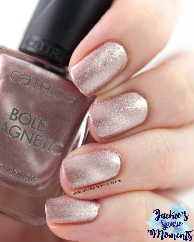
Catrice Bold Magnetic Don’t Be So Clingy
Catrice Bold Magnetic 020 Don’t Be So Clingy
Mijn laatste manicure van de maand is een nieuwe magnetische nagellak van Catrice. Ik heb op elke nagel Catrice Bold Magnetic 020 Don’t Be So Clingy in twee laagjes aangebracht. Ik ben niet zo handig in magnetische nagellakken. Daarom draag ik ze niet zo vaak, want het kost veel tijd om zo’n nagellak op 10 nagels met de magneet stap aan te brengen. Al met al was ik heel tevreden met het resultaat!
My final manicure this month is a new magnetic polish from Catrice. I wore Catrice Bold Magnetic 020 Don’t Be So Clingy in two coats. Magnetic polishes are not my most practiced technique to apply. I don’t wear them not so often because it takes a lot in time to apply a magnetic polish on 10 nails with the magnetic step between every layer. In the end I was very happy with the result!
De maand begon erg warm, maar daarna koelde het af en het eindigde met een periode van wisselvallig weer. Typisch Hollands zomerweer. Net voor het midden van de maand startte de schoolvakantie. Al met al kon ik regelmatig nagels lakken deze maand. Ik heb zelfs een paar keer neon nagellak gedragen. Ik draag elke manicure met base coat en top coat tenzij anders vermeld.
The month started off really hot, but it cooled down. By the end of the month it was regularly rainy and rather cool for summertime. All with all a typical Dutch summer. Just before the middle of the month the summer school holidays started. I was able to paint my nails on a regular basis. I even wore a few neon nail polishes. I wear every manicure with base coat and top coat unless otherwise stated.
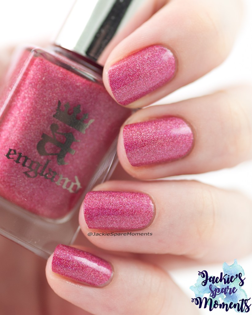
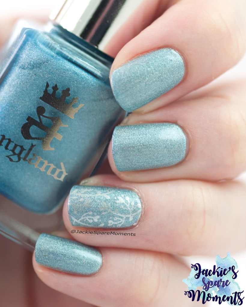
A England Chamuel
A-England Chamuel
Mijn eerste manicure van de maand was A England Chamuel. Deze roze-rode nagellak is volledig dekkend in een laagje. Toch bracht ik er twee aan. In de zon heeft het een prachtige holo flare.
My first manicure this month was A England Chamuel. This pinkish red nail polish reaches full coverage in one coat. Still I wore two coats. In the sun this polish has a beautiful holographic flare.
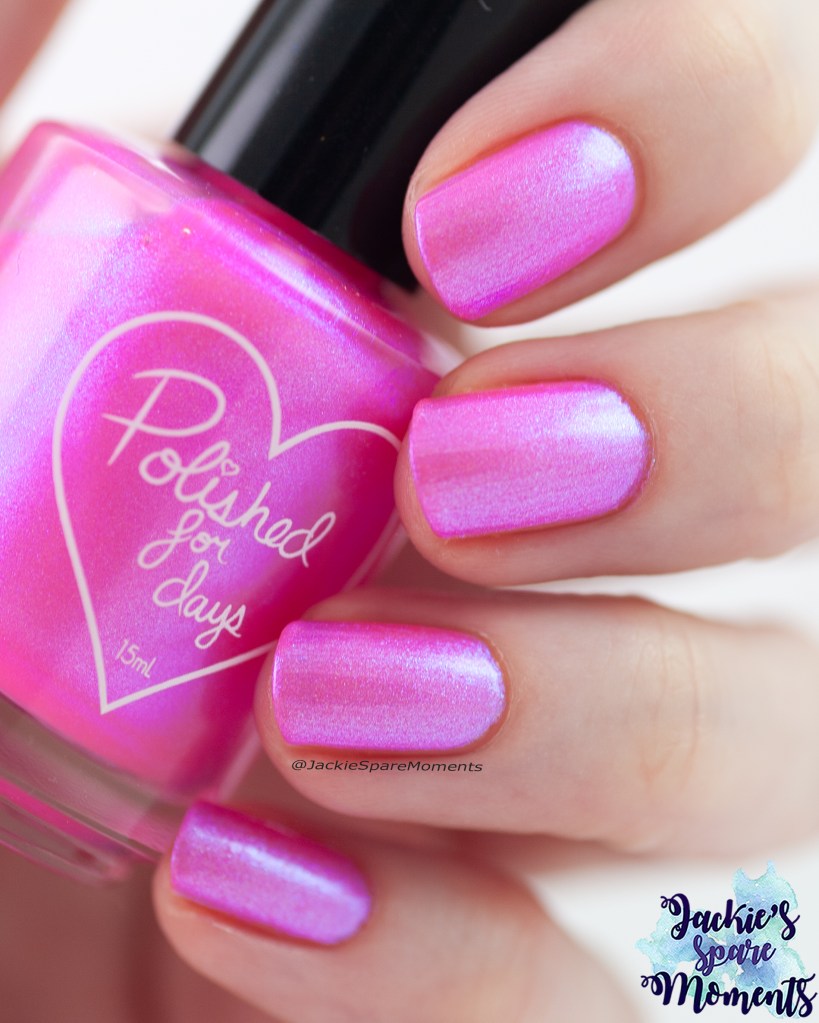
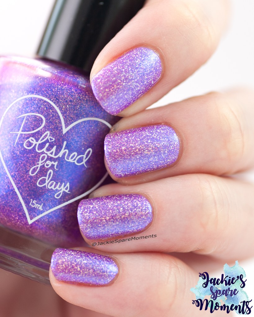
Polished for Days Barbie On The Boardwalk
Polished for Days Barbie On The Boardwalk
Daarna droeg ik Barbie On The Boardwalk. Dit is een neon roze nagellak met blauwe shimmer. Ik droeg het in drie laagjes. De shimmer is very glowy. Een leuke zomerkleur.
Next I wore Barbie On The Boardwalk. It’s a neon pink polish with blue shimmer. I wore it in three coats. The shimmer is very glowy. It’s a fun summer colour.
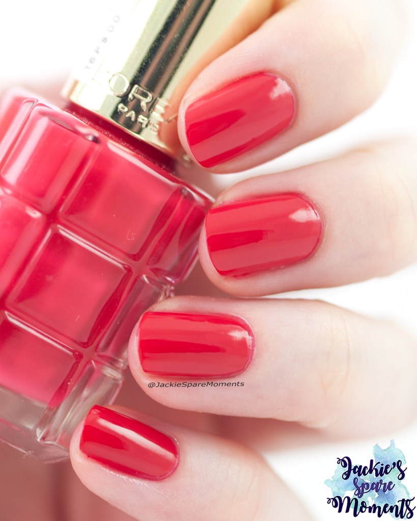
L’Oréal Color Riche A L’Huile Je T’Aime
L’Oréal Color Riche A L’Huile Je T’Aime
Daarna koos ik voor een helderrode creme nagellak. Dit is L’Oréal Je T’Aime in twee laagjes. En fijne zomerse rode nagellak.
Then I wore a bright red cream nail polish. This is L’Oréal Je T’Aime in two coats. It’s a nice summery red nail polish.
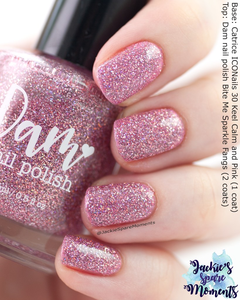
Dam nail polish Bite Me Sparkle Fangs
Dam nail polish Bite Me Sparkle Fangs
Vorig jaar droeg ik Bite Me Sparkle Fangs naar het concert van P!nk in Amsterdam. Ik wilde het graag weer dragen. Vorig jaar droeg ik het in drie laagjes met glitter smoothing top coat en top coat. Dit jaar draag ik een laag van een roze creme nagellak (Catrice Keep Calm and Pink) en twee dunne laagjes Dam. Het totaal geeft ook een dekkend resultaat en het totaal is dunner op de nagels. Zelfs met glitter smoothing top coat en normale top coat erbij. De drie lagen van vorig jaar waren best dik.
Last year I wore Bite My Sparkle Fangs to the concert of P!nk in Amsterdam. I wanted to wear it again. Last year I wore it in three normal coats with glitter smoothing top coat and top cat. This year I wore a layer of pink cream nail polish (Catrice Keep Calm and Pink) and two thin coats of the Dam polish. In total it looks full coverage but including glitter smoothing top coat and top coat it much thinner on the nails. The result of last year was really thick on the nails.
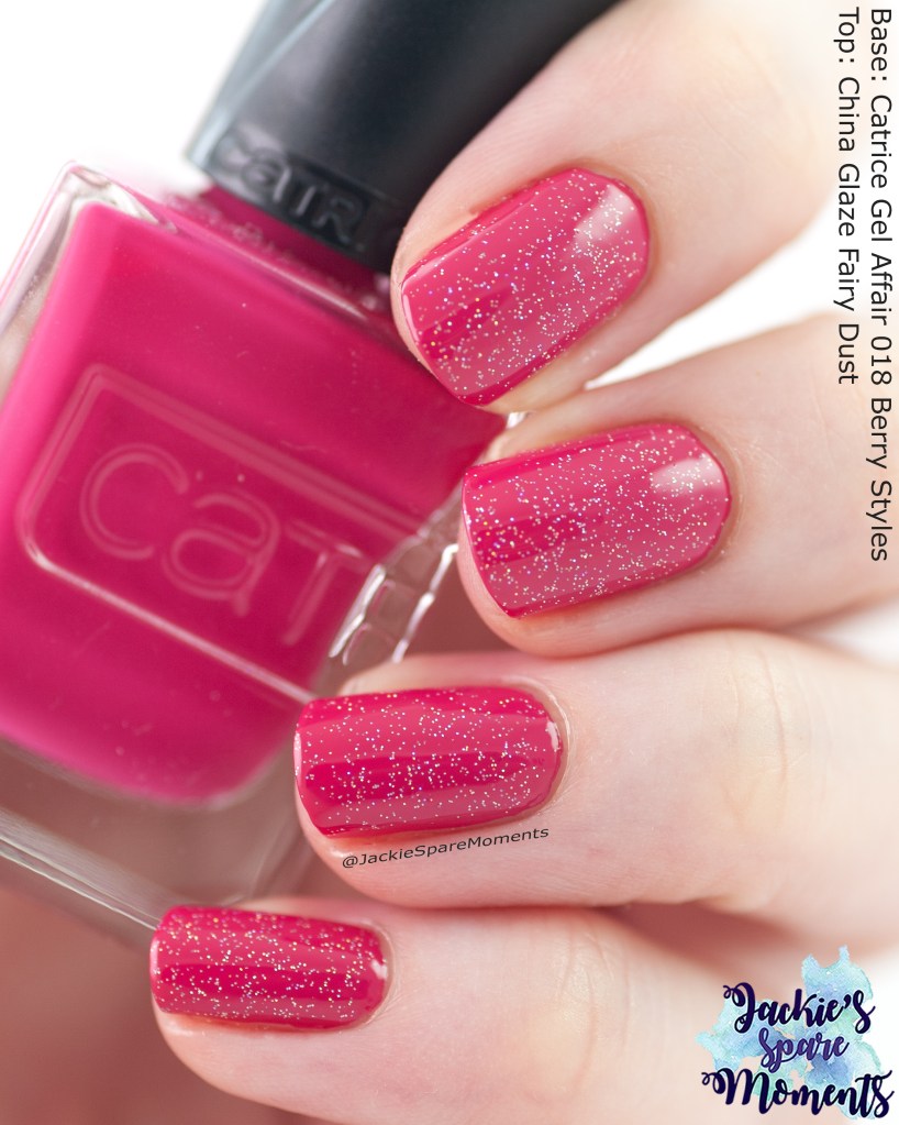
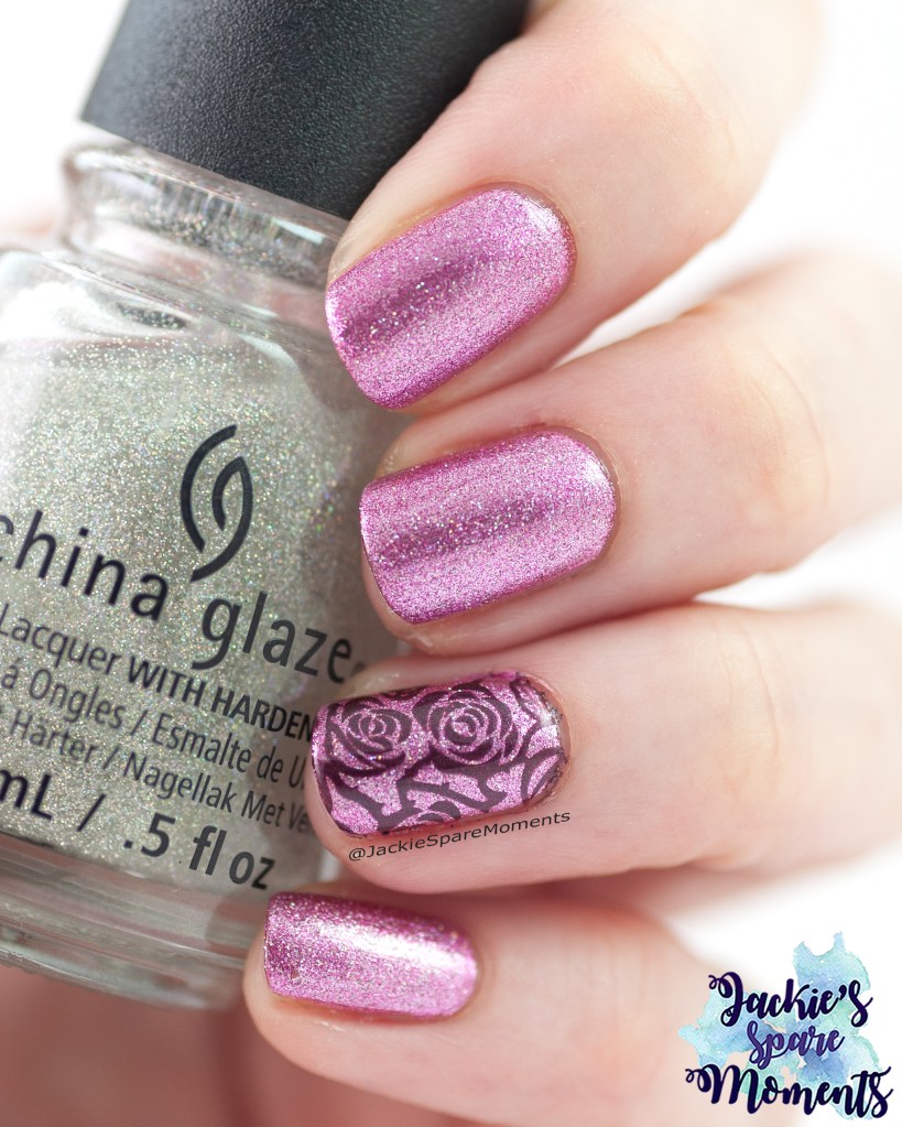
Catrice Gel Affair 018 Berry Styles
Catrice Gel Affair 018 Berry Styles with China Glaze Fairy Dust
Daarna droeg ik Berry Styles van de Gel Affair lijn van Catrice. Het is een mooie diepe bessen roze kleur. Ik draag het in twee laagjes met een laagje China Glaze Fairy Dust.
Next I wore Berry Styles of the Gel Affair line by Catrice. It’s a beautiful deep berry pink. I wear it in two coats with one coat of China Glaze Fairy Dust.
Masura Tears Of My Ex
Masura Tears Of My Ex
Toen was het de verjaardag van Zoon. Voor zijn verjaardag mag hij mijn manicure uitkiezen. Hij wilde net als vorig jaar een glitterige blauwe nagellak. Hij koos voor Masura Tears Of My Ex. Ik moest een beetje lachen om zijn keus. Dit is een duidelijk voorbeeld dat je nagellak draagt voor de kleur en niet voor de naam. Ik draag de Masura in twee laagjes. Net als vorig jaar heb ik de afbeelding met verjaardagslingers van KADS stempelplaat Mini 032 gebruikt. Deze keer heb ik gestempeld met meerdere kleuren. Vervolgens heb ik glitter smoothing top coat en daarna normale top coat gebruikt. Zoon was zeer te spreken over het resultaat. Na de zomervakantie gaat hij naar de middelbare school. Ik ben heel benieuwd of hij dan nog steeds door wil gaan met de verjaardagsnagellak uitkiezen.
Now it was Son’s birthday. For his birthday we have this little habit that he can pick my manicure. Like last year he wanted me to wear a blue nail polish with glitter. He chose Masura Tears Of My Ex. It amused me, because it was a clear example that you wear a nail polish for its colour and not for its name. I wore Tears Of My Ex in two coats. Like last year I added an image with birthday garlands from KADS stamping plate Mini 032. I used multiple colours for the image. Then I added glitter smoothing top coat and regular top coat. Son was very happy with the result. After the summer holidays he’ll start secondary school. I hope this little tradition will continue, but it wouldn’t surprise me if things will change. He’s growing up fast!
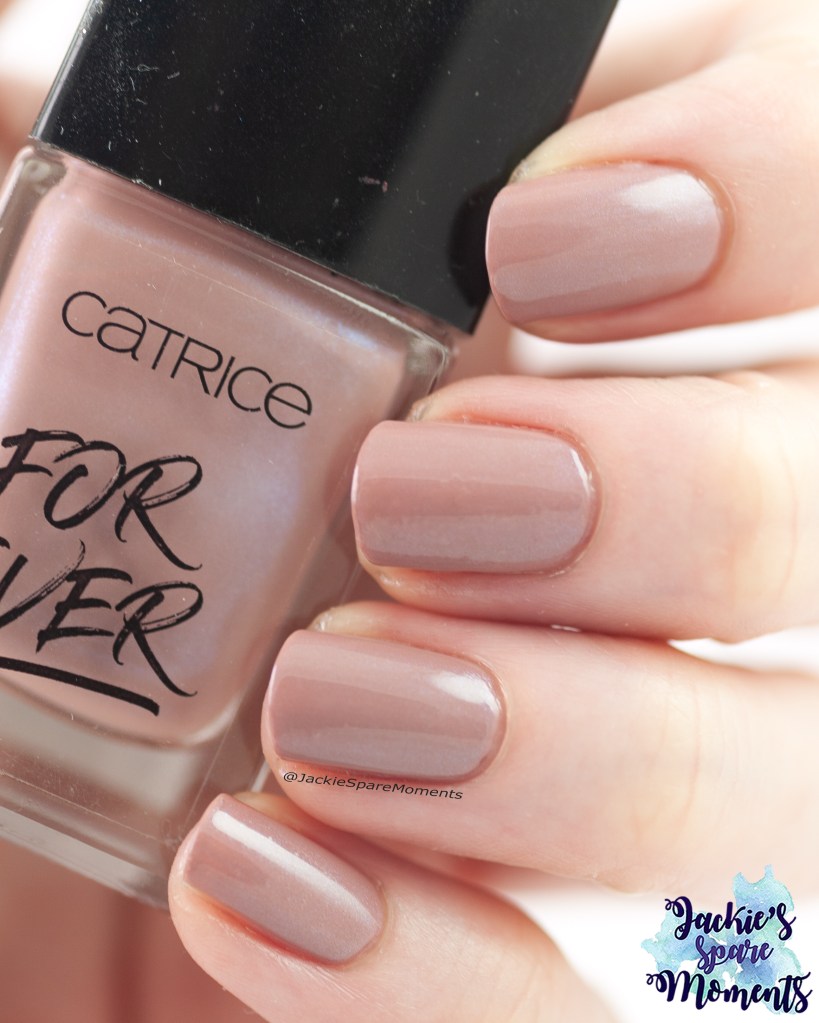
Bourjois Bouquet Of Roses
Bourjois Bouquet of Roses
Daarna koos ik voor een neutrale kleur. Dit is Bourjois Bouquet Of Roses in drie dunne laagjes. Deze zachte roze nagellak heeft een lichte shimmer. Neutraal maar wel met een beetje extra.
Next I chose a palette cleanser or a more neutral manicure. This is Bourjois Bouquet Of Roses in three thin coats. This soft pink nail polish has a bit of shimmer. Neutral with a little extra to it.
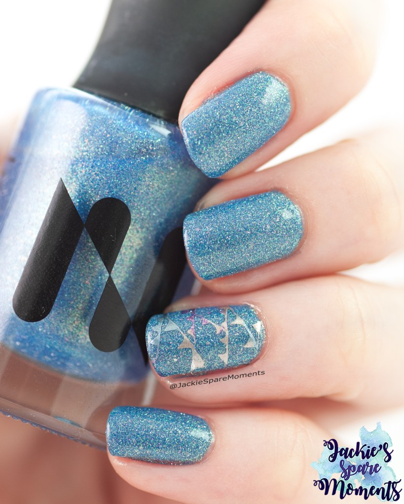
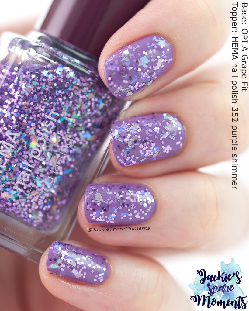
OPI A Grape Fit with topper
OPI A Grape Fit with HEMA purple shimmer topper
Vervolgens had ik wel weer zin in wat meer uitgesproken kleur op de nagels. Ik koos voor de HEMA topper Purple Shimmer en koos er een bijpassende creme bij. Dat werd OPI A Grape Fit en ik draag het in twee laagjes. Daarover bracht ik een dikke laag aan van de HEMA topper. Glitter smoother top coat was niet nodig, een dikkere laag van mijn gewone top coat was genoeg. Het is een leuke topper met metalen glitters, iridiscerende snippers en holografische snippers. Afhankelijk van het licht ziet het er steeds anders uit.
Then I was ready for a more colourful manicure. I chose the HEMA topper Purple Shimmer and picked a matching cream to use it over. I chose OPI A Grape Fit and I applied it in two coats. Then I added a thick layer of the HEMA topper. I didn’t need glitter smoothing top coat, a thick layer of my regular top coat was enough. It’s a fun topper with metallic glitter, iridescent shards and holographic shards. Depending on the light it looked different every time.
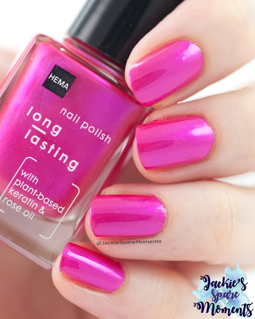
HEMA nail polish Candy Twinkle
HEMA nail polish 115 Candy Twinkle
Daarna volgde een tante – nichtje duo manicure. Ons nichtje was op bezoek en wilde graag met tante haar nagels lakken. Zij koos deze roze HEMA nail polish Candy Twinkle. Ik lakte haar en mijn nagels met maar een laagje, zo dekkend is deze nagellak.
Then an aunt – niece manicure followed. My niece was visiting us and wanted to paint her nails met Auntie. She picked this bright pink nail polish by HEMA nail polish called Candy Twinkle. I painted her nails and my nails with just one coat, so much coverage gives this polish.
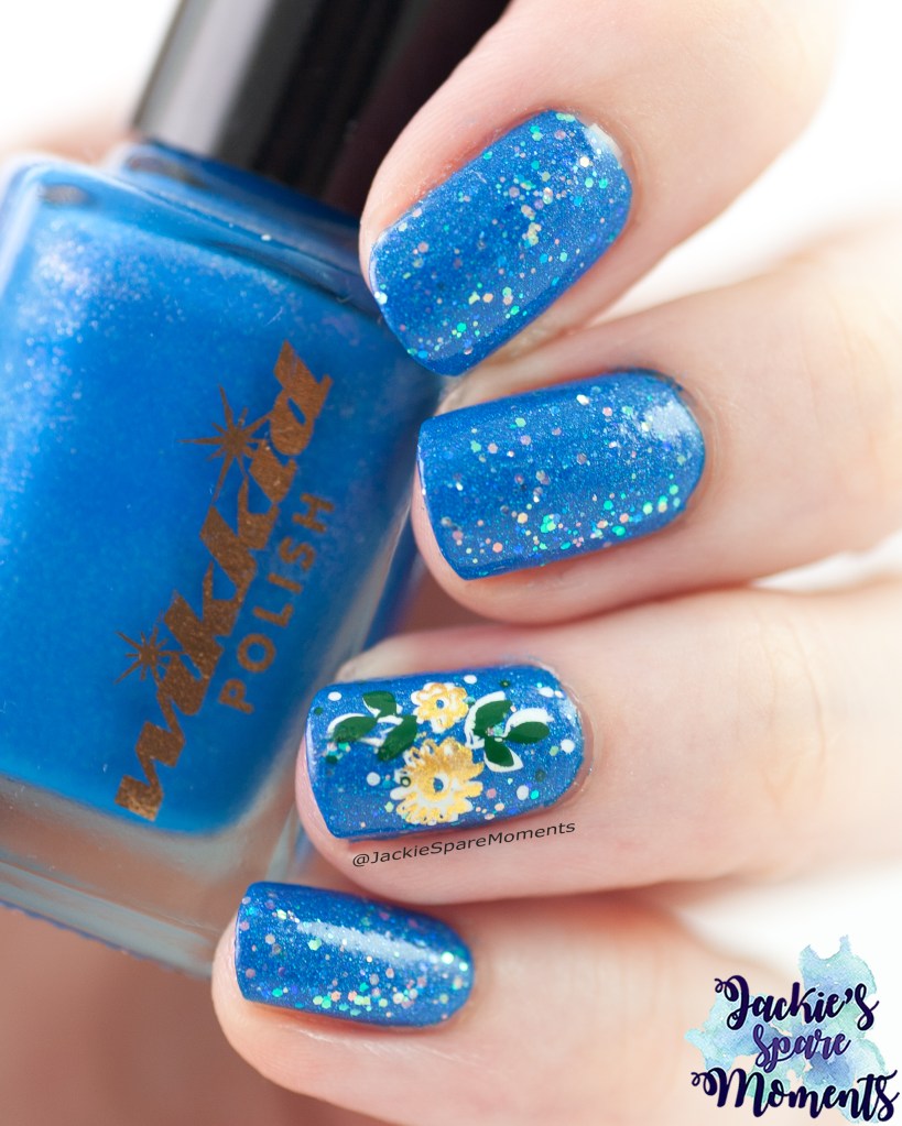
Wikkid polish Dodge ‘em with OPI Better Be Blue
Wikkid polish Dodge ‘em with OPI Better Be Blue
Nu volgt een herhaling van een manicure die ik eerder heb gedragen. Dit is Wikkid polish Dodge ‘em, een neon blauwe nagellak. Ik draag het in twee laagjes en daarover een laagje OPI Better Be Blue. Als accent bracht ik nu een afbeelding aan van KADS stempelplaat Flower 044.
This is a rewear from another summer. This is Wikkid polish Dodge ‘em, a neon blue nail polish. I applied it in two coats and added a layer of OPI Better Be Blue. As accent I added an image from KADS stamping plate Flower 044.
Jelly sandwich
Jelly sandwich with Kinetics Glitter Storm
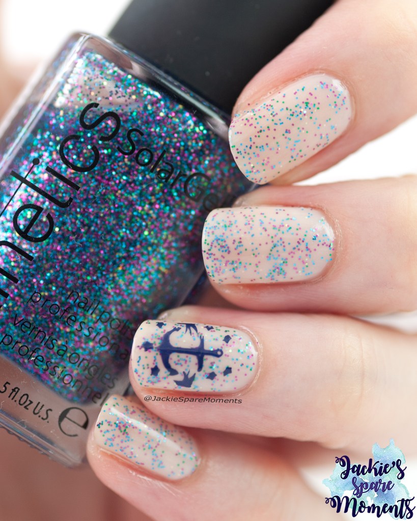
De laatste manicure van de maand is een jelly sandwich. Als basis startte ik met twee laagjes Catrice Cloudy Illusion, daarna bracht ik een laagje Glitter Storm aan en tot slot nog een laagje Milky Not Guilty. Het resultaat voelde nautisch aan. Dus wilde ik dat verder accentueren met een afbeelding van een anker met sterren en twee zwaluwen van stempelplaat Dashica SdP 22.
The last manicure of the month is a jelly sandwich. As base I started with two layers of Catrice Cloudy Illusion, then I added a layer of Glitter Storm and finally a layer Milky Not Guilty. The result seemed nautical to me. So I wanted to accentuate that more with an image of an anchor surrounded by stars and swallows from stamping plate Dashica SdP 22.
Gedurende de maand hadden we twee keer een periode met heel warm weer. Technisch gezien start eind deze maand de zomer, maar het weer was er al vroeg bij. Ik heb deze maand gemiddeld drie keer per week mijn nagels kunnen lakken. Dus veel foto’s deze maand. Alles heb ik gedragen met base coat en top coat, tenzij anders vermeld.
Twice this month we had a period with very warm weather. While technically the summer season started at the end of the month, the summer weather came early. I was able to paint my nails on average three times a week. So enjoy all the photos of this month. Every manicure was worn with base coat and top coat, unless otherwise stated.
Pantone Moccha Mousse floral edition
Essie Clothing Optional, Essence I am what I am, Catrice Aqua Man-icure with floral stamping detail
De eerste manicure van de maand was geïnspireerd op een kleurenpallet hoe je Pantone Mocha Mousse in de zomer kon dragen. Voor Mocha Mousse koos ik Essie Clothing Optional en voor de andere kleuren van het pallet gebruikte ik Essence I am what I am (groen) en Catrice ICONails 117 Aqua Man-icure (blauw). Ik bracht elke kleur in twee laagjes aan. Op mijn ringvinger bracht ik een afbeelding van Dashica stempelplaat SdP-65 aan met een blauwe stempellak.
The first manicure of the month was inspired by a colour palette that showed how you could use Pantone Mocha Mousse in the summer season. As Mocha Mousse I chose Essie Clothing Optional and the other colours are Essence I am what I am (green) and Catrice ICONails 117 Aqua Man-icure (blue). I wore each colour in two coats. On my ring finger I added an image from Dashica stamping plate SdP-65 with a blue stamping polish.
Clionadh Cosmetics Palace
Clionadh Cosmetics Palace
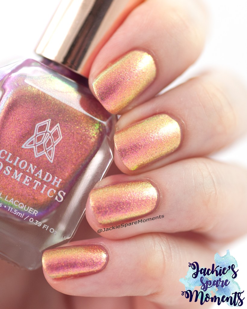
Daarna droeg ik deze multichrome nagellak: Clionadh Cosmetics Palace. Ik draag het in twee laagjes. De nagellak heeft een larger particle pigment. Dat geeft het idee van textuur onder de macro lens, maar in de praktijk ziet her een stuk gladder uit. Deze multichrome heeft echt heel veel kleur shifts! Hoofdkleuren als je er recht naar kijkt zijn dieproze naar rosé goud. Maar daarnaast zie je ook geel, groen en blauw en paars langskomen in de verschillende lichtvallen en hoeken.
Next I wore this multichrome nail polish: Clionadh Cosmetics Palace. I wore it in two coats. This nail polish has a larger particle pigment. Under a macro shot it gives the illusion of texture, but in normal circumstances it looks smooth. This multichrome has many color shifts! The main colours when looking head on are pink and rose gold (or peach). But then come the other colours like yellow, green. blue and purple depending on the light and angles.
Catrice Jelly-licious met ILNP My Private Rainbow
Catrice ICONails 141 Jelly-licious with ILNP My Private Rainbow (L+S)
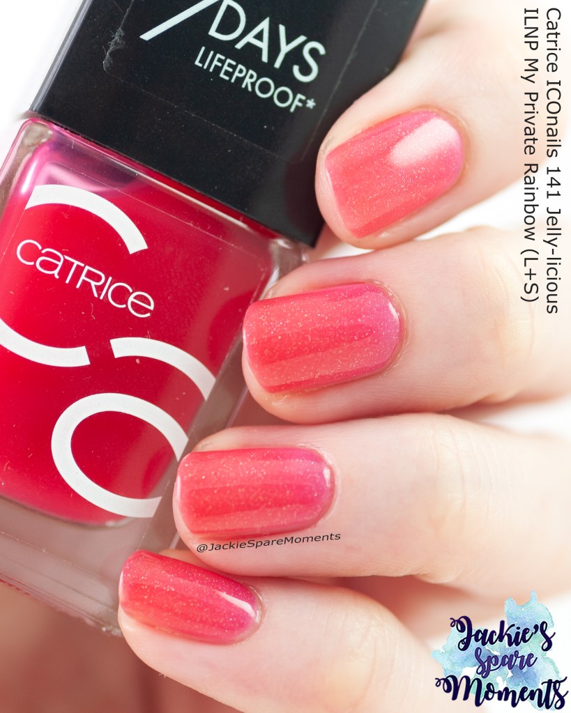
Ik had zin in een jelly sandwich. Dan gebruik je een meer transparante nagellak (een jelly, hier Catrice Jelly-licious) en een effect topper (hier ILNP My Private Rainbow) en bouw je het resultaat op. Hier heb ik het resultaat opgebouwd uit een laagje Catrice, gevolgd door een laagje ILNP, weer een laagje Catrice en nogmaals een laagje ILNP. Ik had het extra laagje ILNP nodig, want het holografische effect was niet genoeg zichtbaar. Heel resultaat was heel mooi in de zon. Helaas verbloemde het totaal niet helemaal de uitgroeiende verkleuringen in mijn nagels.
I craved a jelly sandwich manicure. It’s a manicure where you use a more transparent nail polish (a jelly, here Catrice Jelly-licious) and an effect topper (here ILNP My Private Rainbow) and in layers you build the look. Here I build it up through a layer of Catrice, a layer of ILNP, another layer of Catrice an finally another layer of ILNP. I needed the extra layer of ILNP, because the holographic effect was very shy. The end result was very pretty in the sun. It did not fully hide my outgrowing discolouration in my nails.
ILNP Petals
ILNP Petals
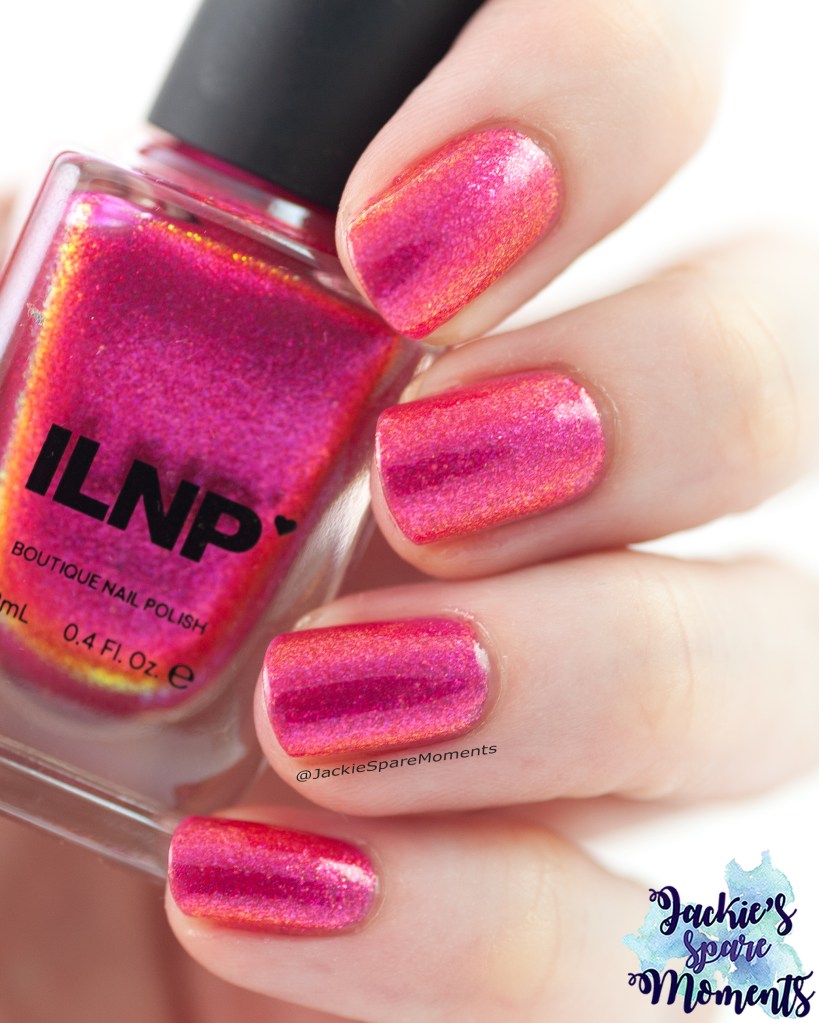
Daarna koos ik voor ILNP Petals. Ik droeg het in drie laagjes. Het heeft mooie shifts van roze naar rood naar goud. Het was de nagellak waar ik deze maand complimenten voor kreeg, toen ik het droeg.
Next I chose for ILNP Petals. I wore it in three coats. It has beautiful shifts. It was the nail polish that got me compliments this month.
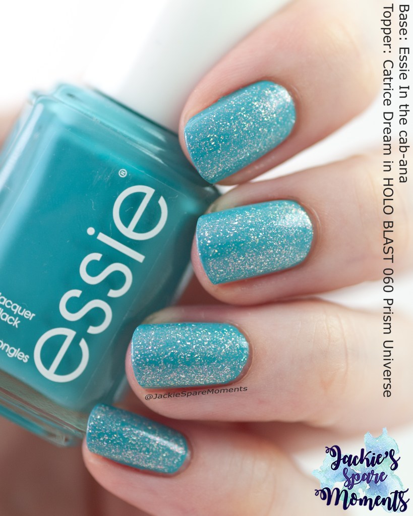
Essie In the cab-ana with topper
Essie in the cab-ana topped with Catrice Prism Universe
Na alle roze, even een onderbreking met een blauwe nagellak. Ik draag hier twee laagjes Essie In the cab-ana met een laagje Catrice Prism Universe. Onder mijn lampen op de foto zie je het holografische effect nauwelijks, maar het was heel mooi in de zon.
After all the pink manicures, I took a break with a blue polish. I’m wearing two coats of Essie In the cab-ana and one coat Catrice Prism Universe. Under the lights in the picture you can hardly see the holographic effect, but it was really pretty in the sun.
KBShimmer Sea-ing Is Believing
KBShimmer Sea-ing Is Believing
Daarna ging ik weer voor een multichrome nagellak. De basis is paars, maar de flakes hebben shifts tussen roze, oranje, geel, groen, blauw en paars. Een volle regenboog dus. Ik draag KBShimmer Sea-ing Is Believing in twee laagjes. Op mijn ringvinger bracht ik nog een afbeelding aan van stempelplaat KADS Flower 054 met zilver.
Next I wore another multichrome nail polish. The base is purple, but the flakes steal the show. They shift from pink to orange, yellow, green, blue and purple. A full rainbow. I wore KBShimmer Sea-ing Is Believing in two coats. On my ring finger I added an image from stamping plate KADS Flowe 054 with silver.
Catrice MTN translucent effect 01 N-Ice Day
Catrice N-Ice Day
Daarna koos ik voor een parelmoer effect nagellak. Want ik wilde mijn nagels hetzelfde hebben als de parelmoeren knoopjes op mijn zomerjurk. Ik draag hier Catrice N-Ice Day in twee laagjes. Het was heel warm weer en de naam klonk verkoelend.
Next I wore a pearl effect nail polish. I wanted to match my nails to the pearl buttons on my summer dress. I’m wearing Catrice N-Ice Day in two coats. It was really hot weather and the name sounded cooling.
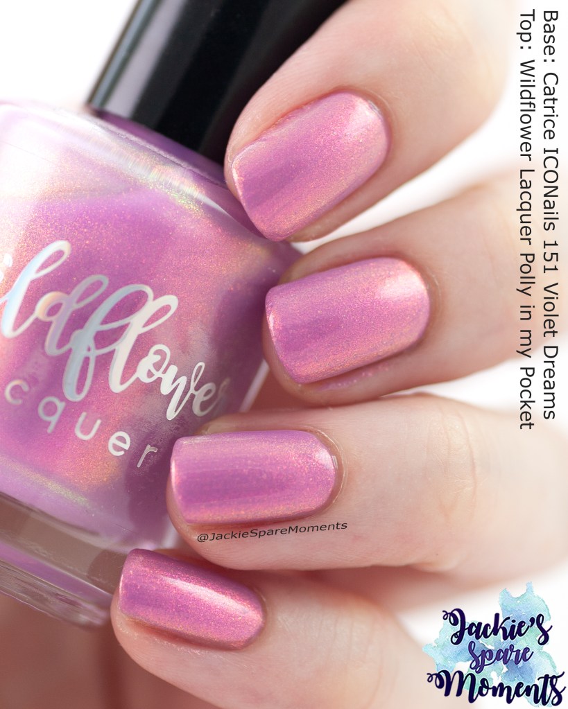
Wildflower Lacquer Polly in my Pocket with undies
Wildflower Lacquer Polly in my Pocket over Catrice ICONails 151 Violet Dreams
Daarna droeg ik Wildflower Lacquer Polly in my Pocket. Eerst draag ik twee laagjes Catrice ICONails 151 Violet Dreams en dan pas een laagje Wildflower. Dit is mijn enige nagellak van Wildflower. Inmiddels heeft de eigenaar van het merk de naam van het merk veranderd naar Royla Lee. Daarom wil ik er extra zuinig mee doen en met een passende basiskleur hoef ik maar een klein beetje te gebruiken.
Next I wore Wildflower Lacquer Polly in my Pocket. First I painted two layers of Catrice ICONails 151 Violet Dreams and next a layer of Wildflower. This is my only nail polish by Wildflower. The owner has rebranded her nail polish brand to Royla Lee. That’s giving me the motivation to be very frugal with it and by using a matching base colour I only need to use a little bit.
KBShimmer Wander-ful World
KBShimmer Wander-ful World
Vervolgens koos ik voor KBShimmer Wander-ful World. Ik had deze nagellak eerder gedragen gecombineerd met nail art. Maar deze keer wilde het graag dragen in een eenvoudige manicure. Ik droeg het in twee laagjes. Onder mijn lampen was het niet zo zichtbaar, maar in de zon was de holo prachtig.
Then I chose to wear KBShimmer Wander-ful World. I had worn this nail polish before with some nail art. This time I wanted to wear it as a plain manicure. I wore it in two coats. Under my photography lamps it’s not so visible, but in the sun the holographic effect is beautiful.
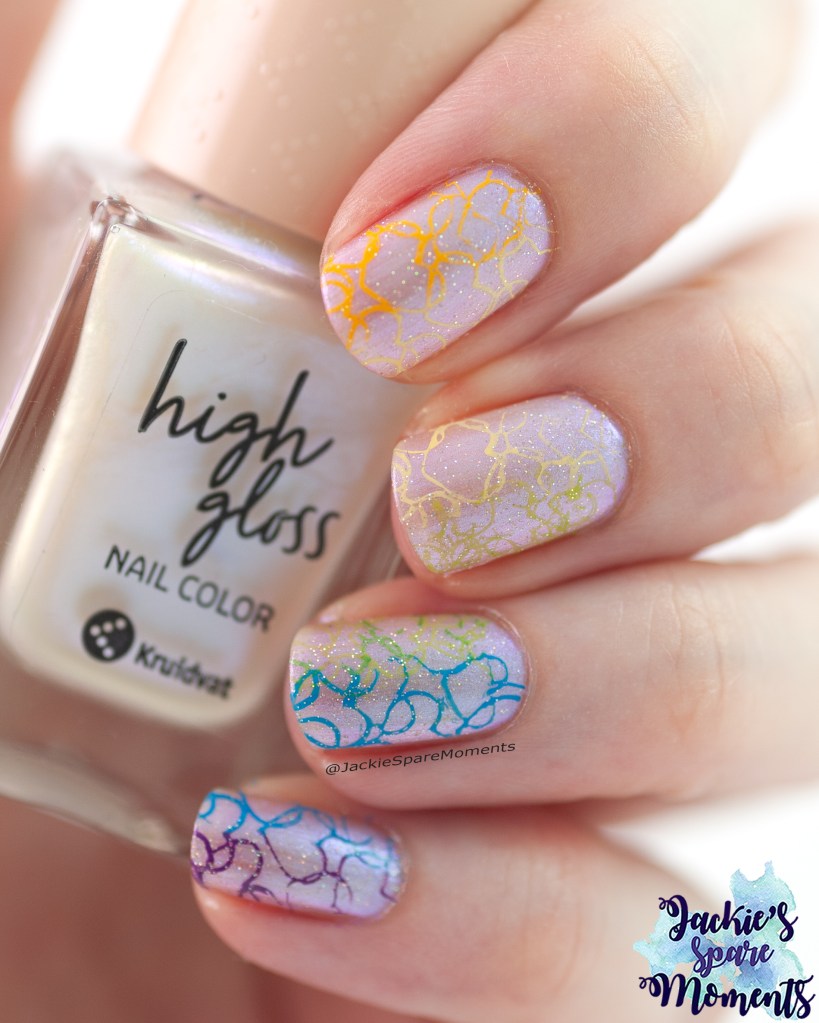
Pride nail art
Pride nails 2025
In het laatste weekeinde van juni droeg ik deze pride nail art. Als basis gebruikte ik twee laagjes van Kruidvat nail color 012 chrome moon. Daarover stempelde ik een regenboog van hartjes. Ik starte op mijn duim met rood en oranje. De rest van de regenboog zie je op de foto. De groene stempellak pakte heel slecht, uiteindelijk heb ik de groene hartjes twee keer over elkaar gezet. Het geheel heb ik een laagje gegeven van China Glaze Fairy Dust. De hartjesafbeelding komt van Dashica stempelplaat Infinity Nails 88.
For the last weekend of June I wore this pride nail art. As base I used Kruidvat nail color 012 chrome moon. Then I stamped a rainbow in heart images. I started on my thumb with red and orange. The rest of the rainbow is on the picture. I had trouble with the green stamping polishes (both of them didn’t wat to cooperate), so in the end I stamped the green hearts twice on top of each other. Then I added a layer of China Glaze Fairy Dust. The heart image is from Dashica stamping plate Infinity Nails 88.
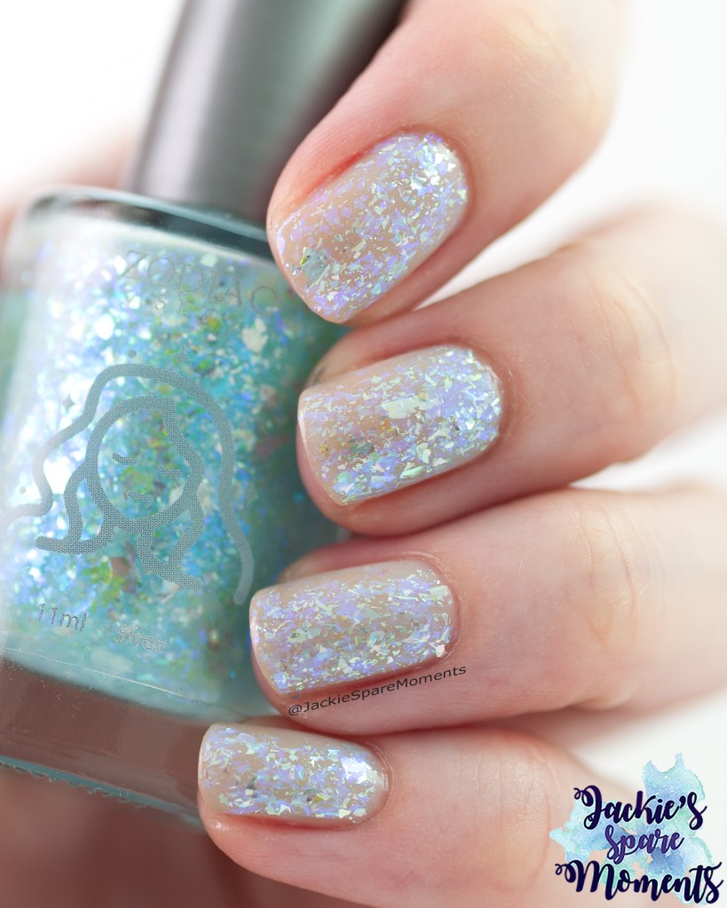
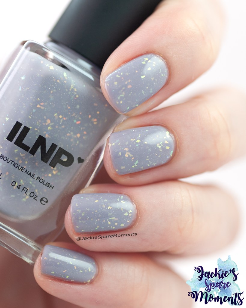
Zodiac Set Blue Calcite
Blue Calcite
Mijn laatste manicure was deze ijsblauwe flake nagellak. De volgende piek van warm zomerweer kwam er weer aan. De basis is een blurring base coat (zodat mijn nagels wat egaler tonen). Daarna bracht ik twee laagjes aan van Blue Calcite. Deze nagellak is van een Zodiac collab van by Dany Vianna, by Vanessa Molina en Whatcha. Het is echt een edelsteen op je nagels.
My final manicure was this icy blue flake nail polish. The next peak of hot summer weather was building up. As base I used a blurring base coat (to have more even colouring on my nails). Next I painted two coats of Blue Calcite. This nail polish is from the Zodiac collab of by Dany Vianna, by Vanessa Molina and Whatcha. It’s a gem stone on your nails.
Een nagellak alphabet is geen nieuw idee. Vooral op Instagram zijn er challenges te vinden die op alphabet gaan. Maar toen ik de video’s zag van Kae the Stephanie en Kokia Faina, was ik erg geïnspireerd om ook eens het alphabet te gebruiken. De regels zijn zo’n beetje om voor elke letter van het alphabet in je collectie een nagellak te vinden die een favoriet is of om andere redenen speciaal is. De eindselectie geeft dan inzicht in wat voor type nagellakken voor jou belangrijk zijn of van welke typen nagellak en kleuren je houdt. Ik vond deze video’s zo leuk, dat ik deze blog post doe. Mijn plan was geen nieuwe foto’s te maken voor deze blog en dat lukte bijna. Met veel plezier heb ik gezocht tussen mijn oude foto’s om mijn keuze voor alle letters van het alphabet te maken. Nou ja, bijna alle letters dus.
A nail polish alphabet is not a new concept.I have seen a couple of nail polish alphabets on Instagram as challenges. But I was very inspired by the videos by Kae the Stephanie and Kokia Faina. The rules are to find a polish for every letter of the alphabet in your collection that is a favourite or is special for another reason. The final selection gives insight in the type of nail polishes you love and the colours you prefer. Their videos were so much fun, that I wanted to do this blog post. I intended to not take new pictures for this post and I was almost successful in this plan. In the end I enjoyed searching through my old pictures finding options for every letter of the alphabet. Well almost all letters.
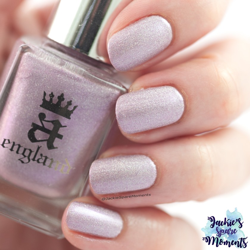
A – A Midsummer Night’s Dream
AEngland A Midsummer Night’s Dream
Bij A koos ik voor A Midsummer Night’s Dream. Deze nagellak heb ik jaren bewaard voor een speciale gelegenheid. Uiteindelijk heb ik hem voor het eerst gedragen in het kader van mijn project om ongedragen te dragen en te fotograferen. Het is een prachtige nagellak in een kleur die ik graag draag en een finish die ik graag draag (holografisch en shimmer).
A is for A Midsummer Night’s Dream. I saved this polish for years to wear it for a special occasion. In the end I wore it for the first time because I was doing my project to wear all my unworn and undocumented polish. It’s a beautiful polish in a colour I love to wear (lilac pink) and a finish I love (holographic and shimmer).
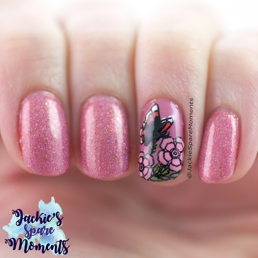
B – Blossom By Blossom
Cuticula Blossom By Blossom
Bij B koos ik voor Blossom By Blossom. Deze nagellak heb ik vorig jaar september voor het eerst gedragen en ik kan niet wachten om hem weer te dragen. Deze nagellak past qua kleur perfect bij de nazomer kleuren van onze tuin.
B is for Blossom By Blossom. I wore this polish for the first time in September last year and I hope to wear it soon. The colour of this polish is perfect with the colours of our garden at the end of summer.
C – Celeste
ILNP Celeste
Bij C koos ik voor Celeste. Ik houd van lichtpaarse en roze holografische nagellakken. Dus toen ik een optie moest kiezen voor C, wist ik het meteen! Celeste is een lichtpaarse of lila holografische nagellak met een hele duidelijke flair in zonlicht.
C is for Celeste. I love light purple and pink holographic nail polishes. So when I had to pick one for C, I knew it right away! Celeste is a light purple or lilac holographic nail polish with a really strong linear holographic flair.
D – Doll Side Of Life
Catrice ICONails 135 Doll Side Of Life
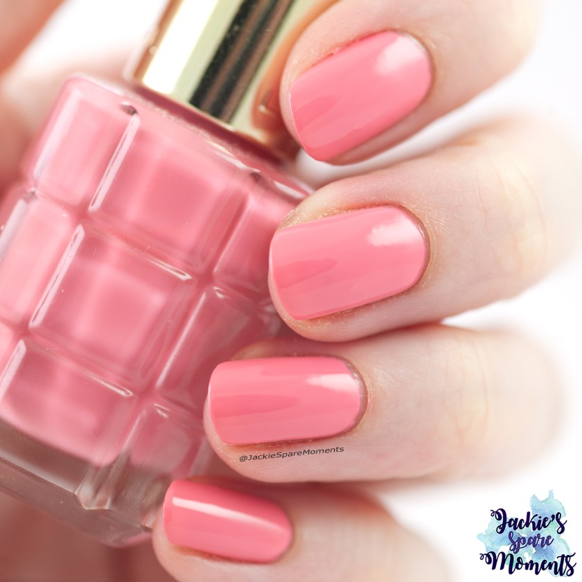
D is voor Doll Side Of Life. Roze creme nagellakken draag ik graag. Dus voor D ging ik voor een hele fijne roze creme nagellak van Catrice.
D is for Doll Side Of Life. I love wearing pink cream nail polishes. So for D I chose a really nice pink cream nail polish by Catrice.
E – Enchanted Rose
Cuticula Enchanted Rose
E is voor Enchanted Rose. Cuticula Enchanted Rose is een lila nagellak met shimmer en flakes. Vrij nieuw in mijn collectie, maar naar mijn mening de mooiste van de letter E.
E is for Enchanted Rose. Enchanted Rose by Cuticula is a lilac nail polish with shimmer and flakes. It’s a more recent addition, but in my opinion it was the prettiest in my collection starting with E.
F – Forget Me Not
AEngland Forget Me Not
Bij F koos ik voor Forget Me Not. Ik houd van de lineaire holografische nagellakken van A England. En deze nagellak heb ik als pedicure gedragen, maar ik zou hem nog heel graag een keer dragen als manicure.
F is for Forget Me Not. As stated before I love holographic nail polishes and I also love love love the holographic nail polishes by A England. I wore this polish as a pedicure, but I would love to wear it as a full manicure too.
G – Gorge-ous Geodes
Essie Gorge-ous Geodes
Bij G koos ik voor Gorge-ous Geodes. In 2019 had Essie een holografische collectie. Sinds ik mijn seizoens selecties maak, plan ik altijd een van deze nagellakken om te dragen. Maar met zoveel ongedragen nagellakken die voorrang hebben, kom ik er nog steeds niet aan toe. Maar bij mijn nagellak alphabet kon ik bij G deze collectie toch even aandacht geven.
G is for Gorge-ous Geodes. In 2019 Essie had a holographic collection. Ever since I started making my seasonal selections, I plan to wear one of the polishes from this collection. But with so many unworn polishes that go first, I still have not reworn this collection. Now in this alphabet I could give this collection some attention.
H – Holo Moly
Essence Holo Moly
Bij H koos ik voor Holo Moly. Twee jaar geleden kwam Essence met Holo Bomb, een holografische collectie. En nog steeds zijn deze nagellakken hier en daar bij de drogist te koop. Voor de prijs is dit ongelofelijk goede drogisterij holo lak. Dus eigenlijk is dit weer een collectie keuze.
H is for Holo Moly. Two years ago Essence added some holographic polishes to the line up called Holo Bomb. And you can still get them at some drugstores. For the price it’s an unbelievable good drugstore holographic nail polish. So H is another collection choice.
I – I’m A Magpie For Pretties
Wikkid Polish I’m A Magpie For Pretties
I is voor I’m A Magpie For Pretties. Deze unieke nagellak heb ik op instagram gewonnen. Dit is een unieke lak, dus lag als keuze voor de hand. Dit was mijn introductie met het merk Wikkid Polish en ik plaatste daarna nog meerdere bestellingen. Helaas bestaat het merk niet meer.
I is for I’m A Magpie For Pretties. This is a unique nail polish that I won on Instagram. For me an easy choice. It was my introduction to the indie nail polish brand Wikkid Polish. Multiple orders followed. Sadly they are no longer in business.
J – Jardin Des Roses
L’Oréal Jardin Des Roses
Bij J koos ik voor Jardin Des Roses. Een andere roze creme nagellak, die ik al vaker had gedragen voordat ik het een keer fotografeerde. Daarmee verdiende het dus een plekje in het alphabet.
J is for Jardin Des Roses. It’s another pink cream nail polish. I had worn it a couple of times before I finally posed with it for a picture. So it earned its spot in the alphabet.
K – Keeper
Masura Keeper
Bij K koos ik voor Keeper. Masura had een langlopende samenwerking met nagellakbloggers op Instagram in de vorm van Collaborations (collectie). Dus dit is weer een collectie keuze. Keeper is een mooie diepere kleur die ik graag in de herfst draag. Maar dat is alweer een tijdje geleden, ik hoop hem weer eens te dragen.
K is for Keeper. For a long time Masura had a collaboration with nail bloggers from Instagram. This collection was called Collaborations and a couple of times a year new polishes were added. So this is another collection pick. Keeper is a beautiful deeper shade that I love to wear in fall. It’s been a while, so I hope to wear this polish again.
L – Lokelani
Black Dahlia Lacquer Lokelani
Bij L koos ik voor Lokelani. Mijn eerste indie nagellak die een enorme verzameling initieerde. Ik heb hem in 2020 het laatst gebruikt voor deze nail art. Ook deze nagellak wens ik nog een keer te dragen.
L is for Lokelani. This was my first indie nail polish. And it was the start for a good sized collection. I wore this polish with a nail art for the last time in 2020. It’s another nail polish waiting for a rewear.
M – Maria
Wikkid Polish Maria
Bij M koos ik voor Maria. Het merk Wikkid Polish was een ontzettend leuk indie merk uit Groot-Brittannië. Helaas is het merk al een tijd geleden gestopt. Maar de nagellakken van dit merk zijn nog steeds favorieten. Maria is een samenwerkingsnagellak met Maria @nailandcreate op Instagram.
M is for Maria. Wikkid Polish was a really fun indie brand from Great Britain. Sadly they are no longer in business. But many polishes from this brand are still favourites. Maria was a collaboration shade with Maria, @nailandcreate on Instagram.
N – Nymphea
L’Oréal Color Riche A L’Huile 226 Nymphea
Bij N koos ik voor Nymphea. Ik had nog geen diepere roze nagellak gekozen. Nymphea is een dieproze kleur uit de L’Oréal Color Riche A L’Huile lijn. Eigenlijk is dit alweer een collectie keuze. Deze lijn heb ik heel veel gedragen, maar nauwelijks gefotografeerd. Veel van de potjes hebben zichtbaar gebruik.
N is for Nymphea. I had not yet picked a deeper shade of pink. Nymphea is deep pink from the L’Oréal Color Rich A L’Huile line. I loved this line of nail polish. I wore it a lot, but hardly ever took pictures of it. Many polishes of this line have fill lines.
O – On The Way
ILNP On The Way
Bij O koos ik voor On The Way. Deze nagellak van ILNP is in een prachtige metallic finish met kleine holografische glitters. Je kan deze lakken nauwelijks mooi op de foto krijgen. Je moet ze dragen om te waarderen.
O is for On The Way. This nail polish of ILNP is a nail polish with a beautiful metallic finish with little holographic glitters. Polishes with this finish are very hard to photograph. You really have to wear them to see their full beauty.
P – Parma Violets
Wikkid Polish Parma Violets
Bij P koos ik voor Parma Violets. Dit is nog een Wikkid Polish nagellak in deze lijst, maar nu een met een lineaire holografische finish. Deze nagellak heb ik het meest recent nog herdragen in april van dit jaar.
P is for Parma Violets. It’s another Wikkid Polish in this list. Now it’s a lineair holographic nail polish. I wore this one in April this year.
Q – Quick’n Pink
Essence Quick’n Pink
Q is voor Quick’n Pink. Dit is mijn enige nagellak met de letter Q. Ik heb deze nagellak wel gedragen in skittle manicures. Dus om er een goede foto van te hebben, heb ik mijn regels gebroken en het opnieuw geswatched en gefotografeerd.
Q is for Quick’n Pink. This is my only nail polish with the letter Q. I wore this polish only in skittle manicures. So to have a good picture of this polish, I broke my rules and took a real swatch picture.
R – Rosewater
ILNP Rosewater
Bij R koos ik voor Rosewater. Dit is ook een nagellak die ik bewaarde voor een speciale gelegenheid. En dat is ook gelukt. Ik heb hem voor het eerst gedragen op de bruiloft van goede vrienden.
R is for Rosewater. This is also a polish that I saved for a special occasion. And my first time wearing was for a special occasion. I wore this polish to the wedding of good friends.
S – She’s So Extra Terrestrial
China Glaze She’s So Extra Terrestrial
Bij S koos ik voor She’s So Extra Terrestrial. Ik ontdekte dat ik ontzettend veel mooie nagellakken heb met een naam die start met een S. Toch koos ik voor China Glaze She’s So Extra Terrestrial. Dit is een mooie pauwblauw-kleurige holografische nagellak van China Glaze. Wat het ook speciaal maakt is dat mijn man deze nagellak heeft meegenomen van een zakenreis naar Amerika.
S is for She’s So Extra Terrestrial. I learned I have many beautiful polishes starting with S. I chose for China Glaze She’s So Extra Terrestrial. It’s a beautiful teal holographic nail polish. It’s also special to me, because my husband brought it home from a business trip to the USA.
T – The London Scene
AEngland The London Scene
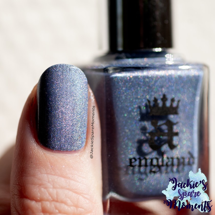
Bij T koos ik voor The London Scene. Ik had nog geen grijze nagellak in mijn alphabet. Dus ik koos voor deze grijze holografische nagellak van A England die ik al meerdere keren heb gedragen.
T is for The London Scene. I noticed I had not yet chosen a grey nail polish in my alphabet. So I chose A England The London Scene, a grey holographic nail polish. I wore this polish multiple times already.
U – Urban Jungle
Essie Urban Jungle
Bij U koos ik voor Urban Jungle. Dit is een creme nagellak van Essie. Ik draag graag de creme nagellakken van Essie, maar ze hadden nog geen plekje in mijn alphabet. Urban Jungle is een lichte nagellak die gemakkelijk aanbrengt en goed draagt. Ik heb deze het meest recent gedragen in maart van dit jaar.
U is for Urban Jungle. This is a cream nail polish by Essie. I like to wear Essie cream polishes. Urban Jungle is easily applied and wears well. My most recent wear was in March this year.
V – Veil & Garland
Penelope Luz and Whatcha Veil & Garland
Bij V koos ik voor Veil & Garland. Ik hoop deze nagellak nog een keer te dragen. En ik houd van deze zachte veelkleurige flakie nagellakken.
V is for Veil & Garland. I hope to rewear this nail polish. I love these soft and ethereal flake nail polishes.
W – Winter Berries
Cadillacquer Winter Berries
Bij W koos ik voor Winter Berries. Deze grijze nagellak met holografische flakes en UCC flakes is een exclusieve nagellak voor de Hypnotic Polish webshop. Deze nagellak is een aantal keren teruggekomen en bij een van de latere edities lukte het mij om hem te kopen. Ik zou graag meer nagellakken van Cadillacquer hebben. Elke nagellak van dit merk is tot nu toe geweldig mooi gebleken.
W is for Winter Berries. This is a grey nail polish with holographic flakes and UCC flakes. It was an exclusive nail polish to the Hypnotic Polish webshop. This polish returned a couple of times and that gave me the option to buy it. I would love to have many more polishes by Cadillacquer. Every polish of this brand has been a favourite.
X – XOXO, Harley
Essence XOXO, Harley
X is voor XOXO, Harley, de enige nagellak die ik heb die start met X. Maar hier is het verhaal niet mee klaar. Deze nagellak heb ik alleen nog maar als pedicure gedragen en ik zou hem ook nog graag als manicure dragen. Het is een mooie rozerode holografische nagellak van essence.
X is for XOXO, Harley. This is my only nail polish starting with X. But that is not the whole story. I only wore this polish as a pedicure and would love to wear it as a manicure too. It’s a beautiful reddish pink holographic nail polish by essence.
Y – You Can Bury Your Own Nuts!
BKL Bee’s Knees Lacquer You Can Bury Your Own Nuts!
Bij Y koos ik voor You Can Bury Your Own Nuts! Deze nagellak is een wijze les. Ik volgde altijd de collecties van het merk BKL Bee’s Knees Lacquer, maar had nog niets van hun gekocht. Vooral de nagellakken die “Lion Siblings” werden genoemd waren favoriet bij mij. Toen het merk bekend maakte om te stoppen, besloot ik toch de stoute schoenen aan te trekken en kocht ik drie “Lion Siblings”. Daar is You Can Bury Your Own Nuts! er eentje van. Nadat de laatste geplande collecties supersnel waren uitverkocht en alle voorraden met grote hype ook waren verkocht… heropende het merk een jaar later weer de deuren. Het zijn prachtige nagellakken en ik hoop ze allemaal nog vaker te dragen, maar het is een wijze les geweest om niet mee te gaan in de hype. Ik moet helaas toegeven dat ik ook andere nagellakken heb met shimmer en holografische flakes en dat deze BKL lakken daarmee niet echt superuniek zijn.
Y is for You Can Bury Your Own Nuts! This polish represents a cautionary tale. I always followed the releases of the brand BKL Bee’s Knees Lacquer, but never bought from them. I especially loved the polishes that were called “Lion Siblings”. When the brand made it known that they were going to close down, I decided that it was really time to buy. I bought three “Lion Siblings”. One of them is You Can Bury Your Own Nuts! After selling out the existing stock and the final releases, it was only a year until they reopened their shop again. I love my BKL polishes, but they represent that I should not let myself get caught up in the hype. It’s just that shimmer polishes with holographic flakes are not that unique and available from other brands.
Z – Zip me up
Essie Gel Couture Zip Me Up
Z is voor Zip Me Up, mijn enige nagellak die start met Z. Ook voor deze nagellak heb ik mijn regels gebroken, omdat ik er een nieuwe swatch foto van heb gemaakt. Ik heb deze lichte lentegroen wel gedragen met skittle manicures. Ik houd van de Essie Gel Couture lijn, maar ik moet eerlijk bekennen dat deze kleur niet speciaal favoriet is bij mij.
Z is for Zip Me Up. This is my only polish that starts with Z. I only wore this polish in skittle manicures, so I broke my rules to take a good swatch picture. I like the Essie polishes from their Gel Couture line, but I do not really like this shade of light spring green. It’s okay.
In conclusion
Het is interessant om te zien dat ik voor elke letter van het alphabet een nagellak kon vinden in mijn collectie. Dat had ik voor de moeilijkere letters als Q, Y en Z niet verwacht. Als ik het overzicht zo bekijk, geloof ik dat mijn favoriete finish holografisch is. Daarna gevolgd door creme nagellak en flakies. Qua kleur is het niet zo verrassend. Ik weet al jaren dat mijn favoriete nagellak kleur roze is (alle tinten), gevolgd door lila en dieprood. Gelukkig is mijn kleurenpallet een stuk breder geworden in de loop van de tijd, want ik heb met dit alphabet bijna een regenboog. Het was al met al ontzettend leuk om mijn nagellakken door te gaan op alphabet.
It’s interesting that I had a polish for every letter in the alphabet. I had not expected that I would have polishes for more difficult letters such as Q, Y and Z. When looking at the overall result, I think I really love holographic nail polishes. Next are cream polishes and flakes. My favourite colour is not really a surprise. I know for years now that my favourite shade of nail polish is pink (every shade), followed by lilac and deep red. I’m happy that my taste has grown, because with this alphabet I have almost a rainbow. I really liked it going through my collection by alphabet.
Mei is voorbij gevlogen. Ik heb regelmatig mijn nagellak kunnen wisselen. Alle manicures zijn gedragen met base coat en top coat, tenzij anders vermeld.
May went by really fast. I was able to change my polish regularly. All manicures were worn with base coat and top coat, unless otherwise stated.
DA Nails 027 Cloudy with toppers
DA Nails 027 Cloudy topped with ILNP Free Spirit and L’Oréal Color Riche 909 Saphyr Lurex
De eerste manicure van de maand was wat dagen later, omdat ik mijn laatste manicure van April nog wat langer had door gedragen. Ik wilde nog steeds blauw dragen, dus ik koos voor DA Nails 027 Cloudy. Het is een mooie blauwe tint die ik dekkend kreeg in twee laagjes. Daarna heb ik het met toppers verder versierd. Eerst bracht ik ILNP Free Spirit aan. Daarna bracht ik nog een laagje L’Oréal Saphyr Lurex aan. Ik was heel blij met het totale resultaat.
I started the month slightly later than normal with my first manicure, because I wore the last manicure of April slightly longer. I still wanted to wear blue, so I picked DA Nails 027 Cloudy. It’s a nice shade of blue that reached full coverage in two coats. Then I added toppers for extra sparkle. First I added ILNP Free Spirit. Then I added a layer of L’Oréal Saphyr Lurex. I loved the end result.
Essie Play date with accent nail
Essie Play date with essence Holo Rainbow 01 hello holo
Daarna koos ik voor Essie play date, een paarse nagellak. Deze was dekkend in twee laagjes. Als accent nagel bracht ik essence hello holo aan in twee laagjes. Deze glitternagellak heb ik daarna gladder gemaakt met een glitter smoothing top coat onder mijn normale top coat. Op mijn wijsvinger en middelvinger stempelde ik bloemen afbeeldingen van KADS stempelplaat Flower 052 met een lichtpaarse metallic stempellak.
Next I picked Essie Play Date, a purple nail polish. I got full coverage in two coats. As accent nail I chose Essence Hello Holo and applied it in two coats. I added a layer of glitter smoothing top coat before my regular top coat. On my pointer finger nail and middle finger nail I added a floral image from KADS stamping plate Flower 052 with a light purple metallic stamping polish.
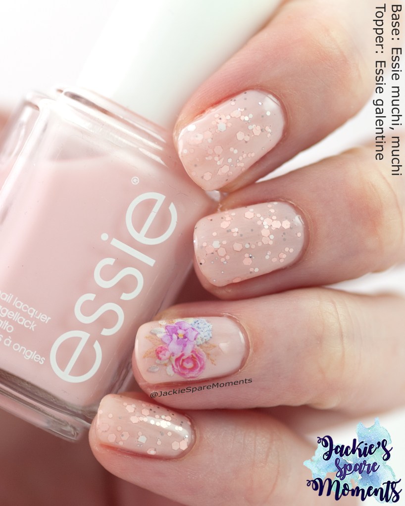
Essie Muchi, Muchi with Essie Galentine
Essie Muchi, Muchi with Essie Galentine
Dit is mijn moederdag manicure. Ik draag dan meestal een bloemen nail art. Deze keer heb ik water decals gekozen. Als basis bracht ik drie laagjes aan van Essie Muchi, Muchi. Daarover bracht ik een laagje Essie Galentine aan, een roze en witte glitter mix met kleine metalen glittertjes. Op mijn ring vinger bracht ik een water decal met een bloemenafbeelding.
Here is my Mother’s Day manicure. I usually wear a floral nail art for Mother’s Day. This year I chose floral water decals. As base I applied three layers of Essie muchi, muchi. Then I added a layer of Essie Galentine, a pink and white glitter mix with small metal glitter. On my ring finger I added the floral water decal.
ILNP Flower Child
ILNP Flower Child
Daarna droeg ik ILNP Flower Child. Dit is een roze nagellak met een sterke blauwe shimmer en holografische glitter. Ik kreeg het dekkend genoeg in drie laagjes. De blauwe shimmer veranderd naar paars als het licht onder een ander hoek op je handen valt. Ik kreeg een aantal complimentjes toen ik deze manicure droeg.
Next I wore ILNP Flower Child. This is a pink nail polish with a strong blue shimmer and holographic glitter. It covered well enough in three coats. The blue shimmer goes to purple depending on the light. I was given a couple of compliments when I wore this polish.
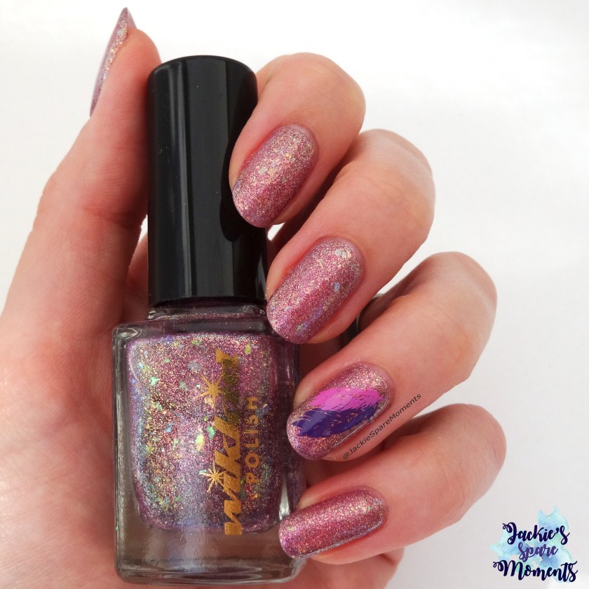
Cadillacquer Maybe We’ll Learn To Be Kind
Cadillacquer Maybe We’ll Learn To Be Kind
Vervolgens koos ik Cadillacquer Maybe We’ll Learn To Be Kind. Ik droeg het in drie laagjes met glitter smoothing top coat onder mijn gewone top coat. Het is een shimmer nagellak met roze reflective glitter. Weer een hele mooie lak van Cadillacquer.
After that I wore Cadillacquer Maybe We’ll Learn To Be Kind. I wore it in three coats with a glitter smoothing top coat and my regular top coat. It’s a shimmer polish with pink reflective glitter. Another beautiful polish by Cadillacquer.
Essence Pink Mystery
Essence LE 04 Pink Mystery topped with China Glaze Fairy Dust
Daarna koos ik voor Essence Pink Mystery, een roze metallic nagellak. Ik koos deze lak voor mijn maandelijkse Fairy Dust challenge. Het paste heel mooi bij elkaar. Als extraatje bracht ik nog een rozenafbeelding van KADS stempelplaat Flower 037 aan met een dieprode stempellak.
Next I picked Essence Pink Mystery for my monthly Fairy Dust challenge. It’s a pink metallic nail polish. They fit nicely together. As accent I added an image of roses from KADS stamping plate Flower 037 with a deep red stamping polish.
Essie Blushin’ & Crushin’
Essie Blushin’ & Crushin’
Inmiddels is de tuin goed in bloei en de laatste nagellakken van de maand zijn geïnspireerd op bloemen die er te zien waren. De eerste keuze was Essie Blushin’ & Crushin’. Deze warmroze nagellak is in twee lagen dekkend.
By now the garden is very much in bloom en the final polish picks of the month are all inspired by the various shades of pink that the flowers are. The first pick was this warm pink that is Essie Blushin’ & Crushin’. It was opaque in two coats.
Catrice ICONails 163 Pink Matters
Catrice ICONails 163 Pink Matters
Daarna koos ik voor deze shimmer nagellak van Catrice. Dit is Pink Matters in drie laagjes. De shimmer wisselt van roze naar goud, wat voor een Catrice nagellak best bijzonder is. Als accent bracht ik deze bloemenafbeelding van BornPretty stempelplaat Daisy BP-X38 met dieproze stempellak.
Next I chose this shimmer nail polish by Catrice. This is Pink Matters in three coats. The shimmer changes from pink to gold, what is quite special for a Catrice nail polish. As accent I added this flower image from BornPretty stamping polish Daisy BP-X38 with a deep pink stamping polish.
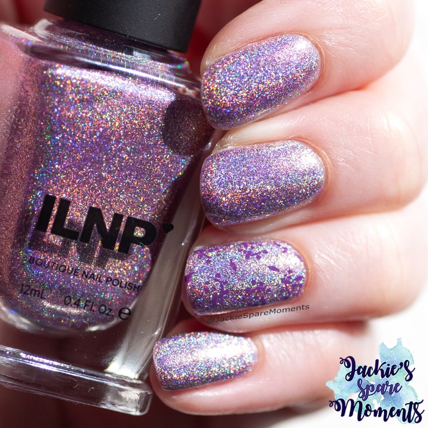
Zodiac Set Rose Quartz
Zodiac Set Rose Quartz by Dany Vienna, by Vanessa Molina and Whatcha
Vervolgens koos ik deze lichtroze nagellak. Dit is een lineair holografische nagellak met holografische flakes. Het is zeer holografisch in de zon. Ook deze kleur paste mooi bij de bloemen in de tuin. De nagellak was dekkend in twee laagjes.
Next I chose a polish for the light pink flowers. I chose a light pink lineair holographic nail polish with holographic flakes. It’s very holographic polish in the sun. I had full coverage in two coats.
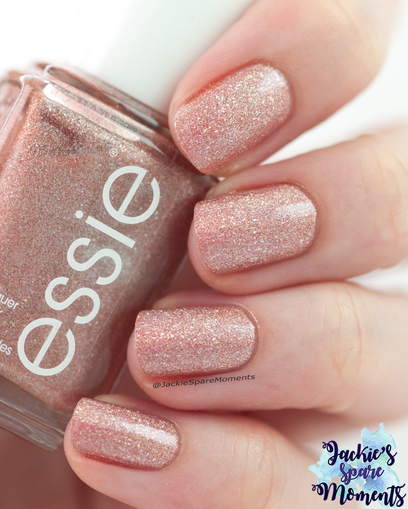
Essie Pink Diamond
Essie Pink Diamond
De laatste manicure van de maand was met Essie Pink Diamond, een roze shimmer nagellak. Het was dekkend in drie laagjes.
The final manicure this month is Essie Pink Diamond, a pink shimmer polish. I reached full coverage in three layers.
April was een maand met veel zon en warm weer. In rap tempo werd de wereld weer groen en in bloei. Pasen kwam met een paar vrije dagen. Daarna volgde Koningsdag, dat dit jaar op zaterdag werd gevierd. Ik heb regelmatig mijn nagels kunnen lakken en verschillende lente kleuren gedragen. Ik droeg elke manicure met base coat en top coat, tenzij anders vermeld.
April was a sunny month with dry weather that was slightly warmer than average. So the world was quickly full of fresh greenery and flowers. With Easter holiday we had some extra days off. Next came King’s Day, that was celebrated on Saturday this year. I could paint my nails regularly and wore different spring colours. I wore every manicure with base coat and top coat, unless otherwise stated.
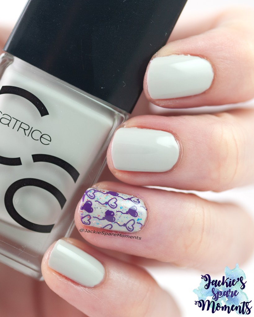
Catrice ICONails 164 Elsa’s Favourite
Catrice Elsa’s Favourite
Mijn eerste manicure van de maand is een zachtgroene lak met roze shimmer. Dit is Catrice ICONails 164 Elsa’s Favourite. Ik draag het in drie laagjes. Als accentnagel bracht ik een afbeelding aan van KADS stempelplaat Flower 048.
My first manicure of the month is this soft green polish with pink shimmer. This is Catrice ICONails 164 Elsa’s Favourite. I wore it in three coats. As accent nail I added an image from KADS stamping plate Flower 048.
Colores de Carol Little Dreamer
Colores de Carol Little Dreamer
Daarna droeg ik mijn eerste (en enige) solar nagellak. Dat is een nagellak die UV gevoelig is en andere kleuren laat zien in de zon of in de schaduw. Dit is Colores de Carol Little Dreamer. Dit is een nagellak die ontwikkeld is om aandacht te vragen voor kinderen met kanker. Ik draag het in drie laagjes met glitter smoothing top coat en gewone top coat. Beide zijn veilig te gebruiken met UV gevoelige nagellak. De meeste solar nagellakken hebben echt verschillende kleuren, maar Little Dreamer kleurt van lichtpaarse tot medium paarse nagellak met flakes en glitter. Dit subtielere kleurverschil is wat ik zo mooi vond en natuurlijk ook het goede doel!
Next I wore my first (and only) solar nail polish. That is a nail polish that is UV sensitive and shows a different colour in the sun and in the shade. This is Colores de Carol Little Dreamer. This is a nail polish that is developed to ask awareness for paediatric cancer. I wore it in three coats with a glitter smoothing top coat and a regular top coat. Both were safe to use with UV sensitive nail polishes. Most solar polishes have different colours in sun and shade, this one instead has different shades of the same colour. Little Dreamer changes from light purple to medium purple and has flakes and little glitters. This more subtle change in colour is why I liked it enough to buy and of course the charity!
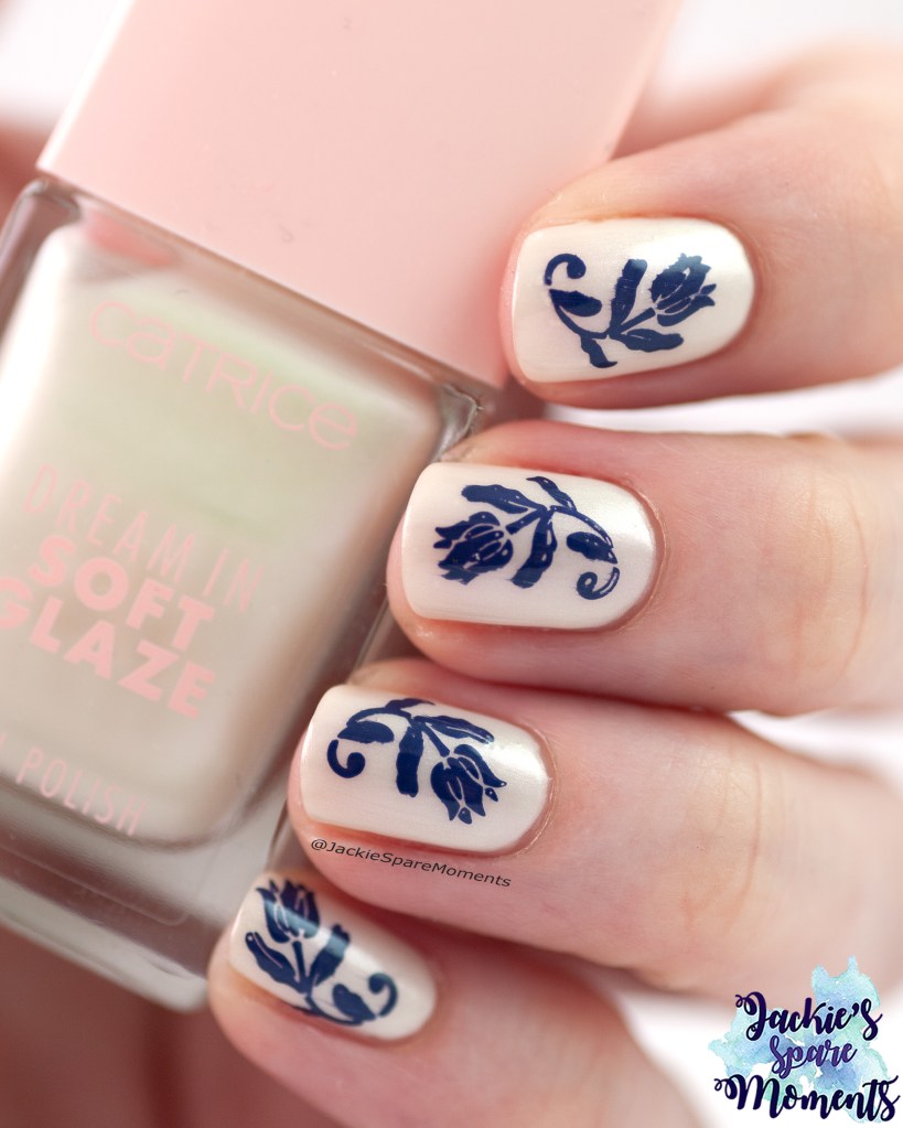
Catrice Dream in Soft Glaze 010 Hailey Baby
Catrice Dream In … Hailey Baby
Vervolgens liet ik mij inspireren door een Delfts blauw patroon met tulpen op oude tegeltjes. Eerst bracht ik drie laagjes aan van Catrice Dream in Soft Glaze 010 Hailey Baby. De afbeeldingen komen van Dashica stempelplaat SdP-81 en zijn aangebracht met donkerblauwe stempellak.
Then I was inspired by a Delft blue pattern with tulips on old tiles. First I painted three layers of Catrice Dream in Soft Glaze 010 Hailey Baby. The images come from Dashica stamping plate SdP-81 and are done with dark blue stamping polish.
Catrice and Sally Hansen sandwiched
Catrice More than Nude 05 Rosey-o and Sparklet with Sally Hansen 105 Crystal Top Coat
Daarna had ik zin om met een topper te spelen. Ik maakte een vierlaagse “sandwich” bestaande uit een laagje Catrice Rosey-o and Sparklet, een laagje Sally Hansen Crystal Top Coat, een laagje Catrice Rosey-o and Sparklet en daarna nog een laagje Sally Hansen Crystal Top Coat. Het werkte heel mooi. De flakes waren mooi gelaagd zichtbaar. Het resultaat was een nude kleur met rode, oranje, gele tot groene flakes.
Next I was in the mood to play with a topper. I made a four layer “sandwich” that went like this: a layer of Catrice Rosey-o and Sparklet, a layer Sally Hansen Crystal Top Coat, another layer Catrice Rosey-o and Sparklet and a final layer of Sally Hansen Crystal Top Coat. I really loved the end result. The flakes were very pretty and visible through the layers. The result was a nude shade with red, orange, yellow to green flakes.
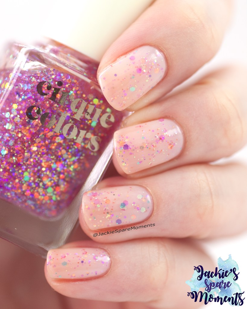
Catrice with Cirque colors sandwiched
Catrice sandwiched with Cirque colors Crystal Tokyo
Aangemoedigd door het succesvolle resultaat van de vorige manicure, ging ik nog een keertje spelen met een topper. Deze keer koos ik voor Cirque colors Crystal Tokyo. Ik startte met een laagje Catrice MTN 08 Shine Pink like A … en daarna een laagje Cirque colors Crystal Tokyo. Omdat Shine Pink like A … erg melkachtig bleek, koos ik daarna voor een laagje Catrice Sheer Beauties 040 Fluffy Cotton Candy. Het effect was weer erg mooi en maakte mij heel blij. Het effect was roze nagels met gekleurde iridescerende glitters.
Encouraged by the success of the last manicure, I went for another topper experiment. This time I chose for Cirque colors Crystal Tokyo. I started with a layer of Catrice MTN 08 Shine Pink like A … and next a layer of Cirque colors Crystal Tokyo. Shine Pink like A … turned out very milky, so next I chose Catrice Sheer Beauties 040 Fluffy Cotton Candy for the final layer. The effect was very beautiful and made me very happy. The final look was pink nails with coloured iridescent glitters.
Easter manicure
Easter skittle manicure
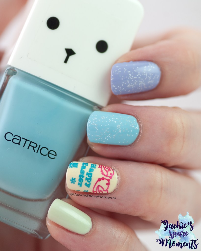
Met Pasen droeg ik een skittle manicure met de volgende nagellakken: Essie expressie sk8 with destiny, Catrice LE Hop, hop hooray reloaded C05 Spring Soul, Catrice ICONails 152 Lemon Butter en Essie Gel Couture zip me up. Ik droeg alles twee laagjes, behalve zip me up (drie laagjes). De Happy Easter afbeelding is gestempeld van Dashica Infinity Nails stempelplaat 171 in twee kleuren. Op de wijsvinger en middelvinger voegde ik nog een laagje witte glitter topper toe, Colores de Carol Noble.
With Easter I wore a skittle manicure with the following polishes: Essie expressie sk8 with destiny, Catrice LE Hop, hop hooray reloaded C05 Spring Soul, Catrice ICONails 152 Lemon Butter and Essie Gel Couture zip me up. I wore all in two coats, except zip me up (three coats). The Happy Easter image is from Dashica Infinity Nails stamping plate 171 and stamped in two colours. On pointer finger and middle finger I added a layer of a white glitter topper, Colores de Carol Noble.
Spring skittle manicure
Spring skittle manicure
Nadat Amanda @TheNailPolishHound een video met paarse holografische nagellakken uit haar collectie had geüpload, was ik geïnspireerd om een paarse holografische nagellak uit mijn collectie te gebruiken. Ik koos voor Wikkid polish Parma Violets (drie laagjes) en waterslide decals van AliExpress. Om het af te maken voegde ik nog Wikkid polish Pistachio (twee laagjes) en Catrice Brave metallics 02 Sweet as sugar (twee laagjes) toe. Het resultaat was paarse en groene holografische nagels met witte accent nagel met decal. Ik vond het een heel geslaagde manicure!
After Amanda @TheNailPolishHound published a video with purple holographic nail polishes from her collection, it inspired me to wear a holographic nail polish from my own collection. I chose Wikkid polish Parma Violets (three coats) and waterslide decals from AliExpress. To finish it off I added Wikkid polish Pistachio (two coats) and Catrice Brave metallics 02 Sweet as sugar (two coats). The result was purple and green holographic nails with a white accent nail with a decal. I liked this manicure a lot!
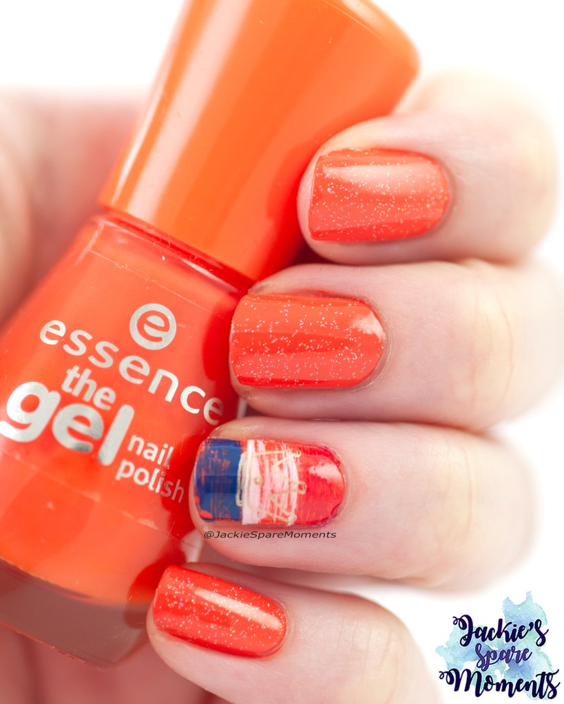
King’s Day nail art
King’s Day manicure with essence 96 orange to go
Daarna was het tijd voor een Koningsdag manicure. Uiteraard gaan we dan voor oranje. De basis is essence 96 orange to go (twee laagjes) met erover een laagje China Glaze Fairy Dust. Als accent nagel voegde ik met een drybrush techniek de kleuren van de Nederlandse vlag toe. Daarover stempelde ik een kroon van een essence stempelplaat met gouden stempellak. Ieder jaar probeer ik weer iets nieuws te bedenken en dit jaar is het weer gelukt!
Next it was time for a King’s Day manicure. Of course the first choice for this day is orange. The base for this manicure is essence 96 orange to go (two coats) with a layer of China Glaze Fairy Dust. As accent nail I added the colours of the Dutch flag with a drybrush technique. On top I stamped a crown image of an essence stamping plate with a golden stamping polish. Every year I try to come up with something new, I was happy with this design.
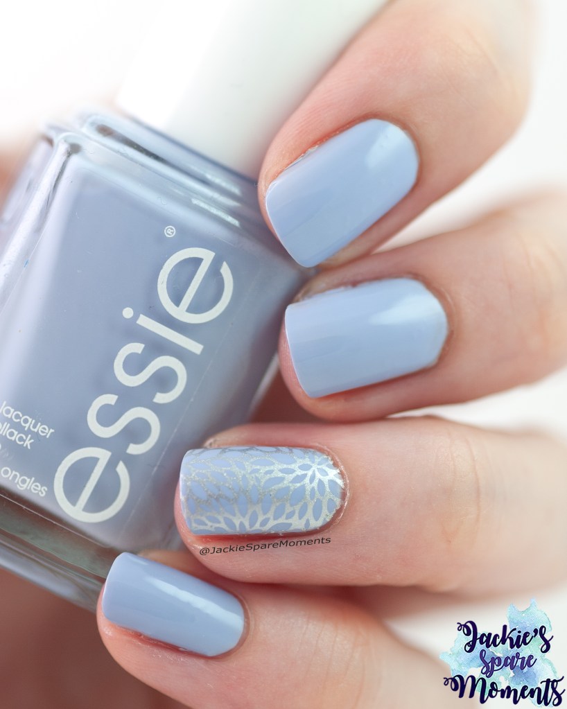
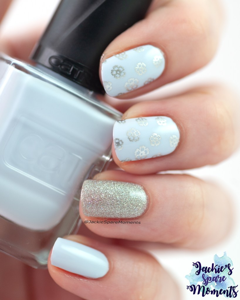
Catrice Gel Affair 029 Blue You A Kiss
Catrice Gel Affair 029 Blue You A Kiss with accent nail A England Titania Fairy Queen
Mijn laatste manicure van de maand is met een nagellak die ik voor Valentijnsdag heb gekregen. Toen heb ik een paar nagellakken gekregen van de vernieuwde Catrice nagellak lijn. Het heet niet meer ICONails maar Gel Affair. Dit is Catrice Gel Affair 029 Blue You A Kiss. Als accent nagel koos ik voor A England Titania Fairy Queen. Op de wijsvinger en middelvinger stempelde ik een afbeelding van stempelplaat KADS flower 051. Het is een mooie lichtblauwe nagellak, ik kreeg het dekkend in twee laagjes.
My final manicure of the month is with a nail polish that my family gifted me for Valentine’s Day. They gave me a couple of polishes of the new Catrice nail polish line. Their polish line is no longer called ICONails, but Gel Affair. This is Catrice Gel Affair 029 Blue You A Kiss. As accent nail I chose A England Titania Fairy Queen. On the middle finger and pointer finger I added a stamping image from the stamping plate KADS flower 051. It’s a nice light blue nail polish that was full coverage in two coats.
Maart was niet mijn beste maand. Helaas was ik twee keer ziek deze maand. Ik begon de maand met griep. En richting het einde van de maand werd ik nog een keer ziek met een buikgriep. Gelukkig lukte het wel om regelmatig mijn nagellak te wisselen. Elke manicure was gedaan met base coat en top coat, tenzij ik anders vermeld.
March was not the best month so far. Sadly I was sick twice this month. I started the month with the flu. And towards the end of the month I was sick with a stomach flu. I did manage to change my polish on a regular basis. All the polishes are worn with base coat and top coat, unless otherwise stated.
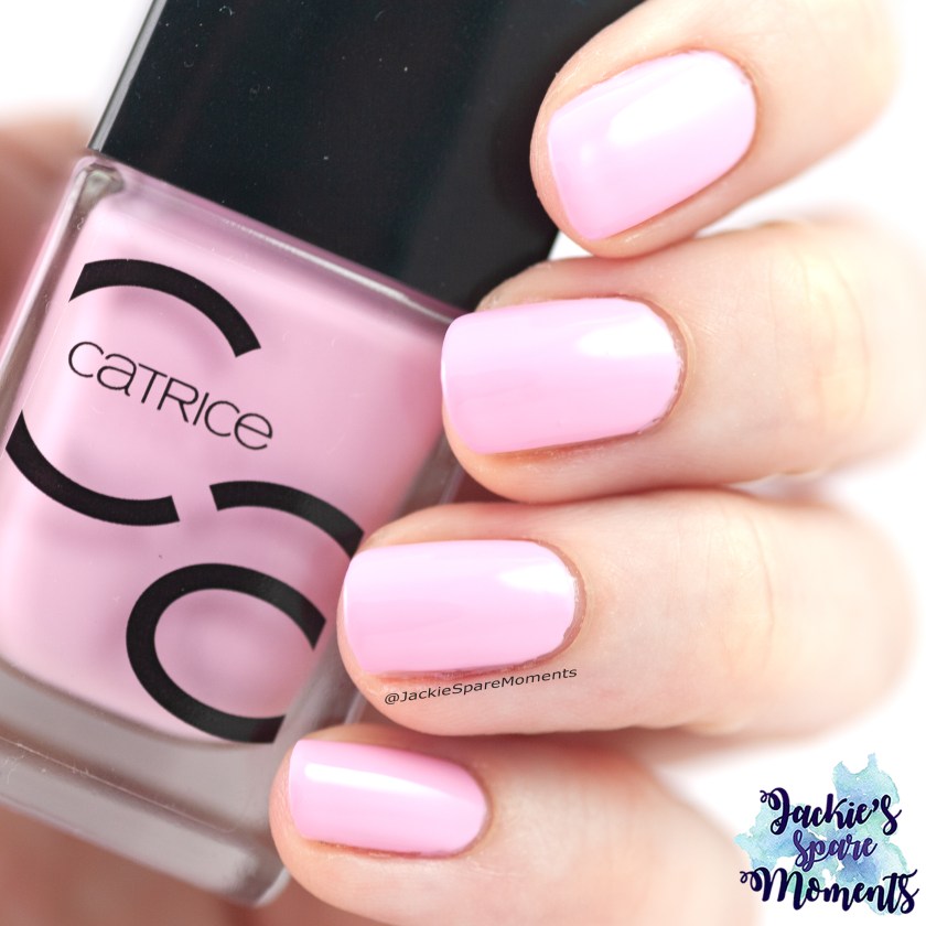
Essie stitch by stitch
Essie stitch by stitch
Ik startte de maand met een neutrale kleur van Essie. Ik droeg Essie stitch by stitch in twee laagjes. Een pauze na de kleuren van februari. En toen werd ik ziek…
I started the month with a neutral colour by Essie. I wore Essie stitch by stitch in two coats. A little pause after the colours of February. And then I fell ill…
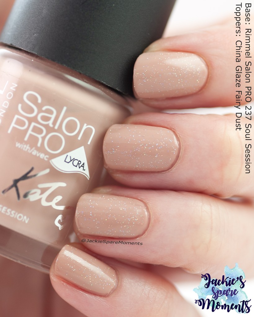
Rimmel soul session with China glaze fairy dust
Rimmel Salon PRO 237 Soul Session with topper China Glaze Fairy Dust
Daarna droeg ik weer een neutrale manicure. Deze keer was het een combinatie van Rimmel Salon PRO 237 Soul Session with topper China Glaze Fairy Dust. Fairy Dust blijft een mooie topper over neutrale kleuren.
Next I wore another neutral manicure. This time it was a combination of Rimmel Salon PRO 237 Soul Session with topper China Glaze Fairy Dust. Fairy Dust remains a very pretty topper over neutral colours.
Masura Cakepops with nail art
Masura Cakepops with Essie urban jungle and nail art
Deze keer was ik fit genoeg voor een beetje nail art, maar koos toch nog steeds voor neutrale kleuren. Als ik ziek ben, zijn neutrale kleuren mijn veilige keuze. Ik bracht ik twee laagjes Masura Cakepops aan op mijn duim, ringvinger en pink. Op mijn wijsvinger en middelvinger bracht ik twee laagjes Essie urban jungle aan. Op deze vingers bracht ik ook afbeeldingen aan van Born Pretty stempelplaat Festival BP-X22. Over de nagels met Cakepops bracht ik eerst een laagje glitter smoothing top coat aan en daarna pas mijn reguliere top coat.
I’m finally feeling well enough to change my manicure with a little nail art. But I still chose a neutral colour, because they are my safe choice when not feeling well. I wore two coats of Masura Cakepops on my thumb, ring finger and pinky. On my pointer finger and middle finger I added two coats of Essie urban jungle. On these fingers I also added images from stamping plate Festival BP-X22 by Born Pretty. Over the nails with Cakepops I added a layer of glitter smoothing top coat before my regular top coat.
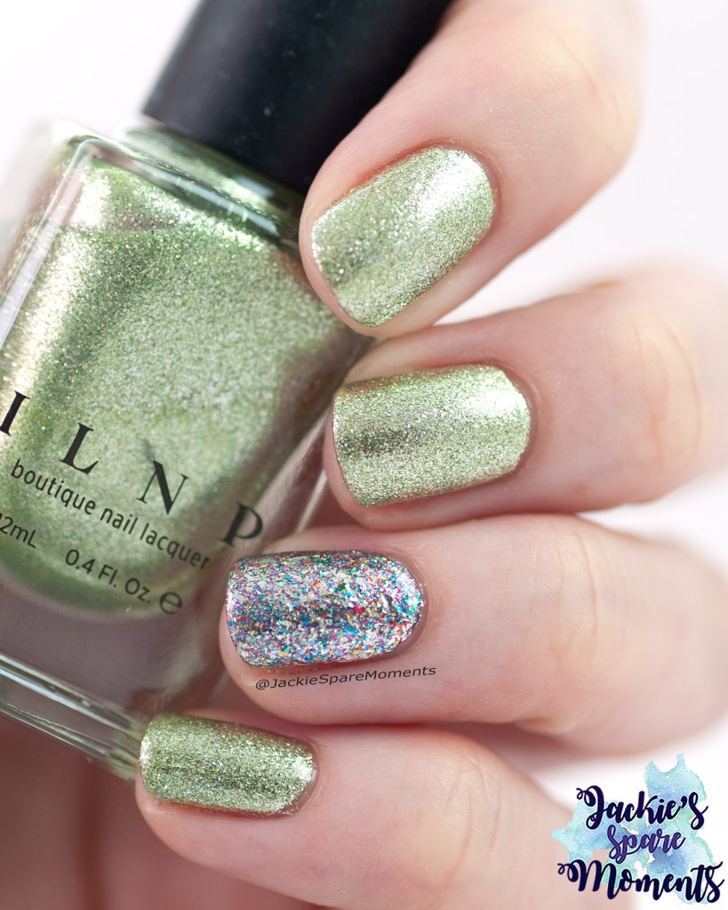
ILNP On the way
ILNP On the way with Rogue Lacquer Shattered rainbows
Eindelijk ben ik weer opgeknapt en is het al bijna Saint Patrick’s Day. Mijn eerste groene manicure is een rewear van vorig jaar. Ik draag hier drie laagjes van ILNP On the way met een accent nagel van Rogue Lacquer Shattered rainbows (ook in drie laagjes).
Finally I’m feeling better and it’s almost St Patrick’s Day. My first green manicure this month is a rewear of last year. I’m wearing three coats of ILNP On the way with an accent nail of Rogue Lacquer Shattered rainbows (also in three coats).
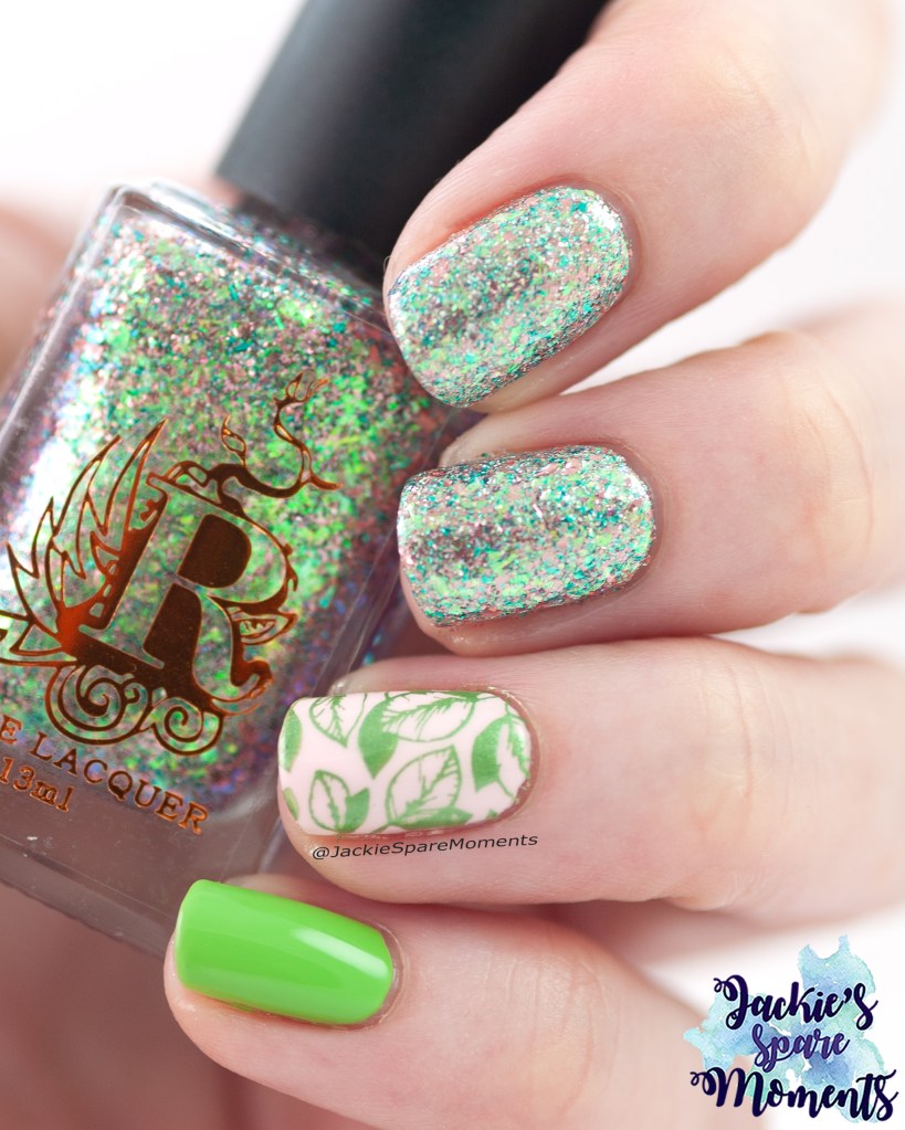
Green spring nails
Green spring nails with Rogue Lacquer Piles of Petals, essence instant friendship and Catrice Spring Meadow
Voor St Patrick’s Day en de dagen erna droeg ik deze nail art. Op duim en ringvinger droeg ik twee laagjes van essence colour boost 01 instant friendship met daarover een gestempelde afbeelding van KADS nature 070 met Hit the bottle stempellak Cactus juice. Op mijn wijsvinger en middelvinger draag ik drie lagen Rogue Lacquer Piles of Petals met een laagje glitter smoothing top coat en mijn normale top coat. Op mijn pink droeg ik twee laagjes van Catrice Hop, hop hooray reloaded C06 Spring meadow. De flakes van de Piles of Petals hebben roze, teal en groene kleuren en ook wat holografische sparkle. Iedere keer als ik naar mijn nagels keek, werd ik er helemaal blij van.
For St Patrick’s Day and the days after I wore this spring nail art. On thumb and ring finger I wore two coats of essence colour boost 01 instant friendship with an image from KADS stamping plate nature 070 with Hit the bottle stamping polish Cactus juice. On my pointer and middle finger I wore three coats of Rogue Lacquer Piles of Petals with a layer glitter smoothing top coat and my regular top coat. On my pinky I wore two coats of Catrice Hop, hop hooray reloaded C06 Spring meadow. The flakes of Piles of Petals have pink, teal and green colours and some holographic sparkle. Every time I looked at my nails it made me happy!
Cuticula Enchanted Rose
Cuticula Enchanted Rose
Daarna droeg ik Cuticula Enchanted Rose in drie laagjes. Wederom bij zoveel flakes droeg ik eerst een laagje glitter smoothing top coat en dan mijn gewone top coat.
Next I wore Cuticula Enchanted Rose in three coats. Again with so many flakes in this polish I added a layer of glitter smoothing top coat before my regular top coat.
Polished for days Snow Cap
Polishes for days Snow Cap
Daarna koos ik voor een iets minder lichte kleur. Dit is Polished for days Snow Cap. Een warme paarse nagellak met blauwe shimmer en holografische flakes. Ik draag het in twee laagjes. De holografische flakes zijn heel mooi in de zon.
Next I chose a stronger colour. This is Polished for days Snow Cap. It’s a warm purple with blue shimmer and holographic flakes. I wore it in two coats. The holographic flakes are very pretty in the sunlight.
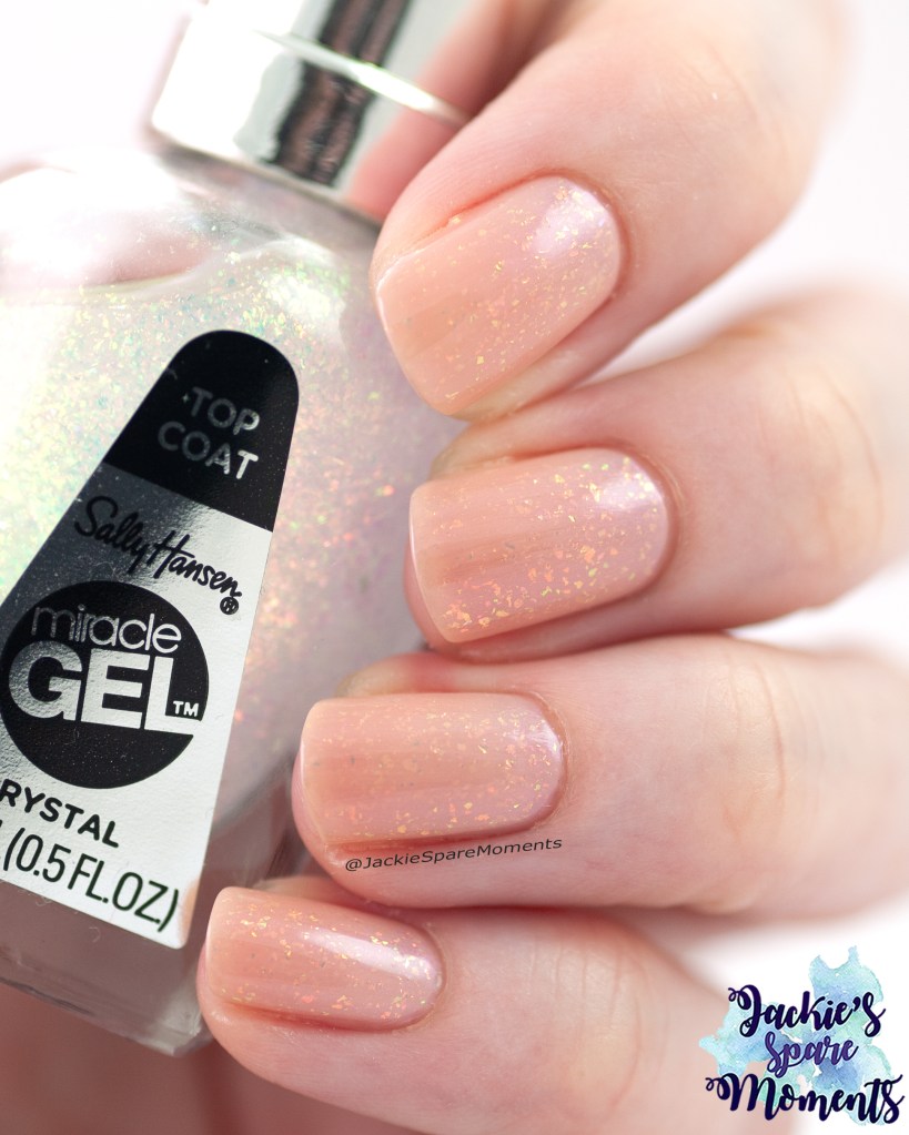
Catrice PEARLFECTION Nail Lacquer C02 Luminous Pearl
Catrice PEARLFECTION Nail Lacquer C02 Luminous Pearl
In de drogist kwam ik deze nieuwe nagellak van Catrice tegen. Ik droeg het meteen. Het is een parelmoer nagellak met een kleine shift in de shimmer. Ik draag het in twee laagjes met een blurring base coat. Helaas werd ik toen weer ziek deze maand.
In my local drugstore I found this new polish by Catrice. I wore it immediately. It’s a pearl polish with a small shift in the shimmer. I’m wearing it in two coats with a blurring base coat. Sadly I fell sick for the second time this month when I wore this polish.
Painted polish Ruffles & Romance
Painted Polish Ruffles & Romance
Zoals ik eerder deze maand deed, koos ik voor een neutrale nagellak toen ik ziek mijn nagellak wilde verversen. Ik koos voor Painted Polish Ruffles & Polish. Ik draag het in drie laagjes. Gelukkig knapte ik snel weer op.
Like I did earlier in the month, I chose for a neutral nail polish when I wanted to change my polish when not feeling well. I chose Painted Polish Polish Ruffles & Polish. I wore it in three coats. Luckily it was a short bout.
Essie flirty flutters
Essie flirty flutters
De laatste manicure van de maand was roze met blauwe shimmer. Dit is Essie flirty flutters. Ik draag het in drie laagjes. Als accent bracht ik met blauwe stempellak een afbeelding van KADS stempelplaat nature 069.
The final manicure this month was pink with blue shimmer. This is Essie flirty flutters. I’m wearing it in three coats. As accent I added an image from KADS stamping plate nature 069 in blue stamping polish.
Ik heb in februari drie keer per week mijn manicure gewisseld. Daar had ik deze maand tijd voor! Daardoor heb ik een heleboel manicures om te tonen. Alles is gedragen met base coat en top coat, tenzij anders vermeld.
I was able to change my manicure three times a week in February. Normally I don’t have time to change it so often. So I have a lot of manicures to show you. Everything is worn with base coat and top coat, unless otherwise stated.
ILNP Sweet Pea
ILNP Sweet Pea
Ik startte de maand met een nude met wat extra’s. De eerste manicure van de maand was ILNP Sweet Pea. Ik droeg het in drie laagjes. Het was zonnig, dus ik kon een foto maken van de holo sparkles.
I started the month with a nude polish shade with something extra. The first manicure of the month was ILNP Sweet Pea. I wore it in three coats. It was sunny, so I could take a picture of the holo sparkles.
Sally Hansen InstaDri 103 Euphoric
Sally Hansen InstaDri 103 Euphoric
Daarna droeg ik Sally Hansen InstaDri Holo-Glow 103 Euphoric. Ik droeg het in drie laagjes. De nagellak heeft een grijze basiskleur met shimmer dat shift tussen groen en roze en holografische glitter. De nagellak droogt met wat textuur, dus ik gebruikte eerst een glitter smoothing top coat en daarna mijn reguliere top coat.
Next I wore Sally Hansen InstaDri Holo-Glow 103 Euphoric. I wore it in three coats. The nail polish has a grey base colour with a shimmer that shifts between green and pink and holographic glitter. The nail polish dried with some texture, so I first used a glitter smoothing top coat and followed it with my regular top coat.
Catrice Amethyst Aura and Essence Jelly nail polish
Amethyst nail polish combination
Amethist is de geboortesteen van februari. Ik heb de Catrice Crushed Crystal effect top coat in 010 Amethyst Aura en wilde het deze maand ergens over gebruiken. Ik combineerde het met Essence glossy Jelly nail polish in 01 Summer Splash. Eerst bracht ik twee laagjes van de Essence jelly aan en daarover bracht ik twee laagjes Catrice Amethyst Aura aan. De effect top coat droogt op met wat textuur. Dus eerst gebruikte ik een glitter smoothing top coat en daarna mijn gewone top coat.
Amethyst is the birth stone of February. I have Catrice Crushed Crystal effect top coat 010 Amethyst Aura and wanted to use it this month. It’s very sheer, so I needed something to use it over. I chose to combine it with Essence glossy Jelly nail polish 01 Summer Splash. First I painted two coats of the Essence jelly and over it I added two coats Catrice Amethyst Aura. The effect top coat dries with some texture. So I first used a glitter smoothing top coat before my regular top coat.
Catrice 175 Too Good To Be Taupe
Catrice Too Good To Be Taupe with Valentine’s Day accent nail art.
Toen was het tijd voor mijn eerste Valentijnsmanicure. Ik ging eerst voor een neutrale basis. Daarvoor koos ik Catrice ICONails 175 Too Good To Be Taupe. Ik draag het in twee laagjes. Als accent nagel bracht ik eerst een dun laagje aan van Rogue Kaleidoscope. Daarna plaatste ik een afbeelding van KADS stempelplaat Festival 003 met paarse stempellak.
Then it became time for my first Valentine’s Day manicure. My first idea was a manicure with a neutral base. I chose Catrice ICONails 175 Too Good To Be Taupe. I wore it in two coats. As accent nail I painted a thin layer of Rogue Kaleidoscope. Next I added an image from KADS stamping plate Festival 003 with purple stamping polish.
Essie Drop the gown
Essie drop the gown with accent stamping nail art
Daarna droeg ik Essie drop the gown, een rode nagellak, in twee laagjes. Als accent bracht ik een afbeelding aan van KADS stempelplaat Festival 017 met zilveren stempellak.
Next I wore Essie drop the gown, a red polish, in two layers. As accent I added an image from KADS stamping plate Festival 017 with a silver stamping polish.
Garden Path Lacquers Path to PBE Valentine’s Day manicure
Valentine’s Day manicure
Vervolgens kwam de manicure die ik daadwerkelijk op Valentijnsdag droeg. Deze bestaat uit een laagje Catrice ICONails 157 I’m A Barbie Girl met daarover een laagje Garden Path Lacquers Path to PBE. Dit is een microglitter nagellak in een kleurloze basis met shimmer en holografische flakes. Heel mooi over de roze Catrice. Als accent nagel bracht ik twee laagjes van I’m A Barbie Girl aan met daarover een afbeelding van KADS stempelplaat Festival 003 met lichtroze stempellak.
Next I wore the manicure that I really wore on Valentine’s Day. First is one layer of Catrice ICONails 157 I’m A Barbie Girl and next a layer of Garden Path Lacquers Path to PBE. Path to PBE is a microglitter polish in a clear base with shimmer and holographic flakes. It was very pretty over the pink Catrice. As accent nail I painted two layers of I’m A Barbie Girl and added an image of KADS stamping plate Festival 003 with light pink stamping polish.
Essie Cool and Collected with toppers
Essie cool and collected with toppers
Daarna droeg ik een combinatie van een basiskleur met twee toppers. De basis is Essie cool and collected, een hele lichte lila, in twee laagjes. Daarover droeg ik een laagje van Essie cosmic chrome en een laagje China Glaze Fairy Dust. Het was heel winters.
Then I wore a combination of a base colour with two toppers. The base is Essie cool and collected, a very light shade of purple, in two coats. On top I wore a layer of Essie cosmic chrome and a layer China Glaze Fairy Dust. It was a very icy and wintery combination.
Rogue Lacquer Super Cell and Essie first kiss bliss
Rogue Lacquer Super Cell and Essie first kiss bliss with stamping
Daarna droeg ik Rogue Lacquer Super Cell in twee laagjes samen met Essie First kiss bliss in twee laagjes. Onder alle shimmer heeft Super Cell een mintgroene basis, iets donkerder dan Essie first kiss bliss. Over de Essie plaatste ik een stempelafbeelding met Super Cell. De afbeelding komt van Dashica Infinity Nails stempelplaat 157.
Next I wore Rogue Lacquer Super Cell in two coats together with Essie First kiss bliss in two coats. Hiding behind all the shimmer Super Cell has a mint green basse, slightly darker than the Essie. On top of the Essie I stamped an image with Super Cell. This image is from Dashica Infinity Nails stamping plate 157.
A England Symphony in blue and silver
A England Symphony in blue and silver
Toen koos ik voor een oudere A England nagellak die ik nog maar een keer had gedragen (jaren geleden). Dat is A England Symphony in blue and silver, een lichtblauwe holografische nagellak. Ik draag het in twee laagjes. Als accent bracht ik een stempelafbeelding aan van stempelplaat BMC-XL222 met zilveren stempellak.
I chose to wear an older A England polish that I had only worn once many years ago. It’s A England Symphony in blue and silver, a light blue linear holographic nail polish. I wore it in two coats. As accent I added an image from stamping plate BMC-XL222 with silver stamping polish.
Catrice ICONails 63 Early Mornings, Big Shirt, Perfect Nails
Catrice ICONails 63 Early Mornings, Big Shirt, Perfect Nails
Vervolgens droeg ik Catrice ICONails 63 Early Mornings, Big Shirt, Perfect Nails in twee laagjes. Dit is een neutrale nagellak met een blauwe shimmer.
Then I wore Catrice ICONails 63 Early Mornings, Big Shirt, Perfect Nails in two coats. This is a neutral nail polish with blue shimmer.
ILNP Pitter Patter
ILNP Pitter Patter
Toen het weer meer bewolkt en regenachtig was, droeg ik ILNP Pitter Patter in drie laagjes. Vond dat wel passend. Pitter Patter is een vergrijsde paars-blauwe nagellak met flakes. Net als de lucht op die dagen.
When the weather was more overcast and rainy, I wore ILNP Pitter Patter in three coats. It was fitting. Pitter Patter is a greyed out shade of periwinkle. Just like the skies at that time.
Catrice Koala-ty Time with Ice And Easy
Catrice Koala-ty Time with KBShimmer Ice And Easy
De laatste manicure van de maand was met Catrice Koala-ty Time, een lichtgrijze nagellak, in twee laagjes met een laagje KBShimmer Ice And Easy. Het blijft een hele mooie topper.
The last manicure of the month was Catrice Koala-ty Time, a light grey, in two coats with one coat of KBShimmer Ice And Easy. I love this topper.